Celonis process mining?
A simple purchase order has a process flow defined via ERP (Enterprise resource planning) which entire organisation follows.
But due to delays and deviation from the purchase order process, creates hidden inefficiency and revenue loss which is difficult to back trace easily.
When these ERP data footprints are fed into process mining it gives a holistic view of process and also deviations from the process from large sets of data.
The Design Challenge Brief
Organizing registrations according to the data job-seekers enhances user targeting, contributing to an improved experience and services.
Scoping of task
Task is to conceptualise and design a data visualisation component. The component as such is expected to contain the following elements:
Demonstrates and explains the conceptual thoughts as well as the actual component design.
Present your process, considerations, and solution based on this file.
Breaking down the Design Brief
The What
Conceptualize data visualization
Explain the conceptual thoughts
Present process, considerations, and solution
The Why
To make the user understand complex information faster and to provide variation in data visualization which covers various use cases of different industries & Domain
The How
Exploring different process flow diagrams (Based on time constraints) like Swimlane diagram, Ishikawa, gantt chart , VSM and ideating upon them, so that it fits into Process mining ecosystem
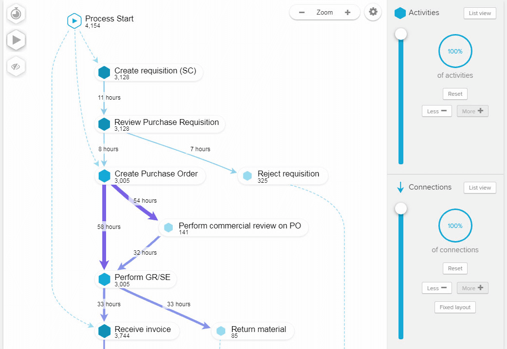
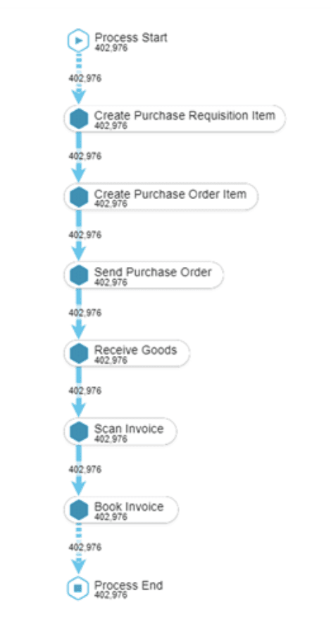
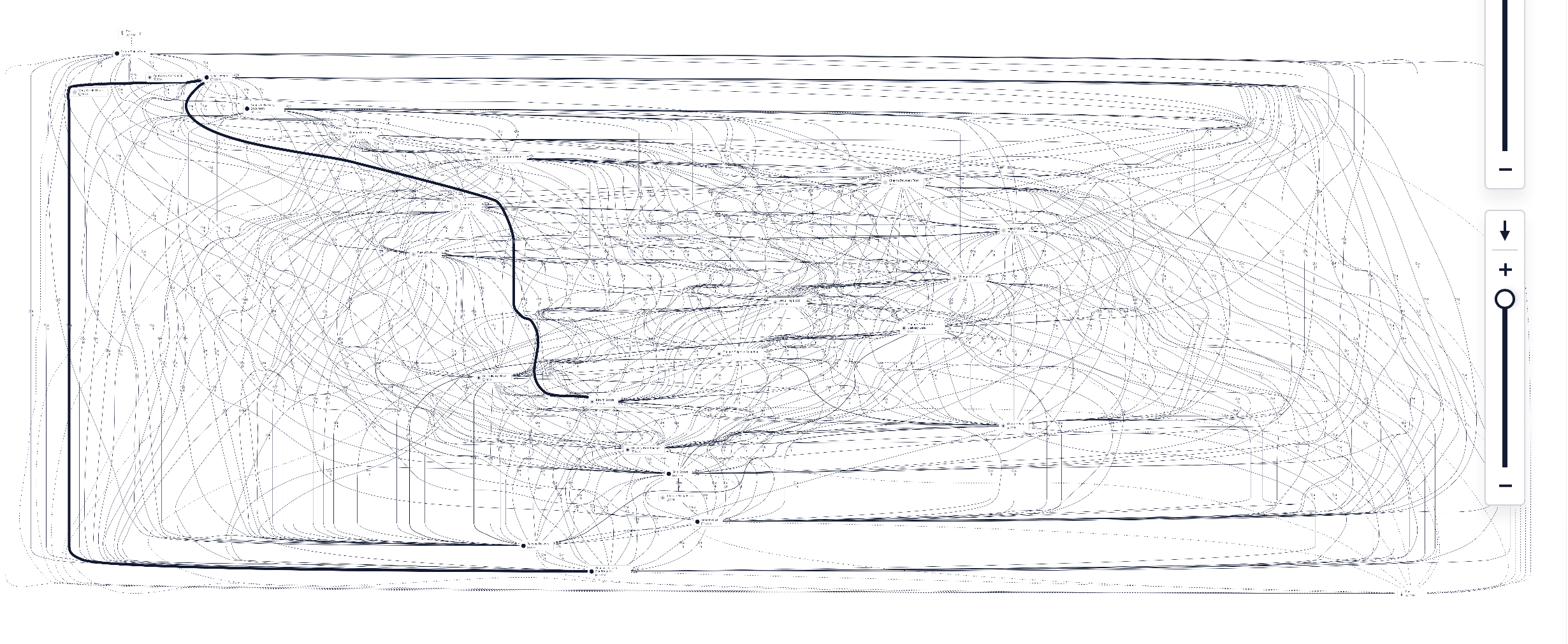
The current process flow of Celonis
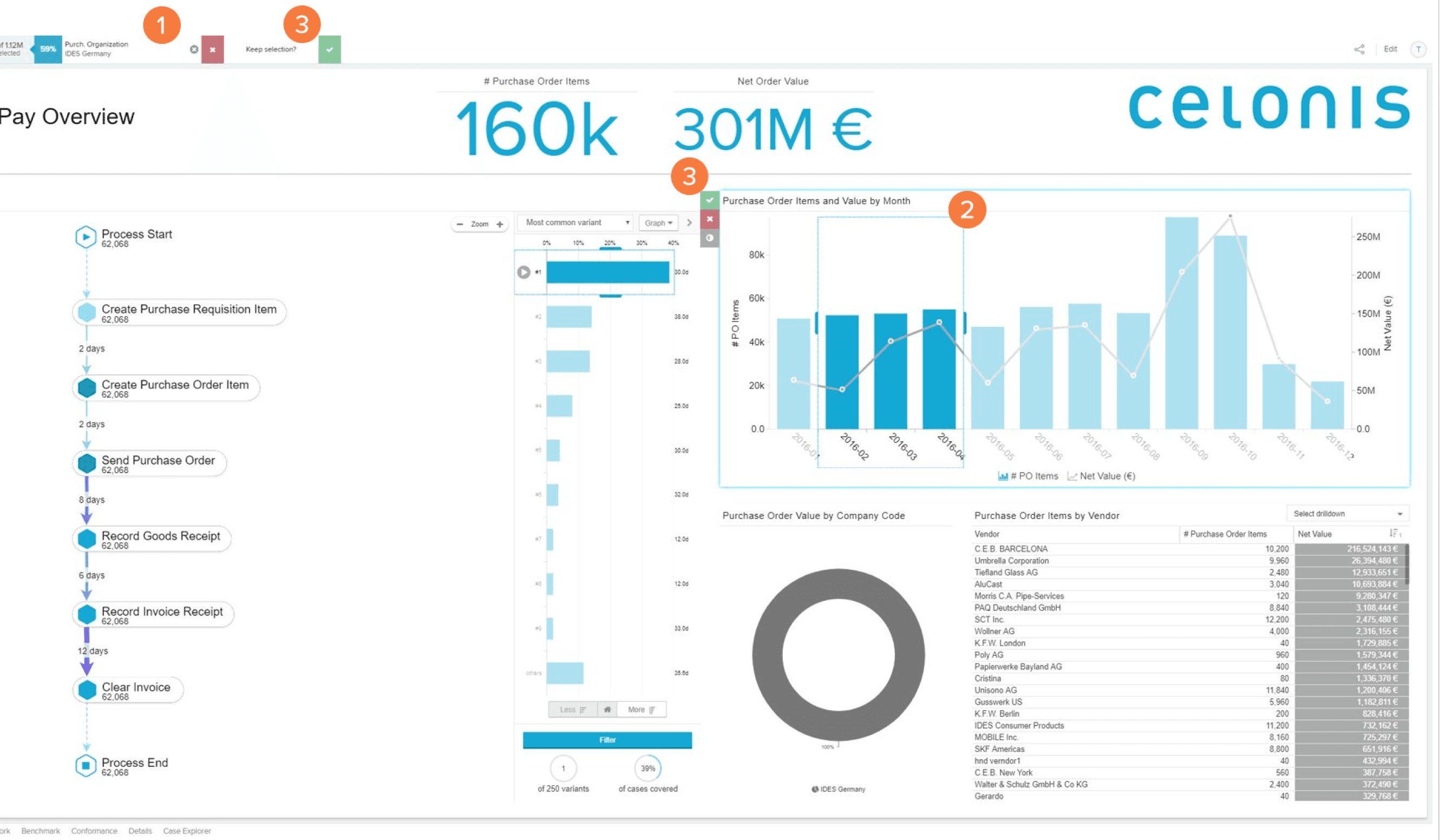
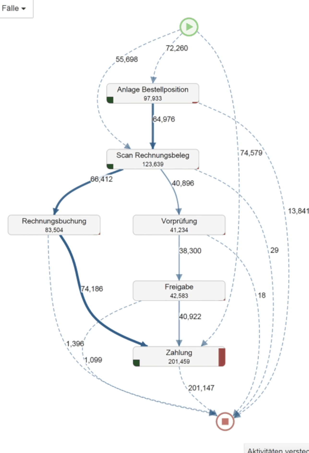
PWA web session logs were used to identify bounce rate, drop offs and avg. session time spent by users during registration process.
I divided the current data available into three categories so that i can think of how the new data visualisation can be shown
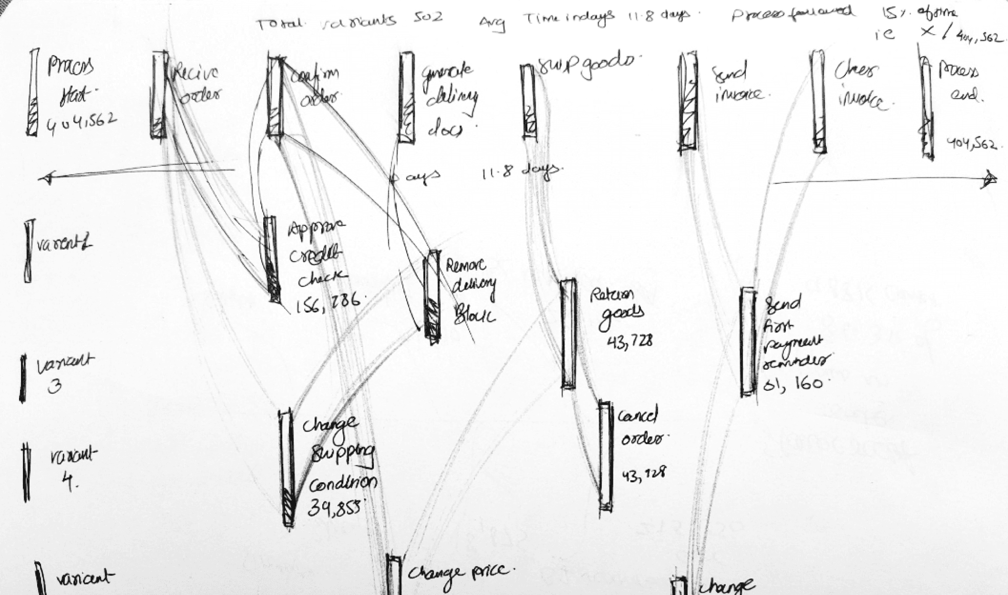
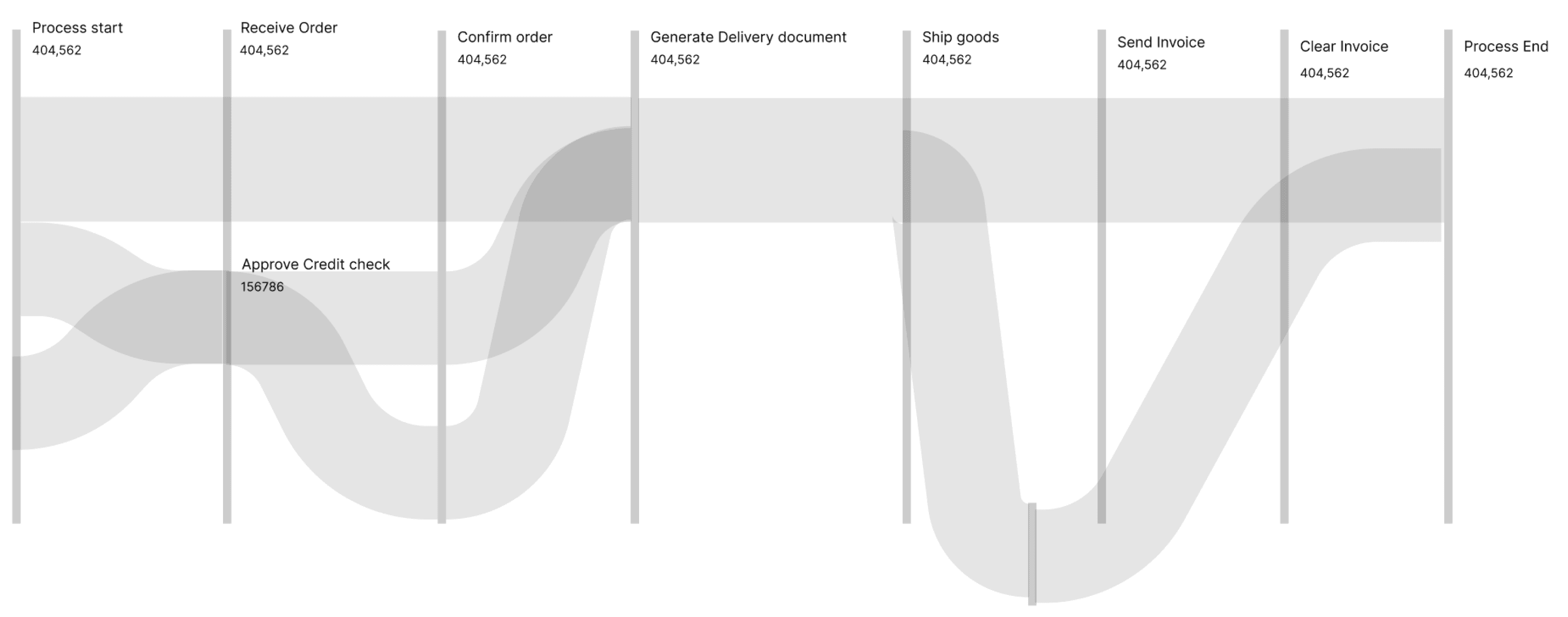
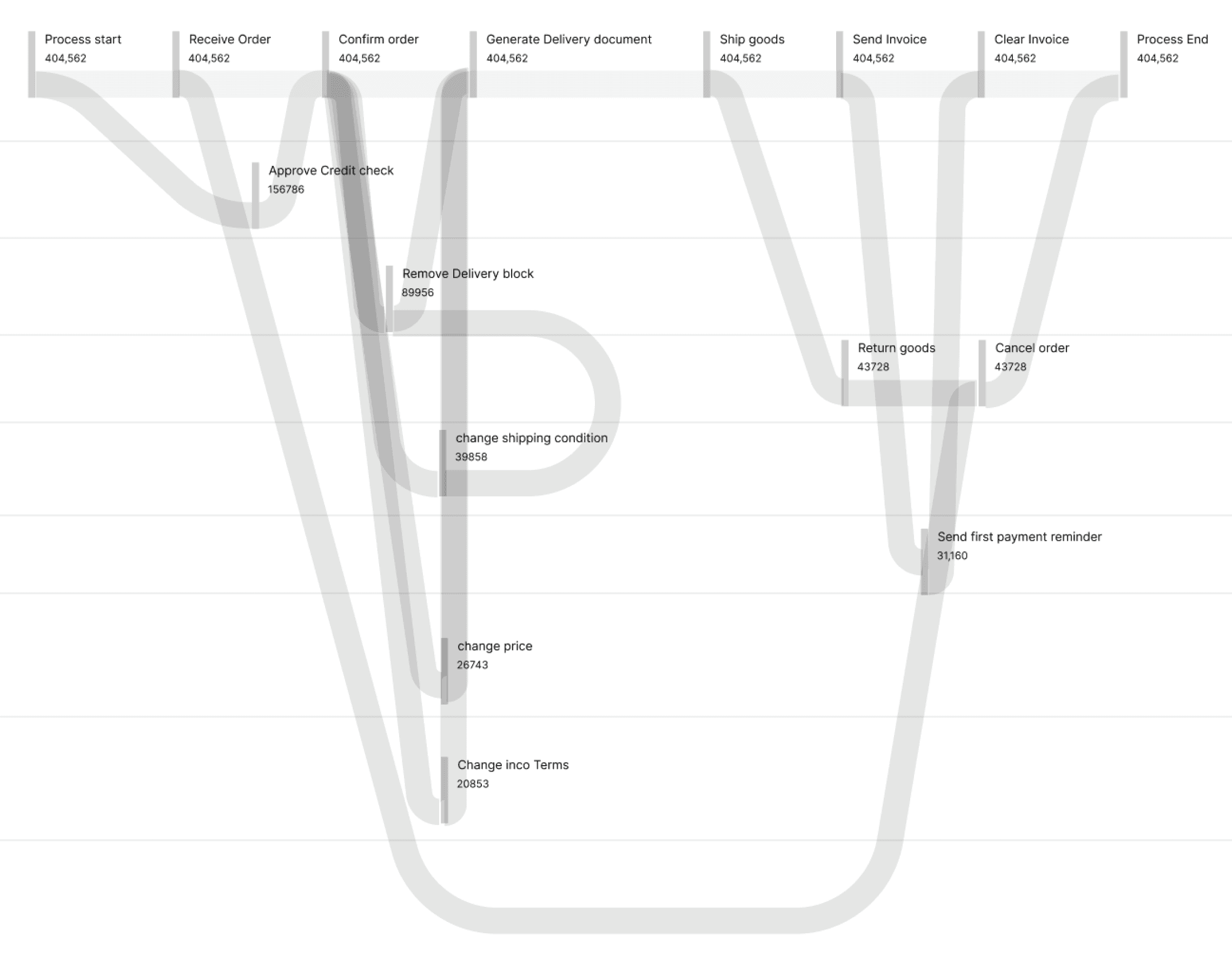
Instances - Refers to the specific process in the data pipeline (Eg: Process start-> Confirm order -> Ship product -> Confirm delivery)
Attributes - Refers to the number of times that entire process was performed/repeated over a time period ( daily/monthly/yearly)
Classifications - The data can be filtered and classified in to different ways (Eg: Time taken,Variants,Frequency, Case covered)
Instances
Process start ->
Receive order ->
Confirm order ->
Approve credit ->
Cancel order ->
Generate delivery
Price change
Remove delivery block
Change shipping
Attributes
831,312
156,786
150,667
39,858
26,743
Classification
Time taken
Variants
Frequency
Case covered
Brainstorming & Visualizing alternatives for process diagrams
Since the data could get more complex when process deviations are shown, it was necessary to explore the best possible way in which the complex data can be shown.
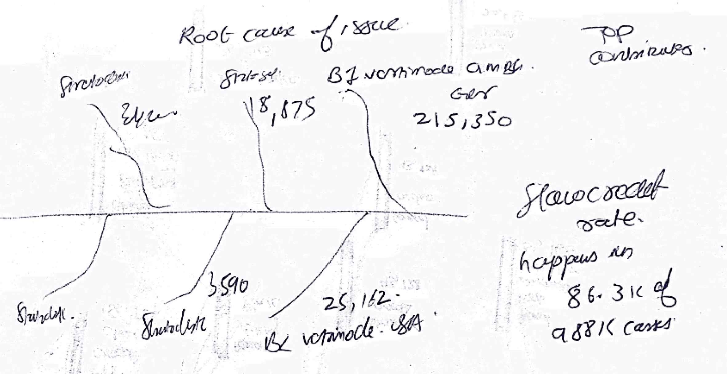
Fish bone - cause and effect Diagram
Histograms
Parallel Coordinates Plot
Sankey Diagram
Scatter plot
& more...
Low fidelity visualization of concepts
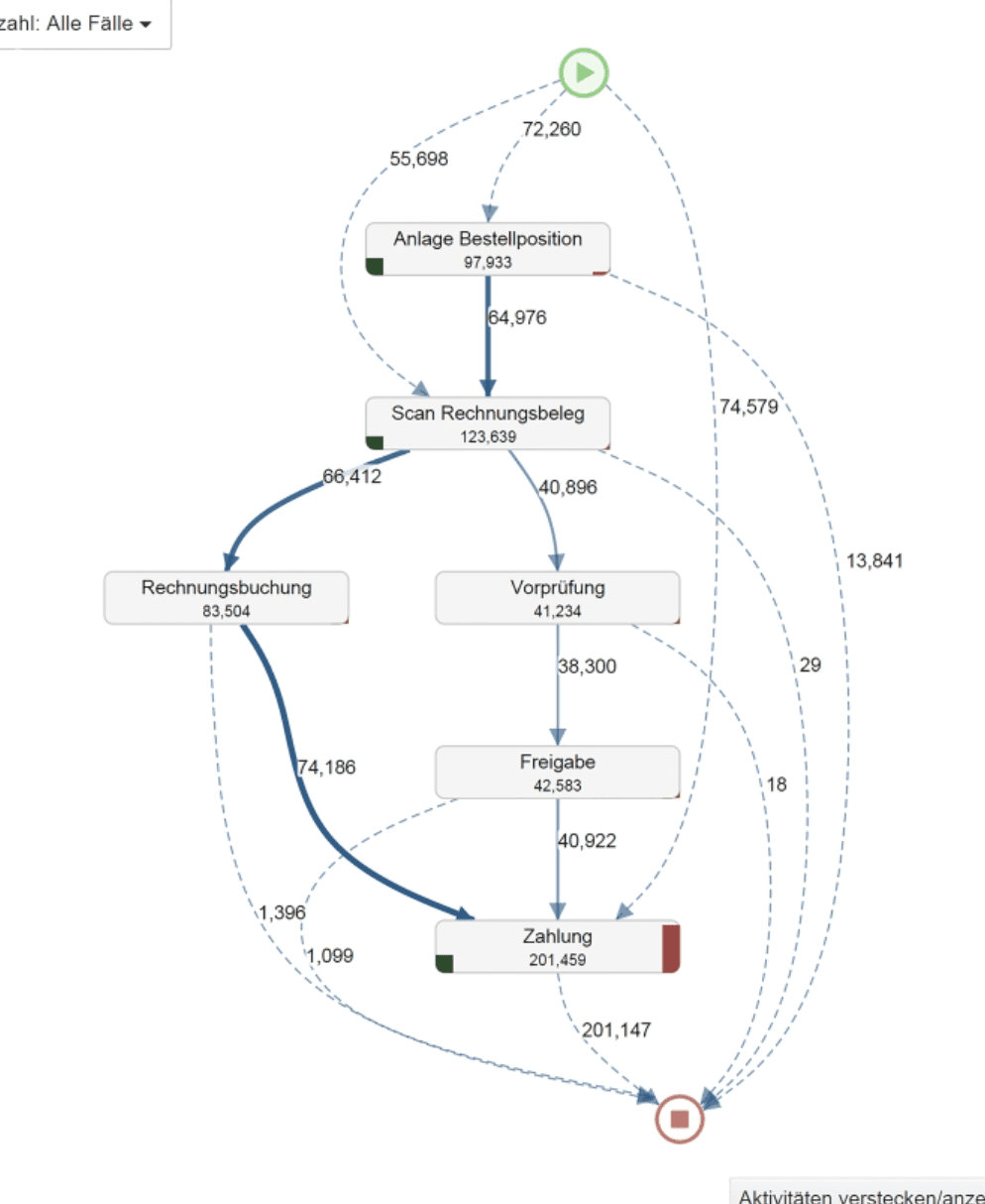
The as is normal process of a pipeline is not always followed 100 % of time, so the process graph can get really complex when all process deviations are shown, a hypothetical example is given below.
55% of orders
No Deviations
25% of orders
Moderate Deviations
20% of orders
Major Deviations
Hypothesis made form all the observations about current visualization.
Process mining graph for no Deviations - to get a overview of process with no deviations its good to see how material or process flows
Major Deviations - It may not be a best choice to see all major deviations in one go, filters to narrow down rhw process would be necessary
Alternate visualisation - To brainstorm alternate and new kind of process visualisation it was decided to ideate on basis of sankey diagram
New concepts ideations in low fidelity (keeping in mind the data points to be shown)
Instances
Attributes
Classifications
Time taken
Variants
Frequency
Case covered
Initial Explorations
Processes -->
<-- Deviations
Mid fidelity adding all instances, attributes, classifications
Processes -->
<-- Deviations
Final new data viz component
I noticed that different apps and websites created registration forms in different ways. I did some more study and examined the various approaches
Existing data viz component
New proposed data viz component
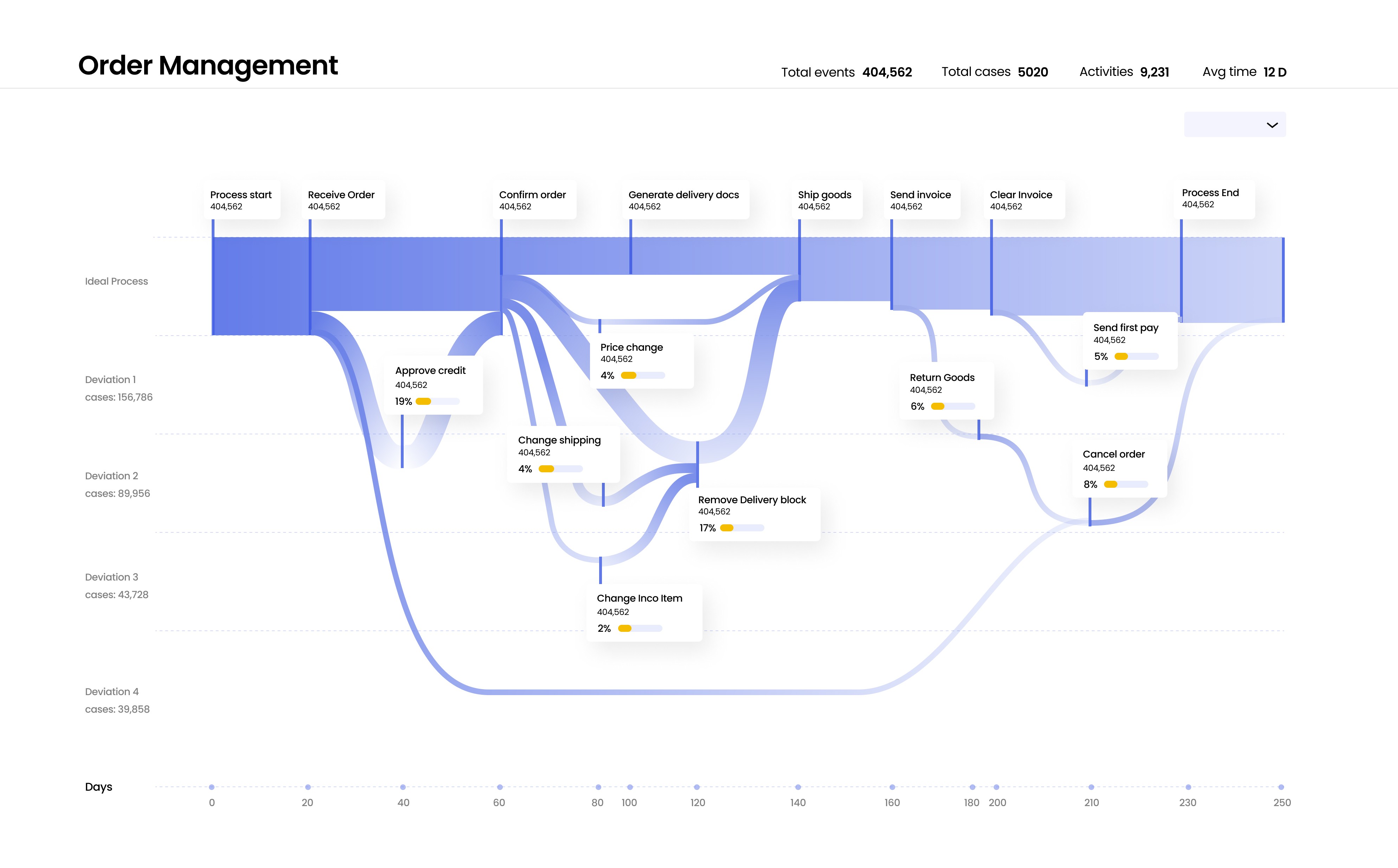
New Component concept covering all data attributes
It covers all the data points thats shown in the original process mining dashboard visualization
Easy to scan pipeline diagram approach, showing all important parameters like total events,cases, activities & avg time.
The first Horizontal axis from top shows the ideal process without deveations
The consecutive next Horizontal axis shows all other major deveations in the process.
For eg: Deviation 1 consists of Approve credit (19% of cases) | Price change ( 4% of cases) | Return goods (6% of cases)
For eg: Deviation 2 consists of Change shipping (4% of cases) | Remove Delivery block( 17% of cases) | Cancel order (8% of cases)
And the last horizontal axis consists of no of days that each of this process takes to complete.
Process name
Ideal process
Different deviations from process
Processing days
Process attributes names
% of cases the deveations happen
Process overview
Variants & filter

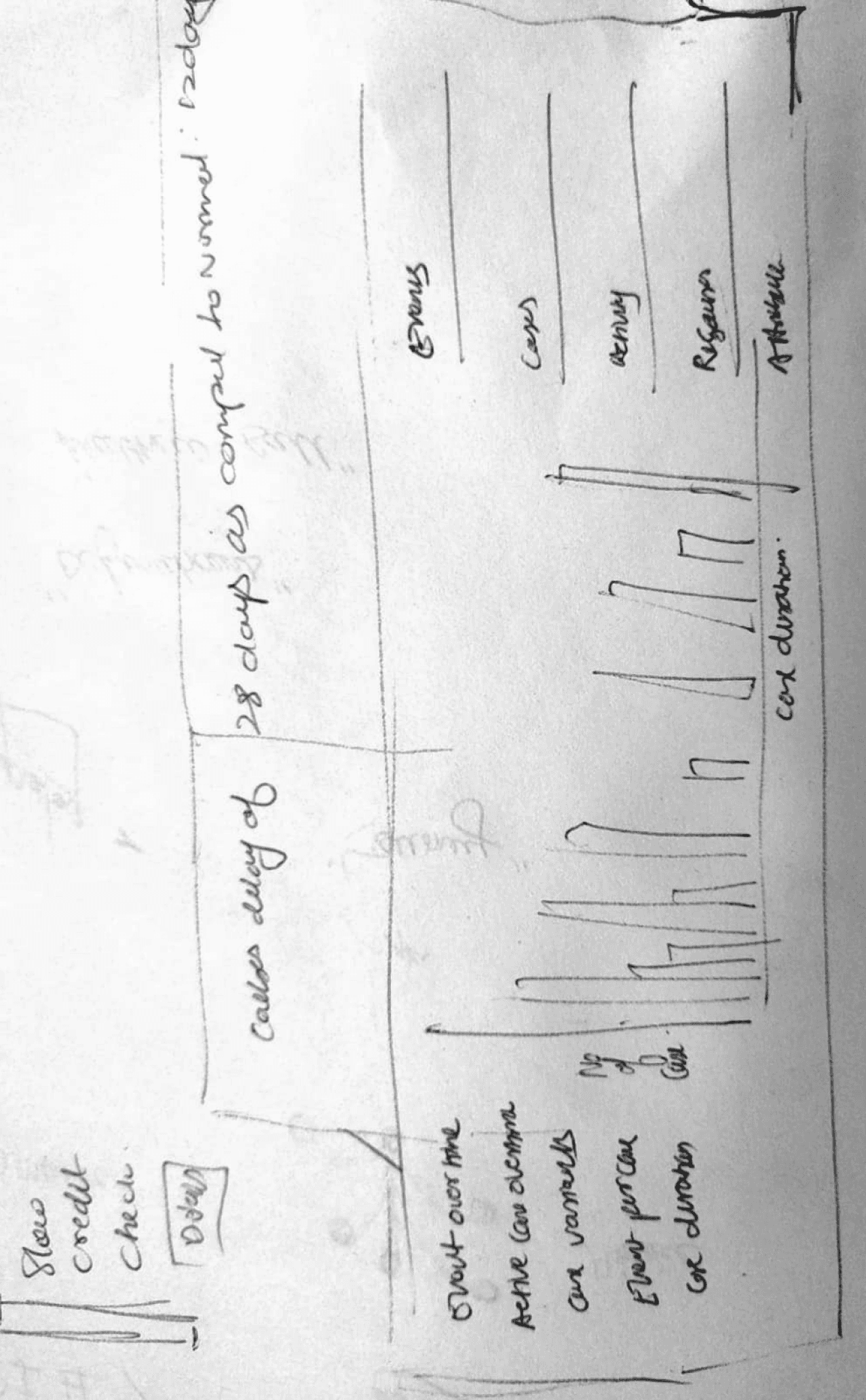
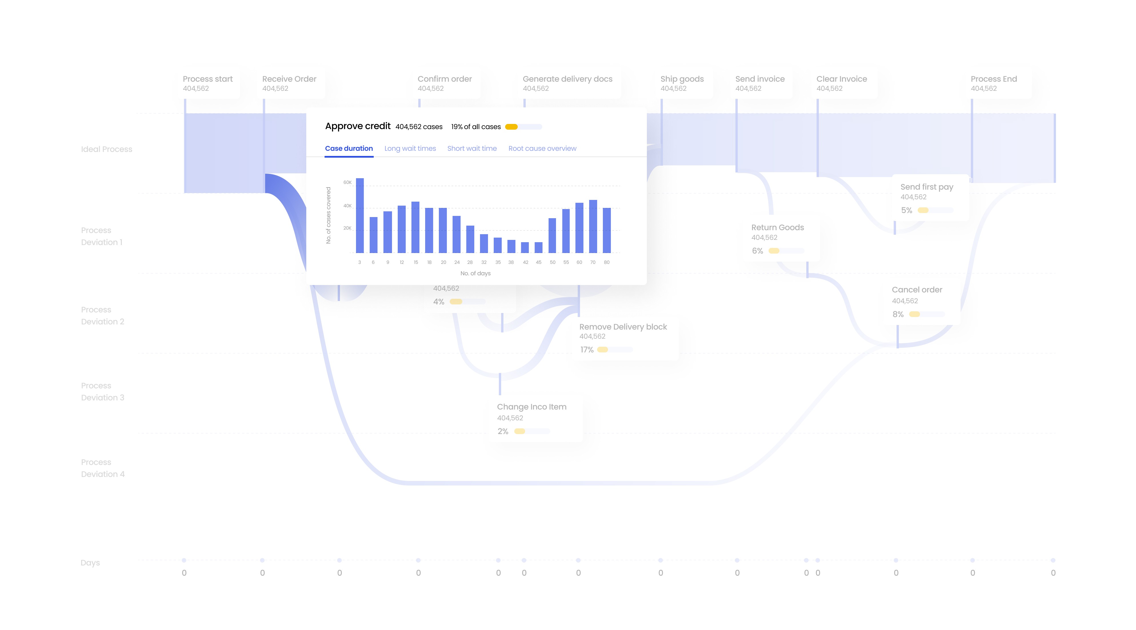
Exploring further deep insights
Clicking on specific process attributes in the pipelines or deveations give more insght about that attributes
For example clicking on Approve credit attributes gives data about number of times that this extra deviating step was repeated
Here this extra step (deviation from normal steps) was taken 404,562 times and in 19 % of overall cases.
It gives further details about duration of extra time lost to complete this extra step
It also gives details about the specific cases which had to wait longest to complete this extra step, also gives info about shortest wait times
It gives a root cause overview of what bottlenecks are causing delays in this particular process.
Data Visualization Design task
Celonis
Celonis, a leading process mining software company, boasts a remarkable impact on business efficiency. With over 2,000 global customers, including Fortune 500 companies. I was assigned a design task to improve data visualisation of their current process mining platform.
Company
Celonis
Role
UX Research
UI & UX Design
Industries
Job Portal services
Date
Jan 2022
