


Understanding objective
PMs Identified a decline in freshers' registrations within the PWA mobile registration flow.
So i was tasked with improving the registration process to enhance user experience.
I therefore aimed to increase the overall number of active users within the system.

Breaking the project brief...
What type of user profile are we aiming?
Are we aiming to increase Resdex (Resume Database) ready profiles?
Is the aim to just bring users into the system with faster form filling?
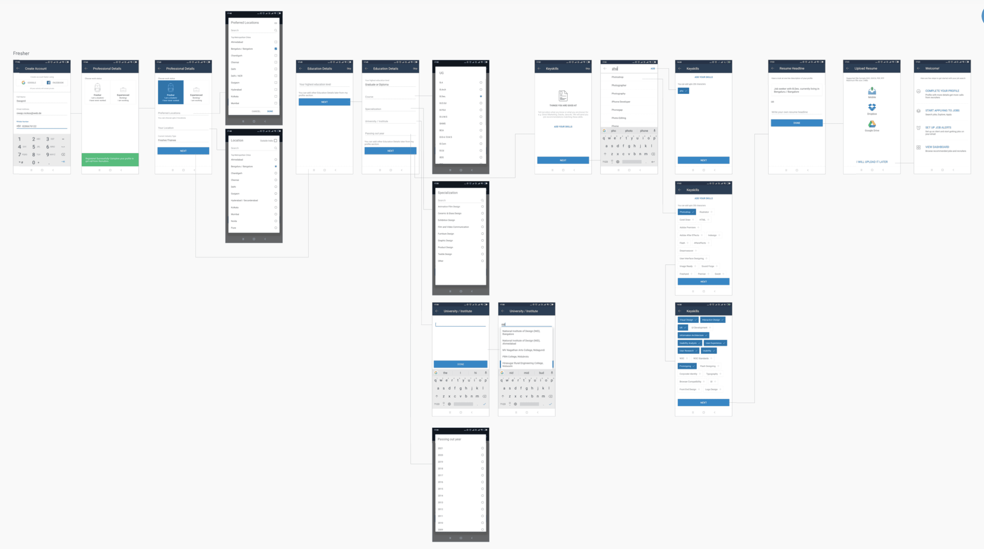
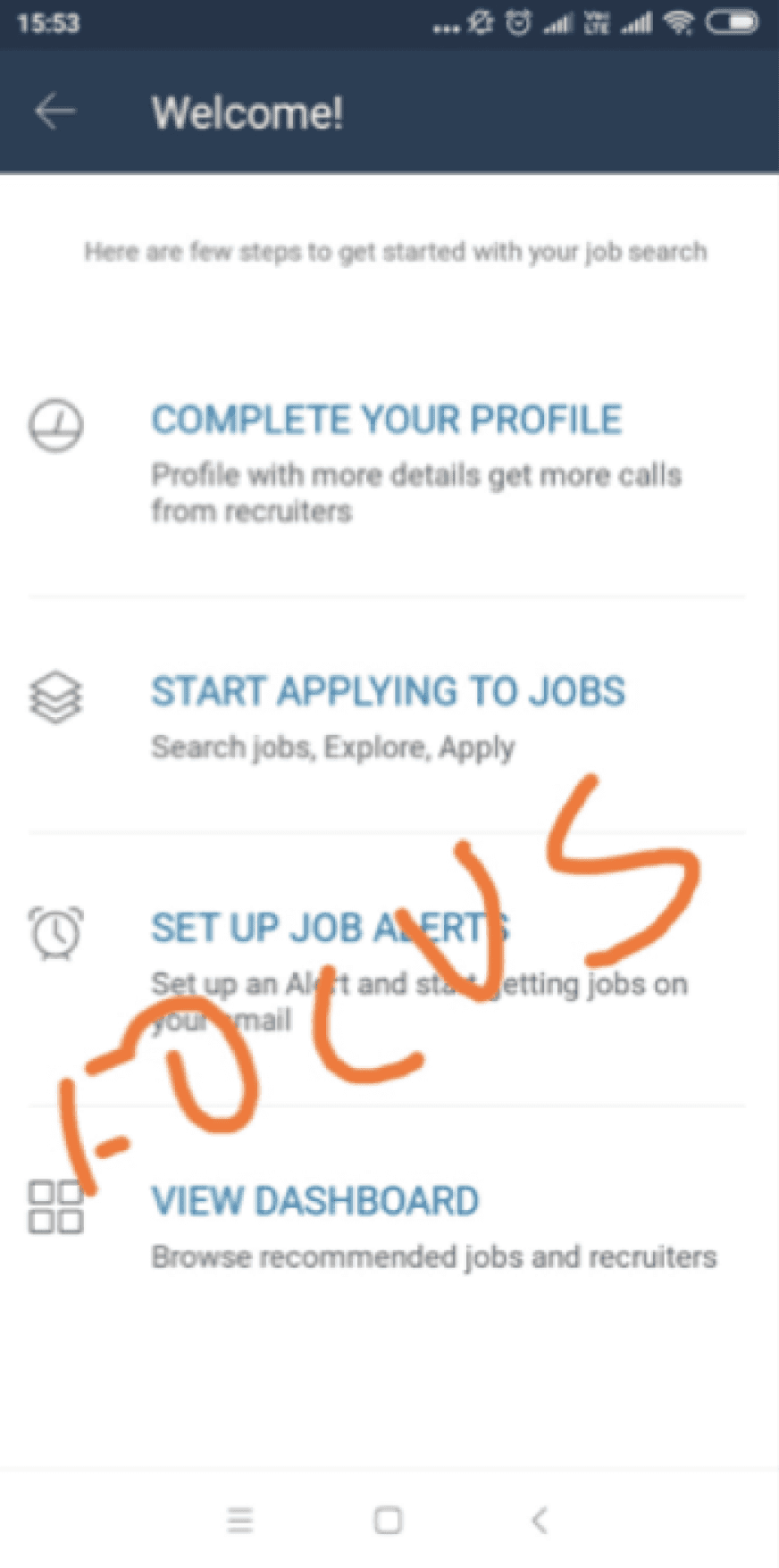
Understanding the registration flow...
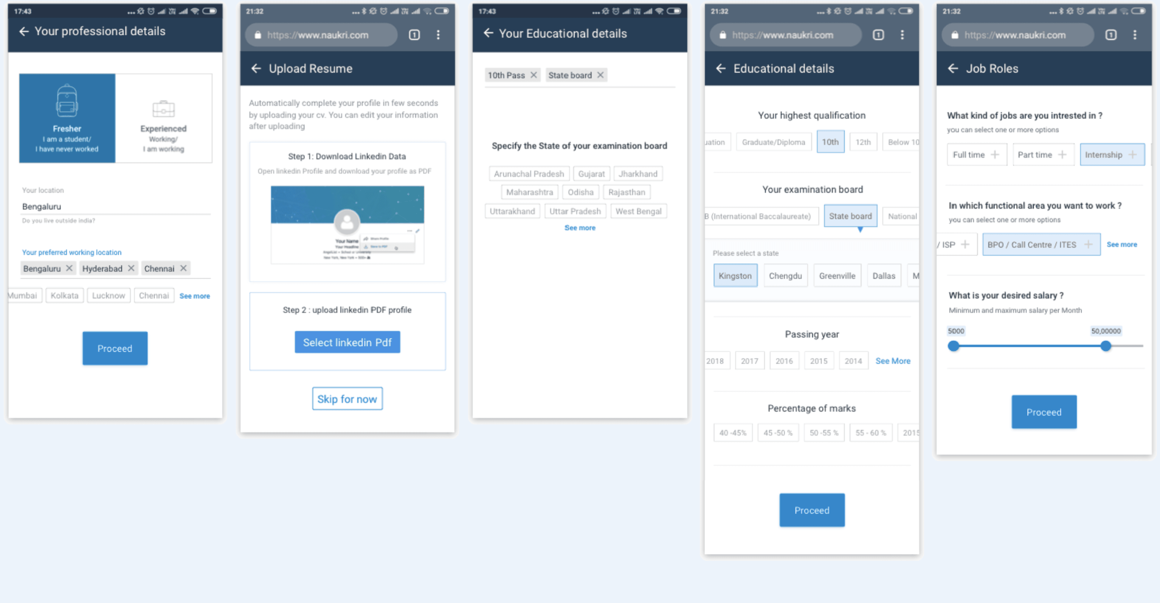
Registration
User landing
Via PWA
Via android device
Via ios Device
Via Job application
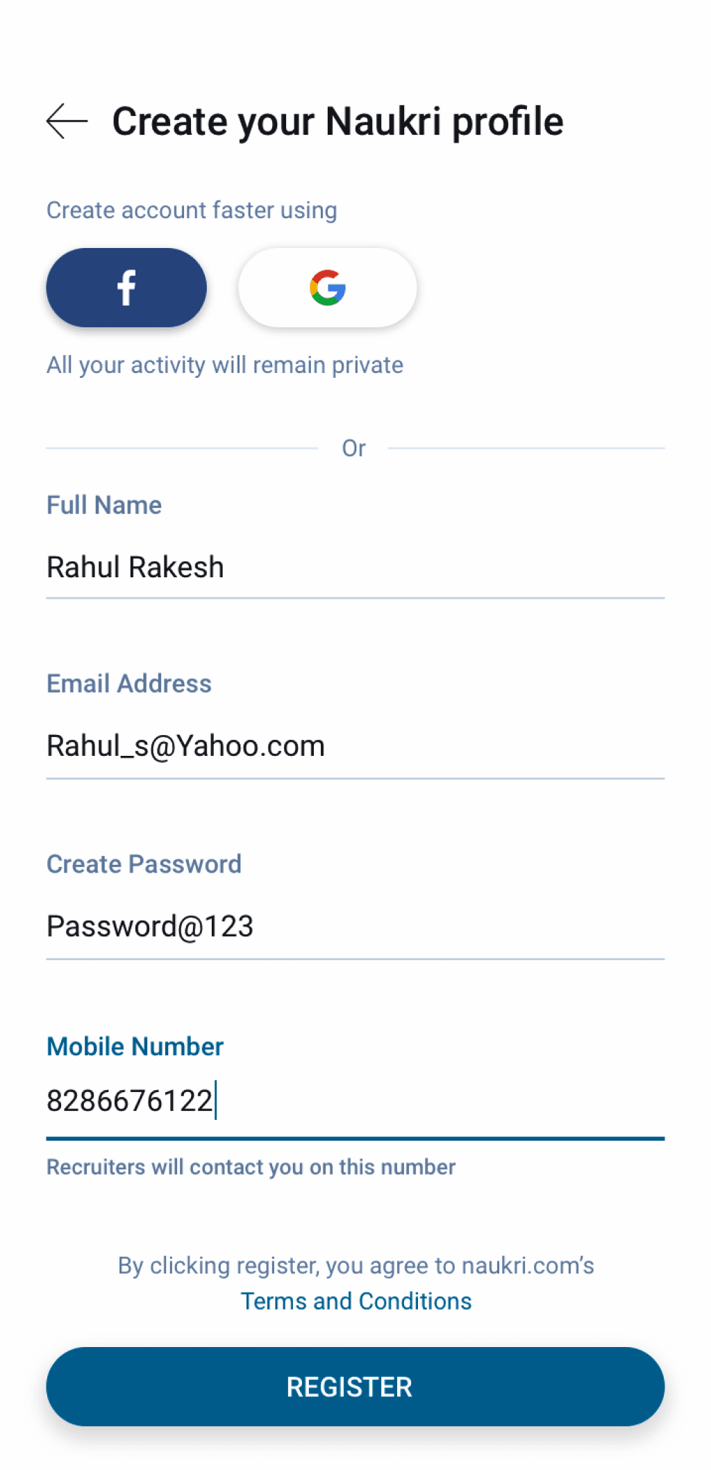
Register details...
Name
Email
Password
Mobile number
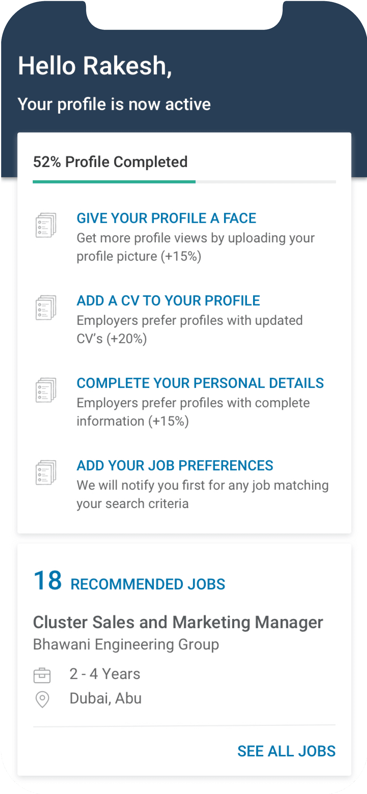
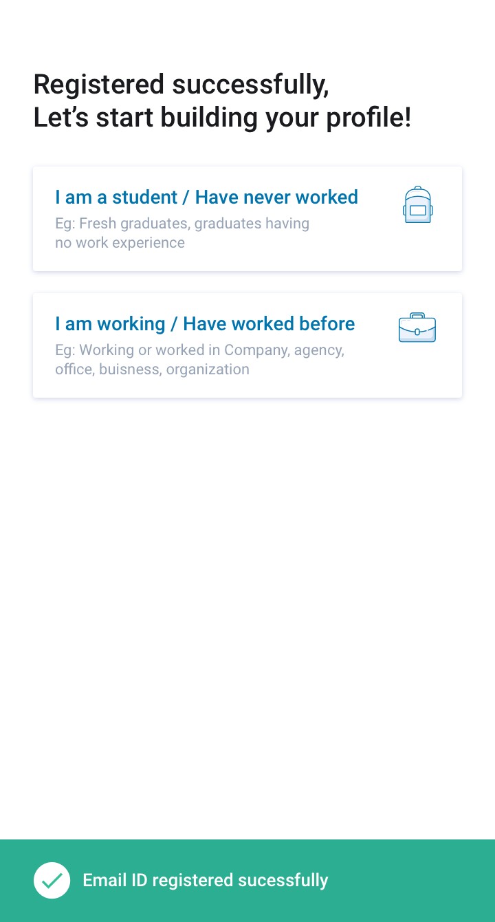
Success
Registered Successfully
Provide Profile details
Fresher Candidate flow
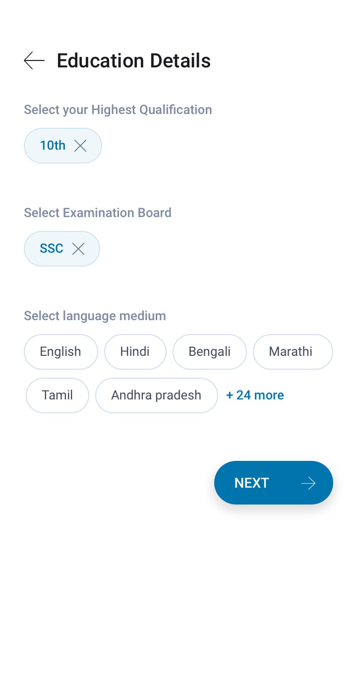
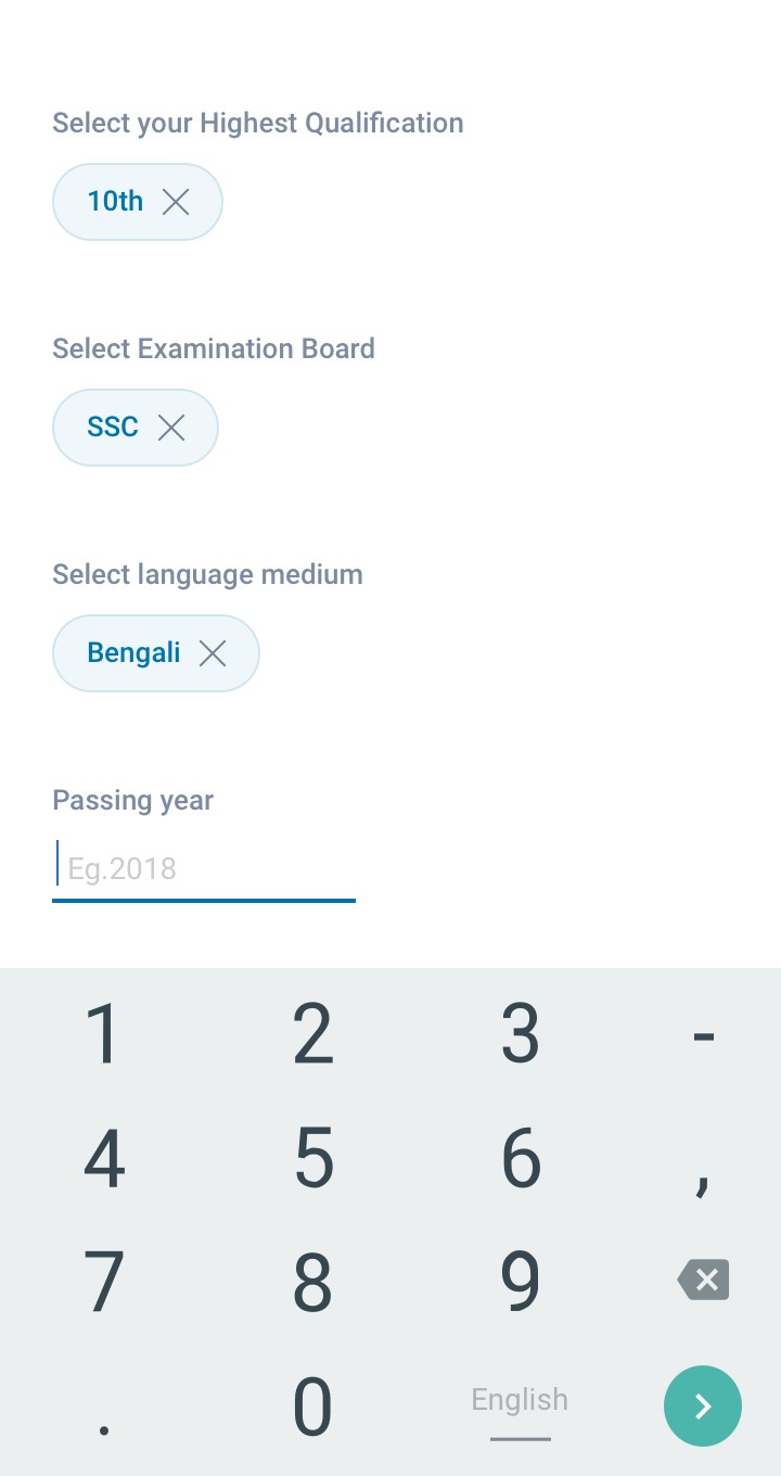
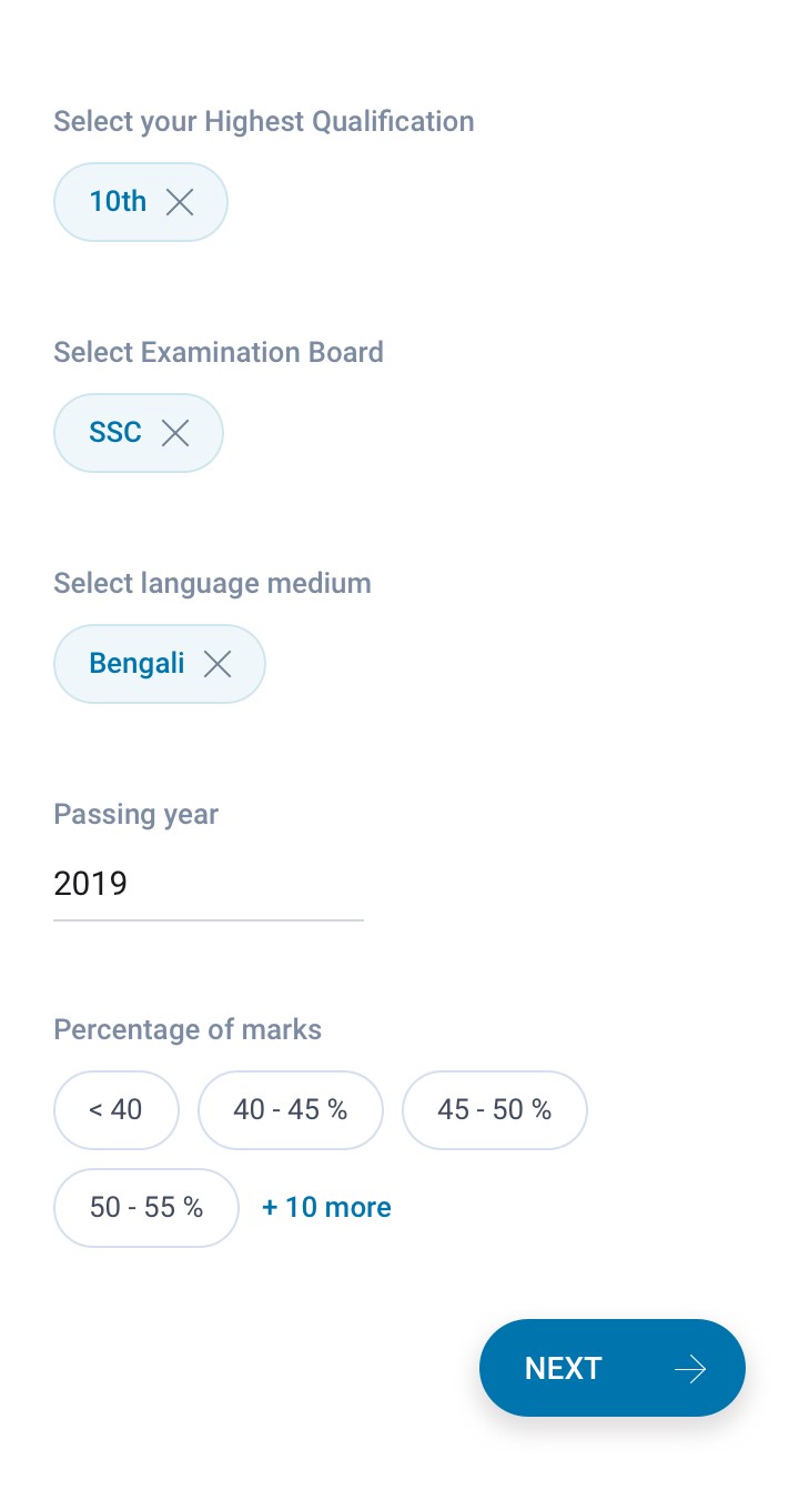
Primary Education
Highest qualification
Select Examination Board
Select language medium
Percentage of marks
Passing year
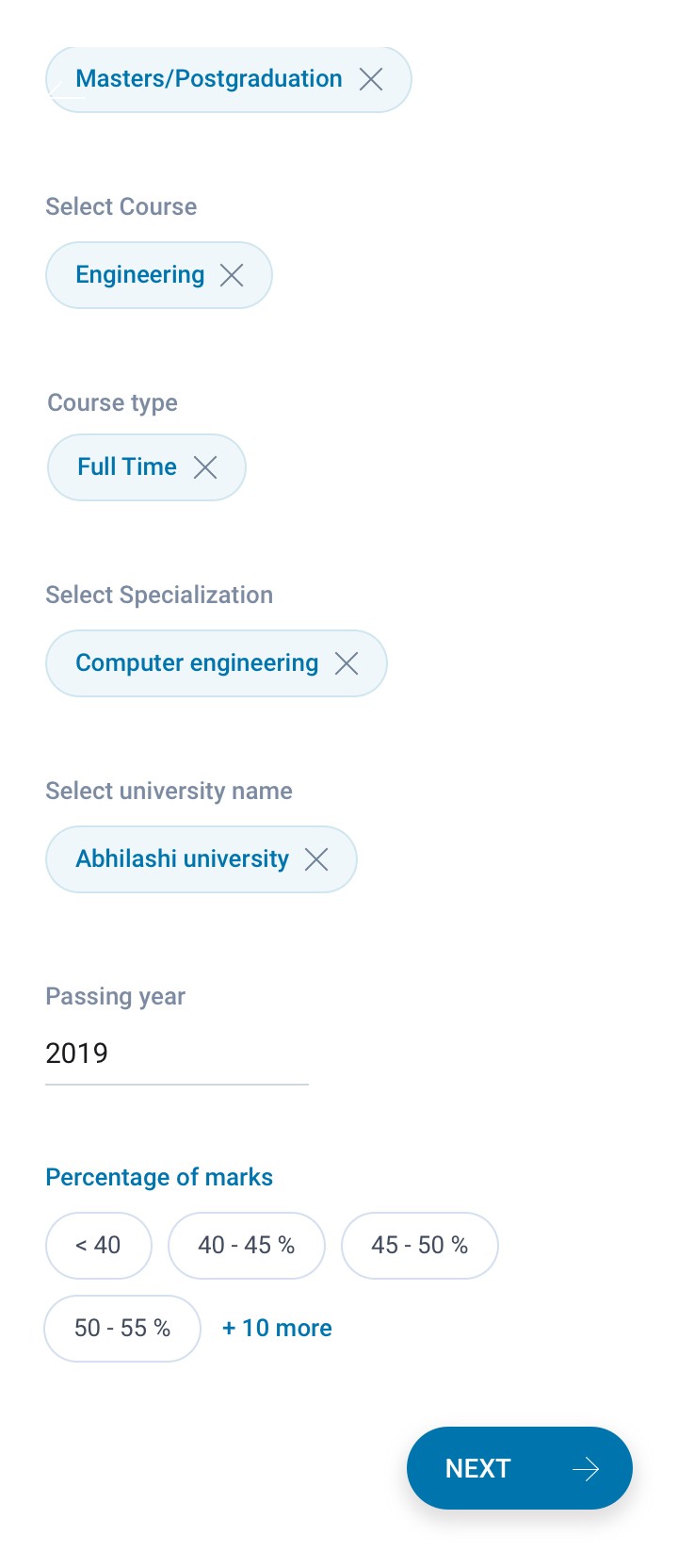
Higher Education
Select course
Course type
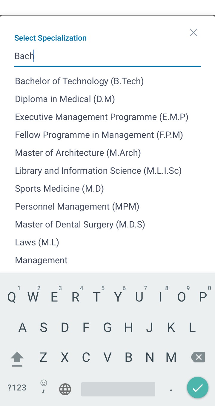
Select specialization
University name
Percentage of marks
Passing year
Other Details
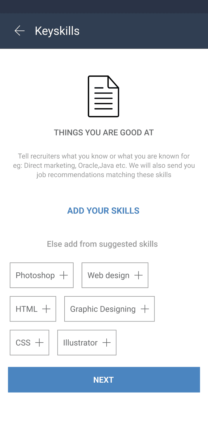
Keyskills
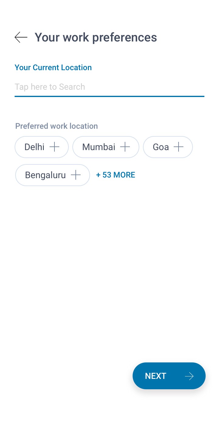
Work location preference
Upload resume
Passing year
Experienced Candidate flow
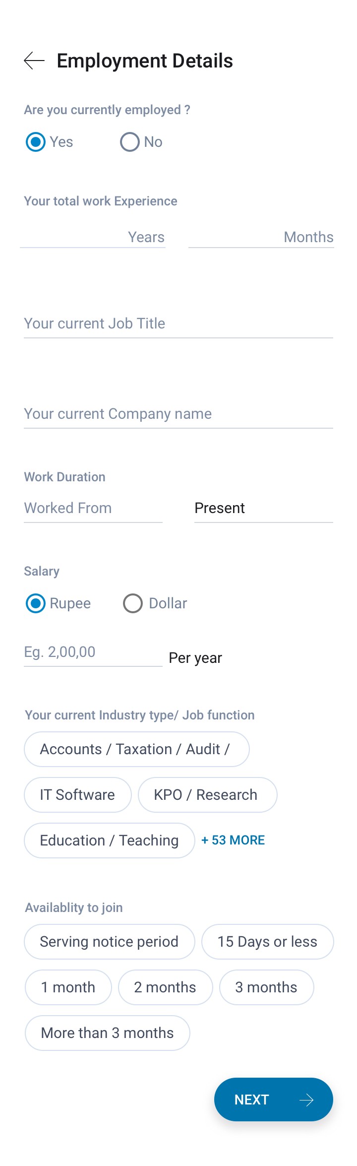
Employment details
Select total work Experience
Select current Job Title
Select current Company name
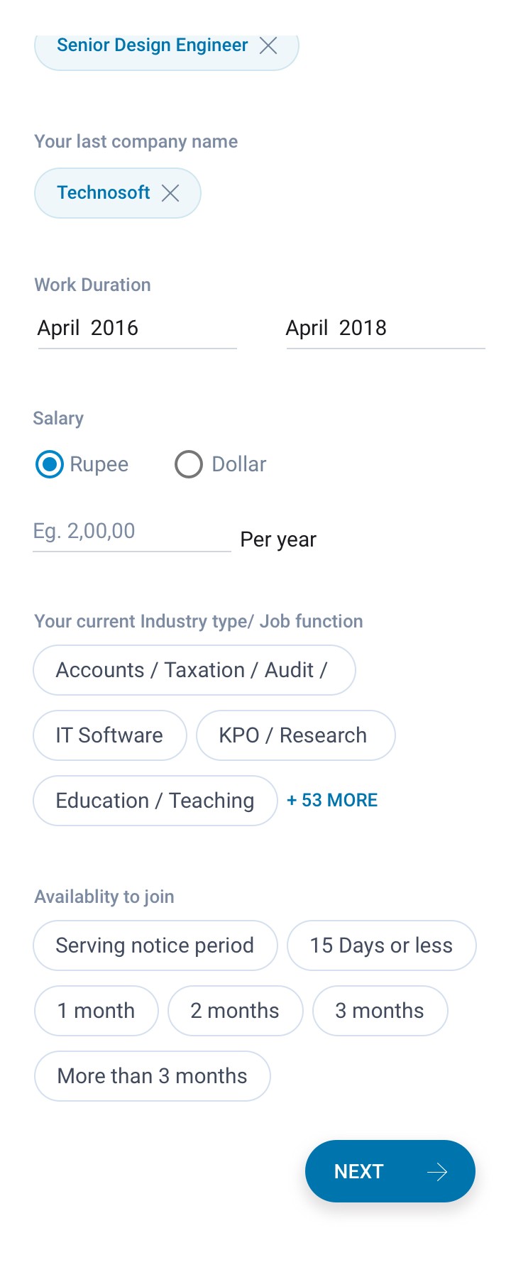
Select Work Duration
Select Salary
Select current Industry type/ Job function
Select Notice period
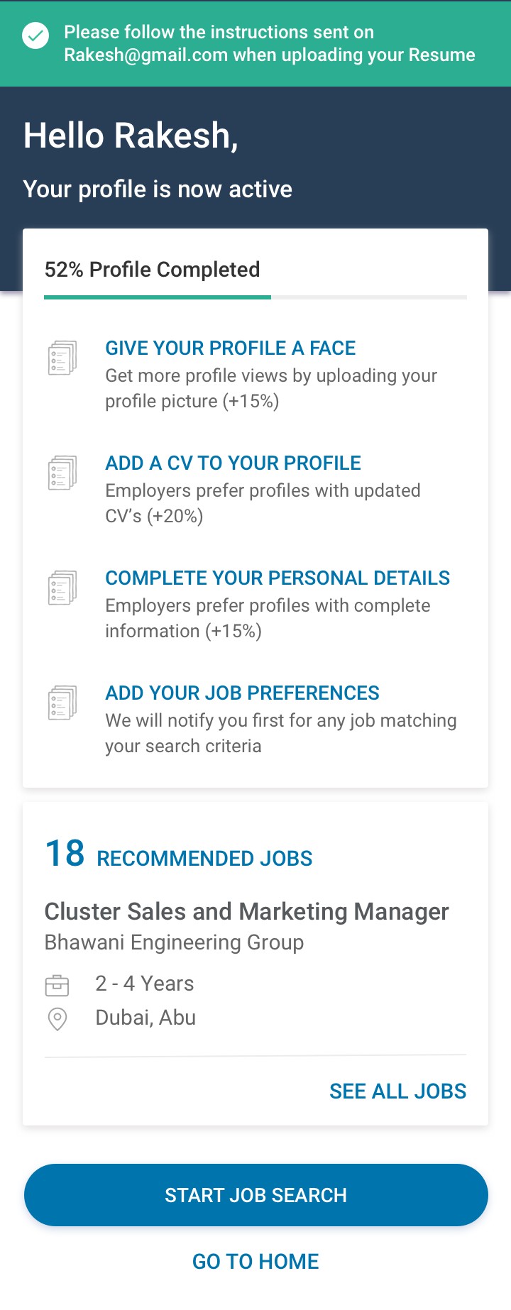
Profile complete
Show job Recommendations

Users page wise drop and field wise drop data
0
10k
20K
30K
40K
40.6%
12.9%
23.2%
23.3%
Add Experience
Employer details
Education Details
Key skills
Based on the data only 21.6% of users are able to complete the registration flow.
Users are dropping off mostly while adding employment and experience details, followed by adding key skill & education details.
0
2000
4000
6000
8000
Current Industry Field
Passing year
school percentage
preferred Location
started From
current Location
Currrent Employer
Highest Education
Add Experience
worked Till
experience Years
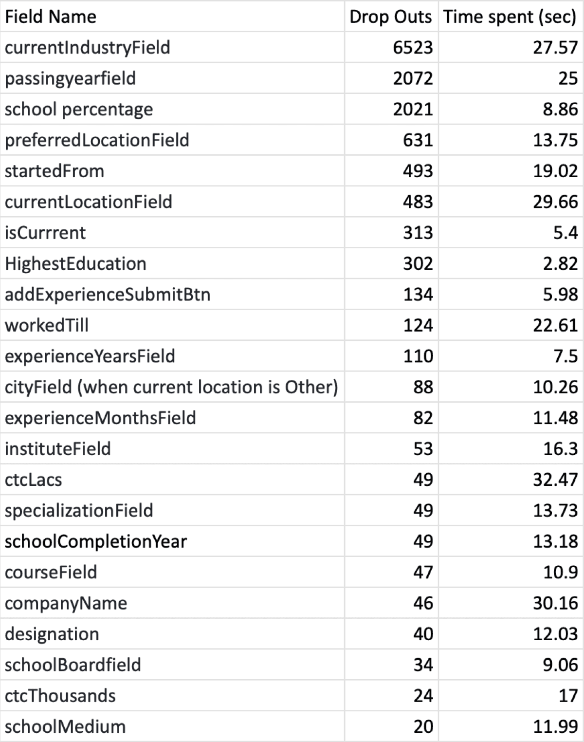
In Text field / Selection filed the major dropout is in Industry Text input, followed by passing year, school percentage, preferred location and so on...
The user were spending most time on input fields like, CTC, company name, location, industry, passing year, work year & so on...
0
10
20
30
ctc Lacs
company Name
current Location
current Industry
passing year
worked Till
started From
ctc Thousands
institute Field
preferred Location
specialization Field
school Completion Year
designation
school Medium
experience Months
course Field
city Field
Understanding Business needs & User needs...
how profile completeness helps in providing services to user and why should user fill their job seeking profile.
Why registration is important for users?
User don't have to upload CV or provide other details every time they apply for jobs.
Better tracking of applied jobs and seeing profile performance.
Registered profiles can be easily contacted by recruiters.
To provide users with better job recommendations.
Push for alerts and notifications.
Why registration is important for Naukri.com ?
Active users are important for Naukri to offer them job seeking services.
A resdex (Resume Databse) ready profile serves more value as it can generate revenue.
Encouraging users to complete profiles is crucial for Resdex (Resume Database), utilized by recruiters through Naukri.com's Recruitment Management System (RMS).
Primary research using Inspectlet web analytics (session recs, Heatmaps, error logs)
PWA web session logs were used to identify bounce rate, drop offs and avg. session time spent by users during registration process.
Problem identified via recording sessions (in different sections, pages and interactions)
Progress bar/
gamification
Gamification/progress not present
Suggesters
Case where no suggestions are there; try 'this'
Education
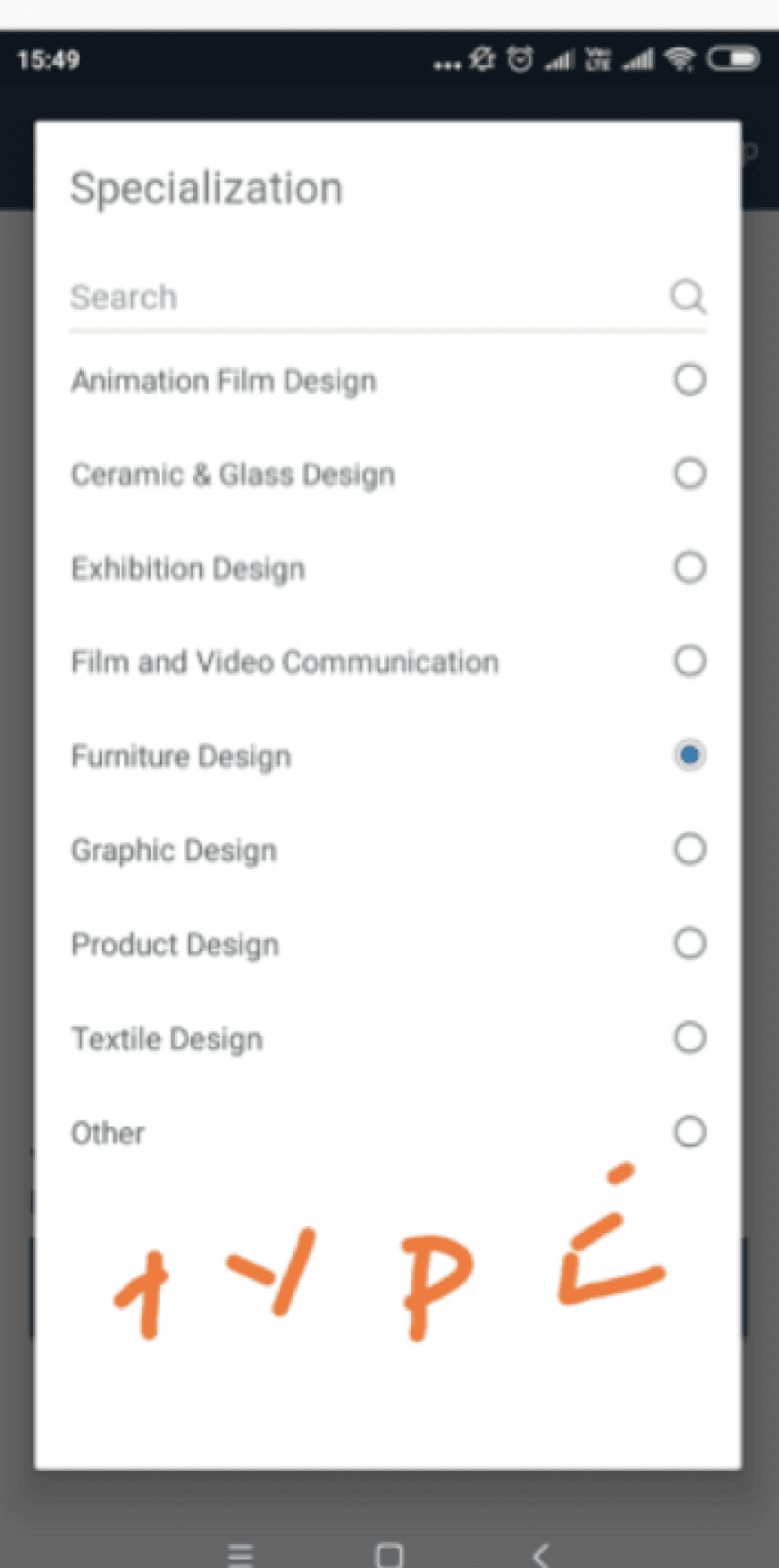
Certain specialisation not listed and users had to use ‘Type in’ boxes.
Education fields filled faster than others fields.
PG & UG qualifications are mandatory.
Error states
Error states are not handled well
Error if out of the view; not coming in the auto focus
Salary
Users are entering monthly salary instead of annual salary
Location
Same city can be entered twice in the preferred locations field
Lightbox
and dropdown
Users are not using field searches and scrolling a lot in drop downs (increasing time spent)
Every field has a light box pop up
Keypads don’t open and change to alphanumerical automatically .
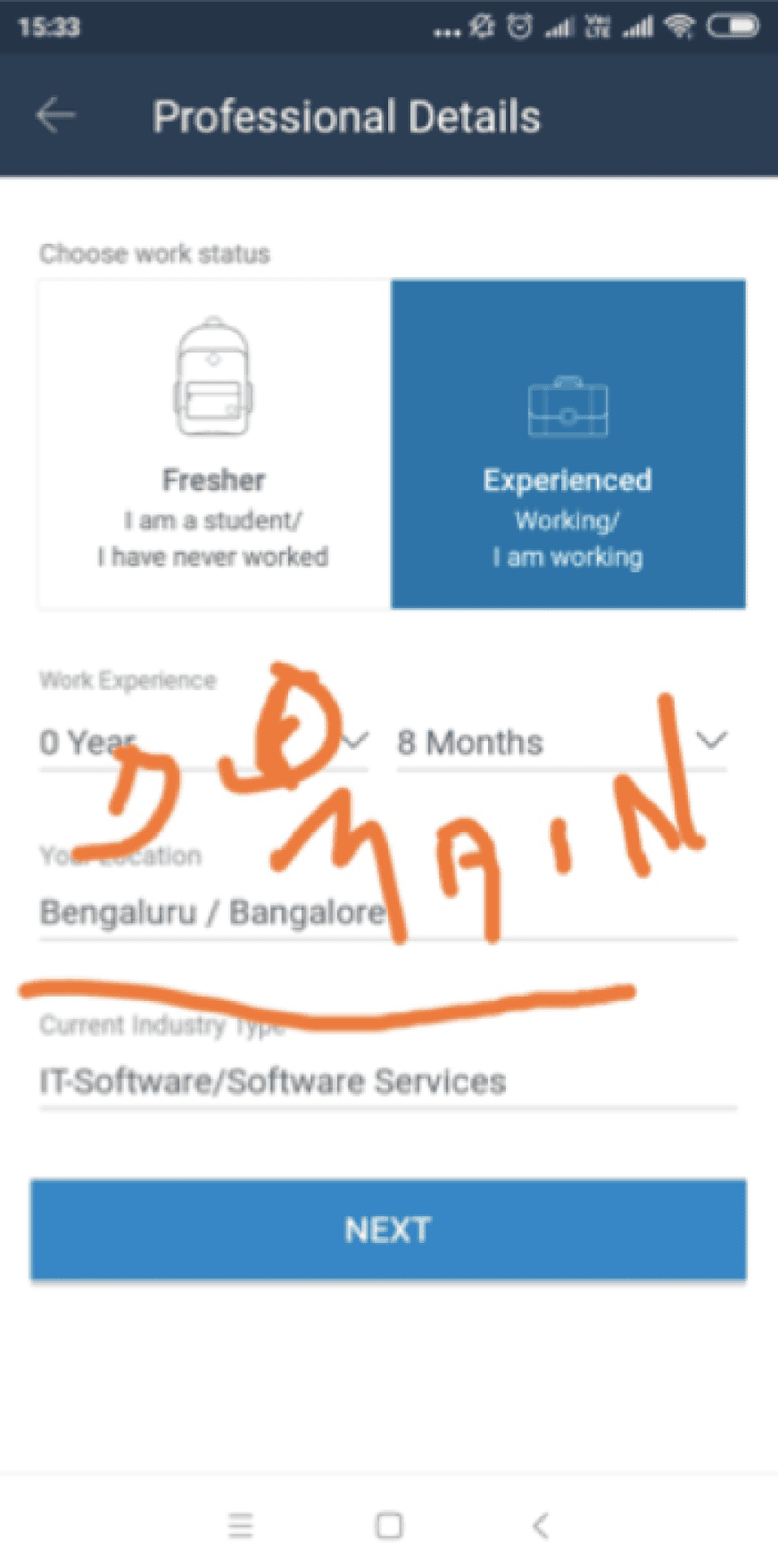
Industry
Industry field is confused with current company.
In work experience, Domain should be asked before industry and related data should be parsed.
Location
Up to 3 locations selectable; delayed message notification.
Duplicate location entry possible (search and suggester).
Cumbersome location editing; excessive scrolling for deselection.
Keyskill
Type Your Skill" text lacks suggestions.
Key skill screen needs suggesters for freshers.
De-selection of key skills tag is unclear.
Specify the number of skills added.
Users typically enter only 1-2 key skills.
No limit to the number of skills that can be added.
Problems identified via Inspectlet user log sessions
50 inspectlet log sessions were analysed to understand the user behaviour pattern and dropoffs

Key-skills Even after entering data, the user finds a prompt to add skills again instead of a "modify" button.
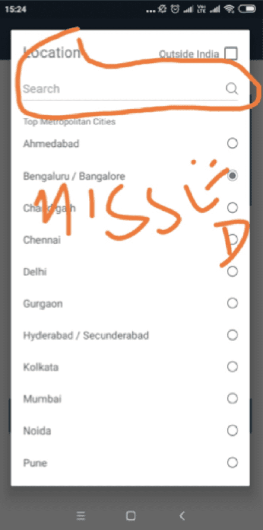
Light box In the location field, users struggled to find the search box, leading to unnecessary scrolling.
Industry users were not able to understand the meaning of industry / domain.
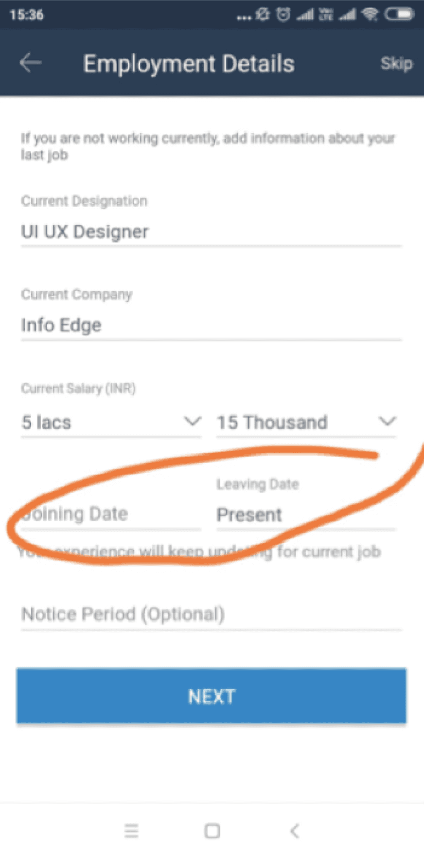
Resignation date Asking unnecessary question not useful for database.
Are you working currently - this field can be transformed into radio Buttons.

Adding key skills page looks inactive, user bounced off this page as they don’t know how to proceed.
Lightbox popups - Lightbox popups disrupted long lists and search, causing irritation. and The search field seemed inactive.
Onboarding - Instead of showing relevant jobs based on inputs given by user, they were asked for further profile completeness.
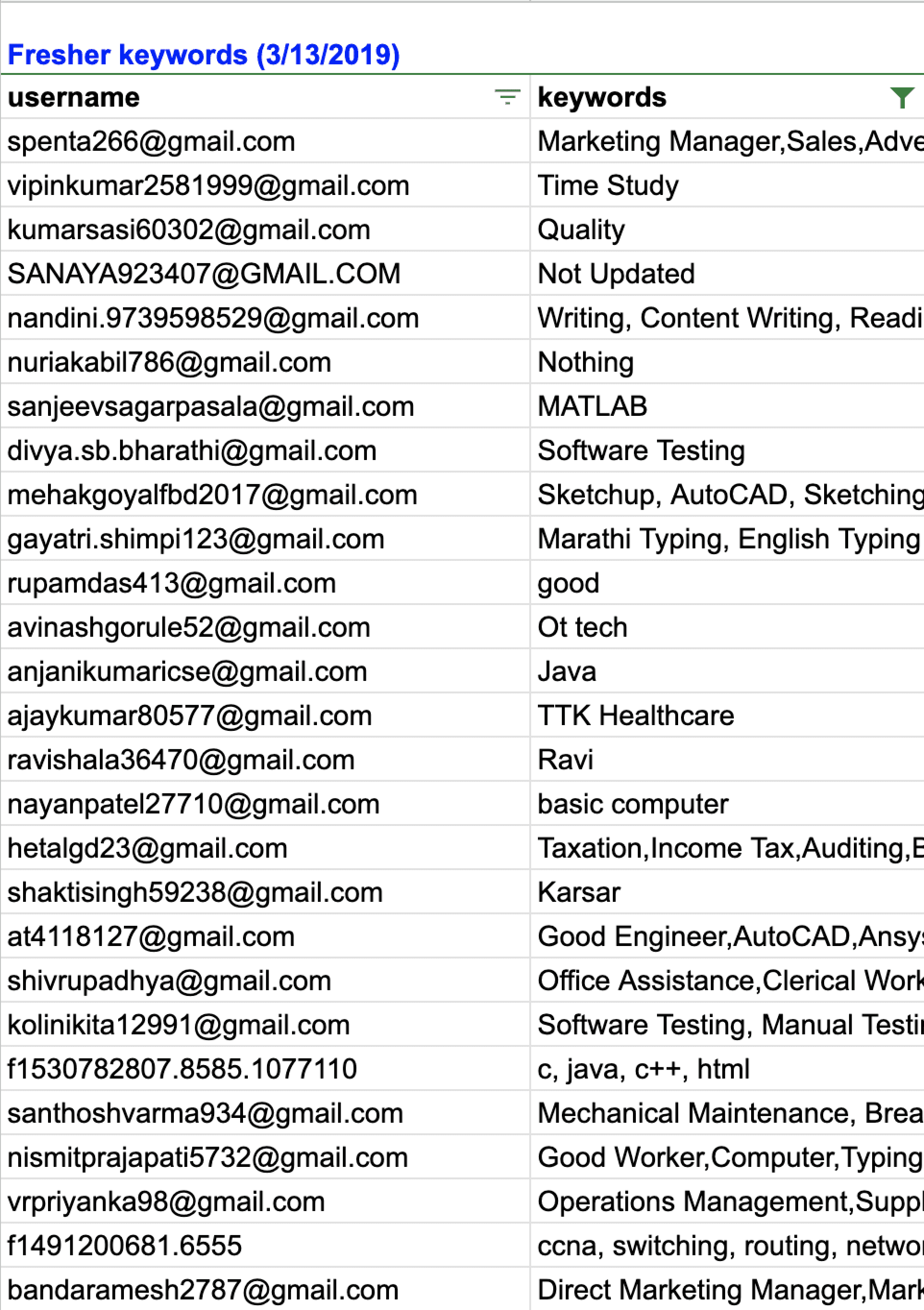
User data analysis while filling key- skills
Key- skills are important tags in registration flow, which are used to recommended job to users and also help recruiters finding candidates
User data entering keyskills
Key- skills are important tags in registration flow, used to recommended job to users.
In the excel sheet there is a overview of key-skills that users have input
But some of the data are void and irrelevant.
For eg: Study,name,OT tech, Ravi, Hard worker, Good worker etc
So we also had to stop user putting void data which is not useful for recruiters.
User Pain points as per primary analysis
Heuristic errors were found such as not able to identify if the field is active while typing.
There is no clear distinction between mandatory and non-mandatory sections.
There is no guidance through the copy at any point.
Keyskills page looked inactive in case of freshers.
Users were unabe to locate or identify that they can type, when dropdown opens of certain categories.
Current working industry were asked to to fresher which was not making sense.
There are 15 pages in total, and there is a high likelihood of drop off.
There is a lack of optimised field interactions via suggester handling, field grouping, and progressive disclosure.
List search approach used instead of using tag approach which hampered the user decision making time.
Desk research to understand the various registration flows
We analyed various job portals registration flows and also looked at parallel interventions
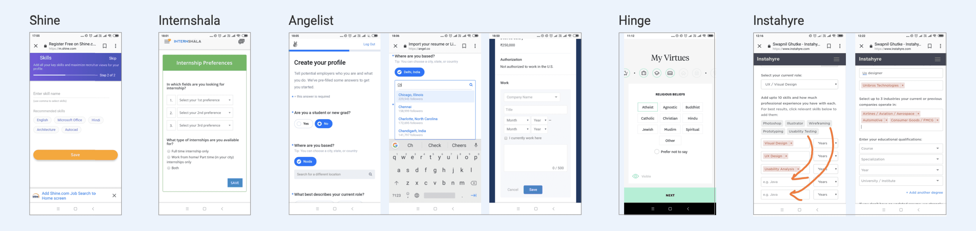
Conducted extensive registration process analysis for diverse apps and websites to gain insights into market trends and identify potential innovations.
Parallel interventions - Explored various dating apps to understand their lengthy profile registration processes, noting the variations in approach and design strategies employed by each platform.
Understanding pros and cons for various Redesign approaches
I noticed that different apps and websites created registration forms in different ways. I did some more study and examined the various approaches
One page with all fields approach
One field on a page — Multi Step Form
Multiple fields on a page — Multi Step Form
Chatbot approach
One page, all fields: Too many questions, making it too long for user completion.
One field per page - Multi-Step Form: Reduces cognitive load but leads to extended length with numerous questions.
Multiple fields per page - Multi-Step Form: Best option, organizes material efficiently on a single page, maintaining page limit.
Chatbot approach: Ideal but time-intensive; integrates conversation-style registration. Requires a separate project due to time constraints.
So the multiple fields on the page approach was clearly the most feasible at this point, and that’s what we settled on!
The Advantages:
It eliminates concerns about navigational errors or pages not loading properly.
Users can track their progress in the sign-up process.
Length Disadvantages
Including numerous fields on a single page can be overwhelming for some users, potentially leading to incomplete transactions.
Single-Page Forms Effectiveness:
Research by Neil Patel indicates that having only three form fields leads to a 25% conversion rate.
With 3-5 fields, the conversion rate drops to 20%, and further decreases to 15% with more than six fields.
Shorter forms are generally more effective for higher conversion rates.
A case study on Macescape demonstrated a 120% increase in conversion by reducing form fields from 11 to 4.
One page - All fields
One field - Multi step
Multi field - Multi step
Chatbot
The Advantages:
Better Focus: One input field at a time leads to better focus and is less intimidating to complete.
Seems like less effort: Only one question at a time can make the process look faster.
The Disadvantages
Recommend incorporating a progress bar on each page of multi-page forms for user awareness.
While aiding navigation, a progress bar can also be intimidating to users.
Even with a limited number of questions per page, the perception of multiple pages may appear daunting.
The Advantages:
Logical Groupings: Multi-page forms allow you to gather information in a logical progression of small steps. Breaking it up will be less intimidating to complete.
Ability to collect more information: By moving a customer through the multi-page process, they become more invested in the process with each step.
Help you avoid the Goldilocks Syndrome.
Kick in the endowed progress effect.
The Disadvantages
Delays in page load times contribute to increased bounce rates.
Multiple pages increase the risk of slow loading, potentially leading to customer loss during sign-up.
Even with 1-2 questions per page, the perception of going through 4 or more pages can be daunting for customers.
Studies confirm that multi-step forms have a 14% higher completion rate compared to single-step forms.
MeetFrank app operates as a chatbot, facilitating direct interaction with users.
On the talent side, users undergo a quick onboarding chat with Frank, the emoji-loving chatbot.
During onboarding, users specify skills and experience from pre-set lists, reducing the need for manual typing.
Users also share their current job title and salary through the chatbot interface.
Potential expectation mismatch due to the chatbot's presence across the platform and its engagement in a two-way conversation.
Addressing and managing user expectations in terms of interaction style and platform-wide chatbot functionalities may be necessary for a seamless user experience.
Form fill UX approach conclusion...
Final needs identifications for users
Remove lightboxes
Removing the lightbox transition triggered by tapping each field, aiming to streamline the user experience and minimize unnecessary page transitions.
Search field & suggesters
Increasing the visual emphasis on the active field, providing a clear indication to the user that it is ready for input.
keypad interactions
Improving interaction by displaying a numeric keypad for input fields where numerical data is expected. This will streamline data entry
Limit Dropdowns / convert to tags
Identifyig drop-downs with limited selections and consider converting them into tags for a more user-friendly experience.
Visual enhancement in subdued section
Enhance the visual design of specific fields such as ‘key skills’ and ‘profile completeness’ to ensure they stand out and are easily noticeable, as they currently appear subdued.
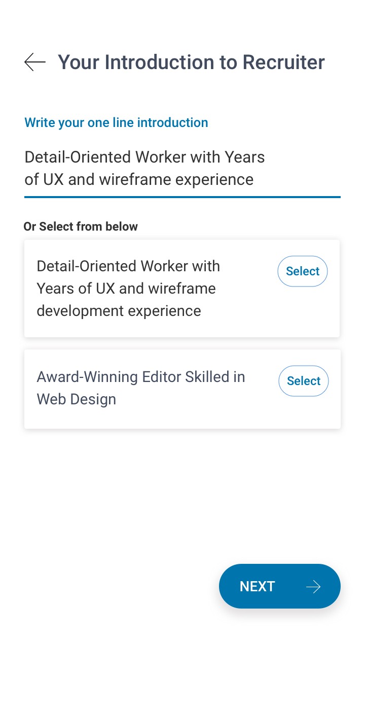
Personalized rofile introductions
Implementing personalized profile introductions for each user.
This not only adds a unique touch to each profile but also aids in better categorization and retrieval of user profiles from the recruiter database.
improving field interactions
Refining the interaction with calendar elements, and improving the input fields for ‘Total Work Experience’ and ‘Salary’.
Using text inputs for these fields to allow for more flexibility and ease of use

Initial quick prototyping for PWA registration flow.
We employed both approaches (Single page & multi page) and conducted A/B testing when we launched.
With A/B testing, it was evident that option 2 was superior, as the single-page strategy resulted in higher drop-offs.
The copy was a crucial part of the registration process.
We aimed to maintain a friendly and confident tone to connect with the target audience.
Multiple entry points were identified on the registration page.
The copy on the first registration varied based on the user’s entry point.
A/B testing and improving Copy


Building a field interaction library
After the form’s approach had been finalised, it was time to examine each individual field’s purpose and interaction.

Define the default, focus, error, and completion states for the user interface.
Determine the nature of interactions and how they will take place.
Specify the types of fields to be used in the design.
Decide on the appropriate input field based on different scenarios.
Consider the behavior of selected chiclets and their interactions.
Define the operation of multi-select functionalities.
Final key interaction prototype screens for Dev handoff
After the form’s approach had been finalised, it was time to examine each individual field’s purpose and interaction.
Implemented Progressive Disclosure in the education details filling process.
Introduced Tags selection approach.
Incorporated contextual suggestions for the upcoming form feild questions, based on the provided information.
Enabled free-text input in specific fields, eliminating the need for light box popups and addressing issues related to infinite scrolling.

Clicking on "More Options" while filling a form field via tag selection, now opens a bottom sheet, reducing information overload compared to pop-ups.
Enhanced visual emphasis on the “search field” to facilitate user information retrieval without the need for scrolling through options.
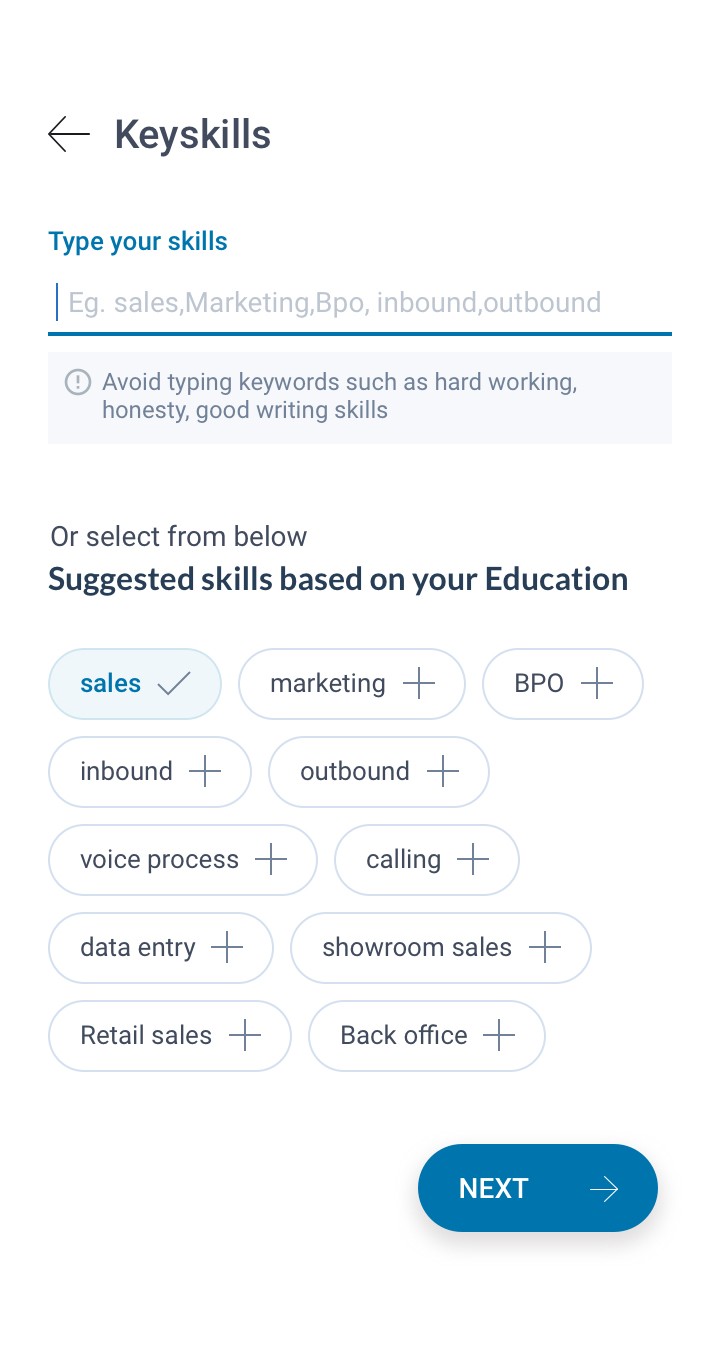
skills are now contextual, offering suggestions based on the user's provided education details.
Error handling improved in key skills section, to prevent the use of generic keywords like "hardworking" and "honesty" typed by users.
Recruiters browse the database using jobseekers profile headlines; hence, a unique profile introduction is now generated based on users data.
Enhanced field interactions for a smoother flow in the experienced professional user registration interaction process.
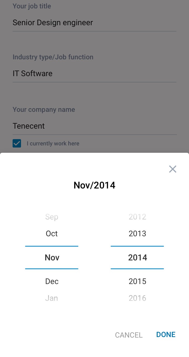
Eliminated the stock Android date selector and introduced a user-friendly custom date selector.
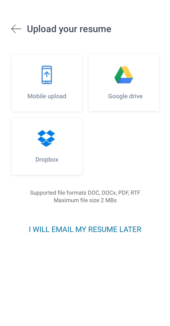
Enhanced interactions for uploading resumes, improving the user experience.
After successful registration, users are prompted to enhance their profiles for improved visibility, making it easier for recruiters to find them via database
In the first fold users receive job recommendations based on the information they provide.
Final user engagement results
As mentioned earlier, Z user profiles offer minimal information, like name and email.
Y user profiles include key details such as name, email, phone number, and experience.
Before the new release, the ratio of Z profiles to Y profiles was 95%, indicating a higher registration rate for Z profiles.
Following new release, the Z profile to Y profile ratio decreased to 74%, signifying a reduction in Z profile and an increase in Y profile registrations.
This means the redesign was successful in PWA
Users were filling more information ie ( Name + email + phone number + experience) with a net increase in profile completeness by 26%
Following the success in the PWA, the redesigned interface was deployed in the Android and iOS job seeker apps.
After release : z/y ratio 74% ( Per 10,000 reg )
Before release : z/y ratio 95% ( Per 10,000 reg )
10000
7500
5000
2500
0
10000
7500
5000
2500
0
F
X
Y
Z
F
X
Y
Z
Further collecting more interaction insights and improving interactions...

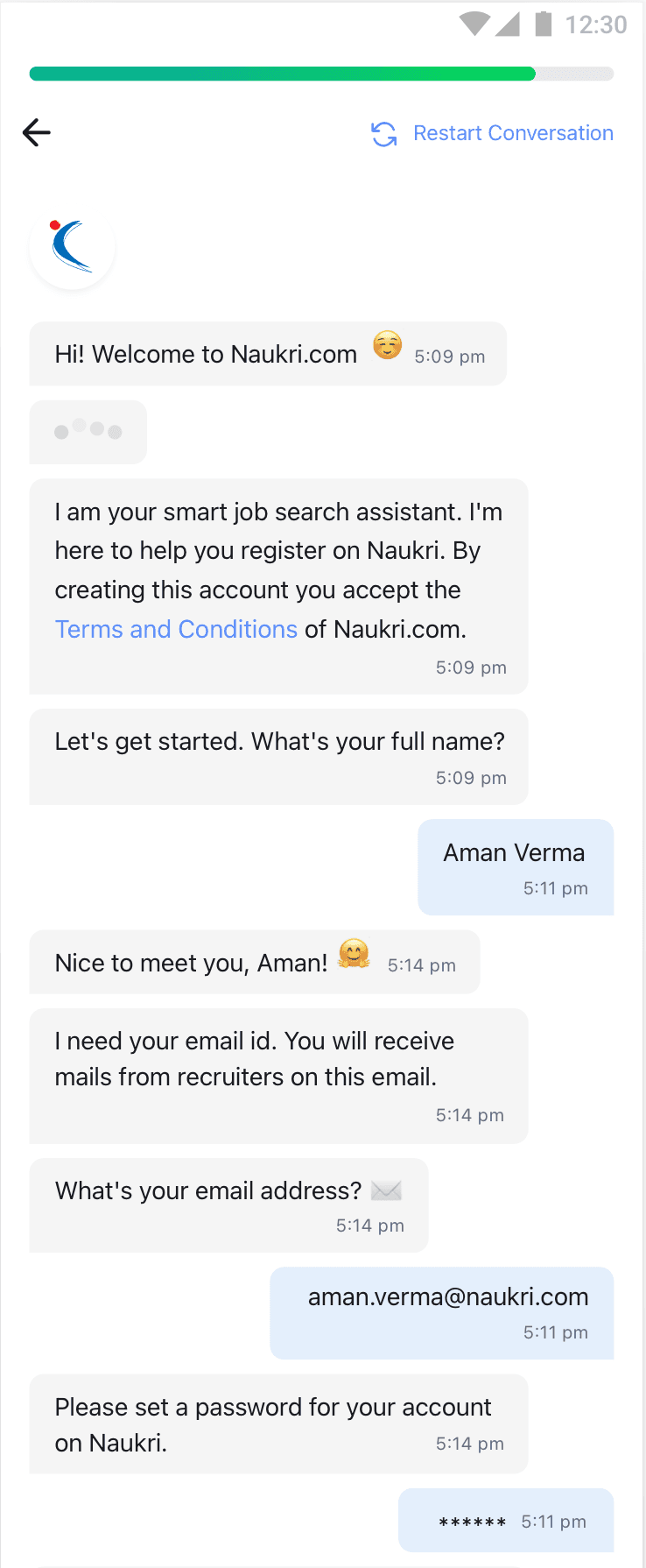
After successful increase in registrations we also introduced chatbot registration.
Mobile Registration revamp
Naukri.com
Naukri.com is an Indian employment website operating in India and the Middle East. In terms of user statistics, Naukri.com has a total of 21 million visits. The website ranks 2nd in the Jobs and Career and Employment category in India. i worked as UX designer in Naukri in job seekers division
Company
Studio Project
Role
UX Research
UI & UX Design
Industries
Job Portal services
Date
Jan 2022
How do we differentiate Job seekers profile registrations.
Organizing registrations according to the data job-seekers enhances user targeting, contributing to an improved experience and services.
Scoping registration types
Z profiles - Providing Name and email
Y - Providing Name + email + phone number + experience
X - Providing All of above + Resume
F - Completing 100% onboarding
First time users - freshers and experienced
Already registered users, registering again
Who are the users

What does the data suggsets to improve...
Experience candidate field improvements
Adding work experiences field.
Current Industry Field
Ctc Lacs, working years
Company Name
Education field improvements
Education details and keyskills.
Passing year, school percentages.
Preffered working locations
Highest education, specialisation fields.
