Understanding redesign objective
The entire structure and use cases had to be redesigned because of the following requirements by product owners.
To increase current conversion & job apply rates by more than 13%.
Add and introduce new features like showing (Job listing + Job description in one page) by splitting single page.
Provide job search statistics to users like - Salary trends, job growth forecast, top industries hiring the skill , Geographical insights of where the opportunities are Concentrated.
Business strategy shifts (Incorporating Company branding).
Accommodate diverse new use cases and all new edge cases within the redesigned structure.
Further improving SEO by redesigning structural elements.
Further reduce bounce rate.
Reducing friction by making job search navigation intuitive and efficient.
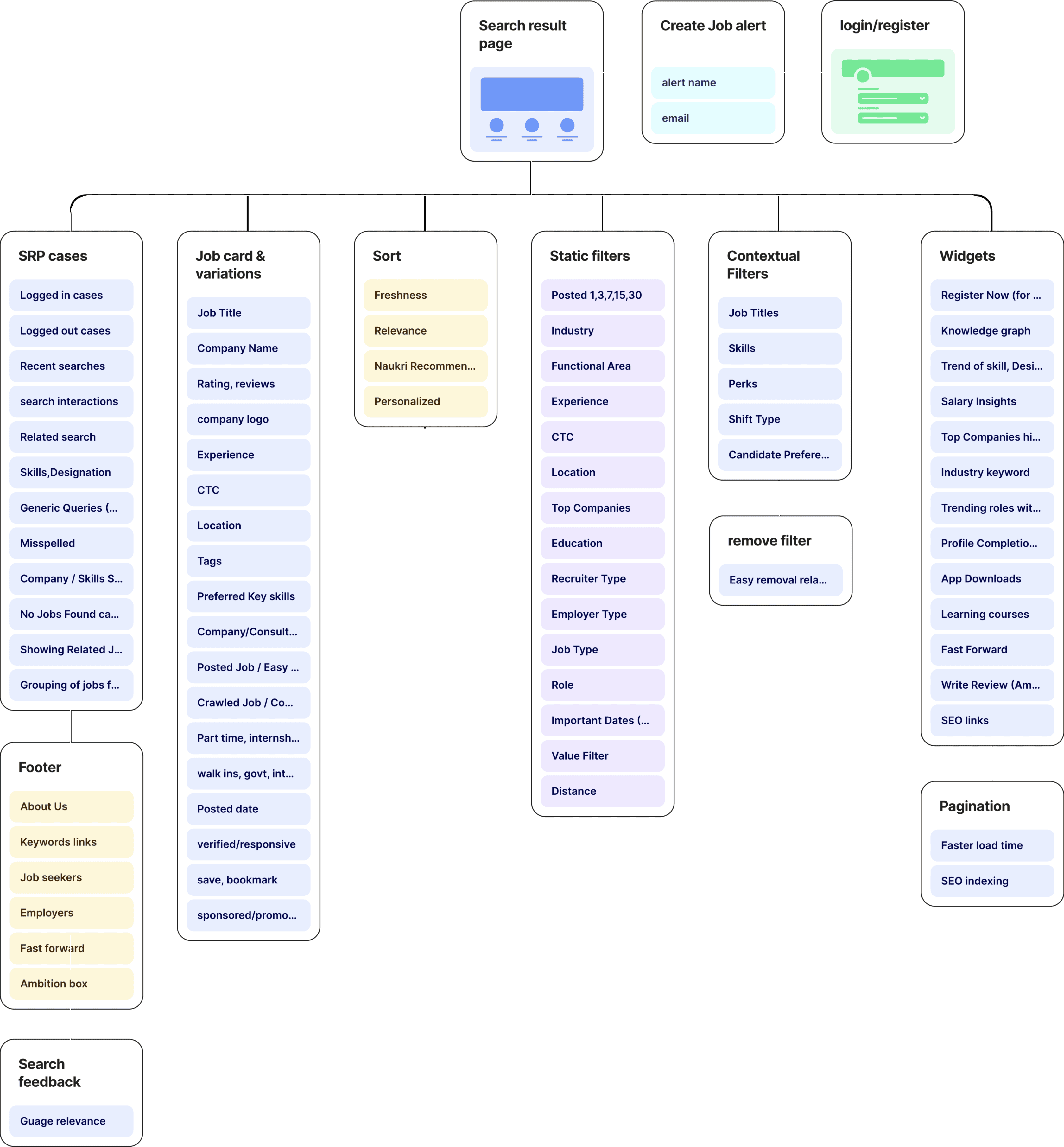
Listing down the core elements and sub elements.
Design Brief given by product managers
The old UI was successfully enhanced (Part 1 of the project) with positive results , but company aimed to integrate new features into the SRP system.
The company acquired a salary and company review platform (like Glass door), and wanted to leverage and display relevant data in the SRP.
They aimed to boost SEO rankings by incorporating additional job keywords throughout the SRP's overall page, including pagination and footer.
It was a phased project involving the translation of all web pages of the job portal through the development of a new UI.
They aimed to further enhance search interaction and filter usage to improve overall user engagement.
A two-column approach was supposed to be tried and user tested, allowing job listings and descriptions to be conveniently viewed in one place.
How users will benefit
More informed career decision based on statistics feature showing salary insights, job market insight and career growth forecasts.
Users will experience a cohesive brand presence increasing job portal trust as redesign includes the incorporation of company branding.
Further improvement in search interaction means quick and efficient job findings, job bookmark and applying.
Improvements in skills keywords and job description keywords, means user can scan jobs faster and make informed decision more quicker.
Incorporating various job card badges like, verified jobs, quick apply, government jobs will build user trust that jobs are verified or can be applied quickly.
A two column approach showing job listing and job description, keeps the user engaged, without opening new pages for job description.
How company business will benefit
Higher conversion builds employer trust, increases opportunity for offering premium job listing services to employers.
Displaying Company branding opens up opportunities for partnerships, sponsorships.
Reduced bounce rates, and improved SEO contribute to increased ad impressions, attracting advertisers, improving organic visibility.
Job search statistics and industry insights can lead to revenue through data partnerships or premium access to advanced analytics.
A more engaging experience increase time spent on platform, providing users to interact with ads and sponsored content.
Efficient navigation reduces friction. This can result in increased retention & repeat visits, contributing to sustained revenue over time.
As we disscued in the previous project below are type of users
Freshers
Individuals who are new to the job market.
Experienced
Individuals who have accumulated professional work.
"The primary focus was to optimize and redesign the new Search result page to best serve the extensive user base of IT professionals on job platform, as they are largest demographic according to database”
States
Focus
User types
Logged in
Can access personalized features, save job searches, upload resumes, and receive tailored job recommendations.
Logged out
Limited access to personalized features; be browsing job listings without the ability to save searches or receive personalized recommendations.
Logged out (repeat user)
Have some familiarity with the platform but not taking advantage of personalized features during the current session.
Solving step by step & case by case basis
Analysing page
Analysing the current page: Understanding structure areas that can be improved.
Market study
We studied multiple other job portals, how they were structuring content, what approach were they taking...
Understanding Page metrics
How many users tap on Register button? How are the jobs ranked? how DCG matrix works? How many users were tapping on Search, sort and filter button?

The timeline was seperated into two parts of SRP redesign, first dealt with some quick wins & other part was more detailed related to slpitview.
As a recap lets look at at the modified SRP structure again...
Pre- filled job alerts
Open - Dynamic filters
Text swap -> icons
Improved job cards
Simplified search bar
New - Skill suggestion
advanced search
Sort
sticky GNB
Pushing registrations
Company logos
Belly filters
Belly filters
SEO keywords
Pushing job alerts
Pushing app download
Contextual filters
Insight from market study
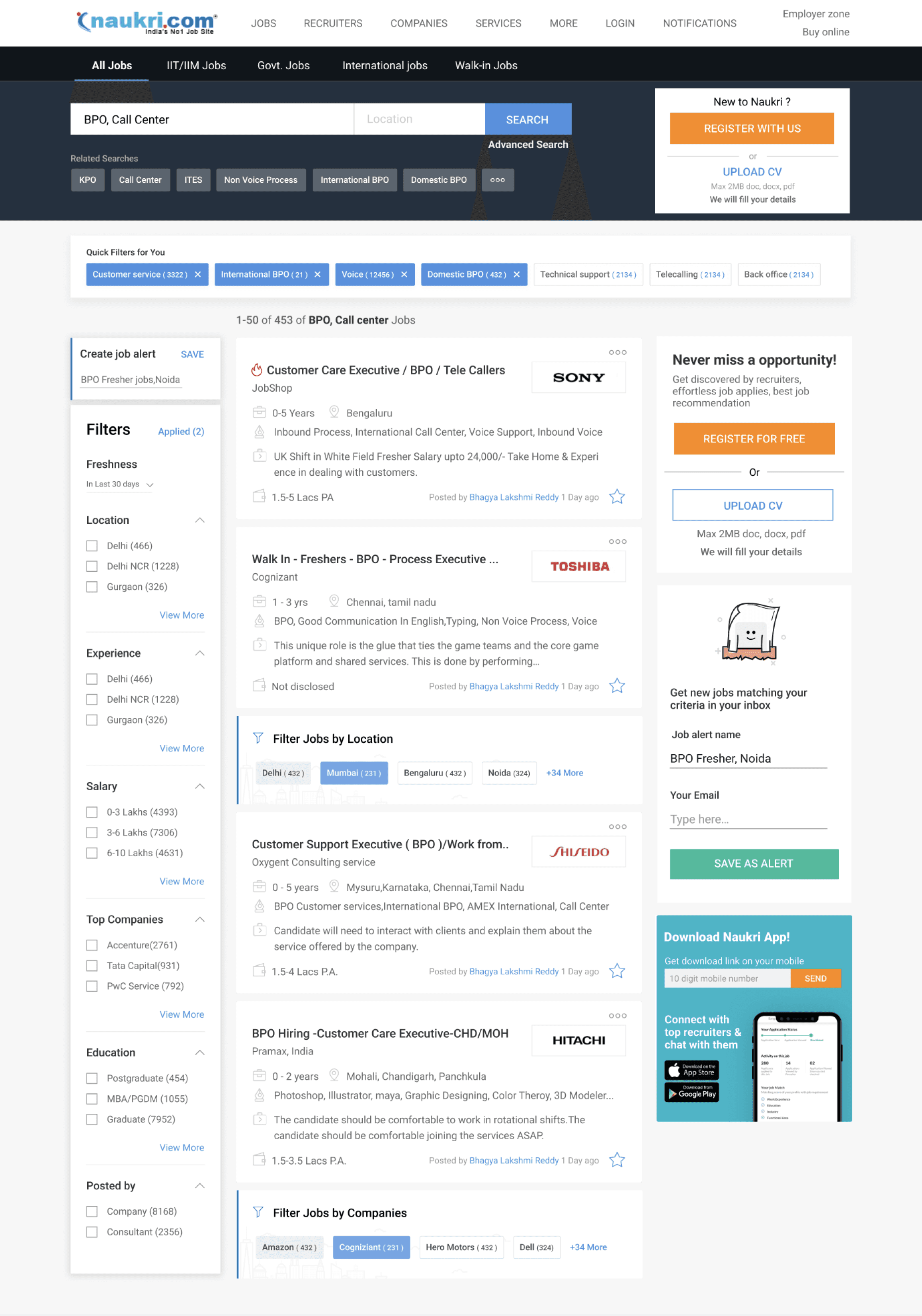
Most of the job portal companies were using top horizontal filter approach.
Search was incorporated below GNB but didnt took to much real estate.
Search fields didn't ask too much inputs, rather filter can be used to adjust the search results.
Saved jobs and alerts were accessible from the search result page, Via tags
Job cards were more or less similar, some cards showing more info and others showing less.
Indeed
Well found
Google jobs
Search bar
Job cards
Job portal


Redefining search & GNB bar
Differentiating service actions
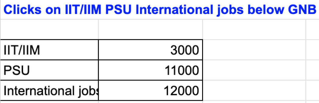
Removed this bar - Usage count was too low
Simplify search with one input
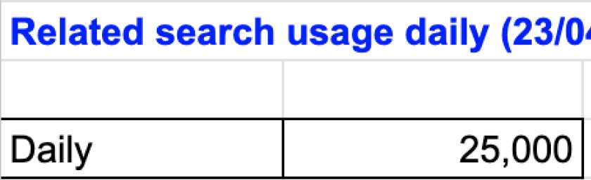
Related search - was not much used - backend relevancy was being improved.
Remove advanced search - Low use, focus on other filter
like contextual, static and belly filters, to improve search result
organising user actions together
Disappear it - if logged in
Search and GNB Redesign options
Grouping of service actions.
All parameters of advanced search were translated into filters- keyskill,location,work ex, salary,industry, job category
Simplified search within GNB
Visual Emphasis on context filter -
changes based on search query
Showing the number count helps in SEO
Grouping action together -search, create alerts, contextual filter
Pushing job alert next to search query
Simplified search - expands when user clicks on the input filed
Sticky search interaction while scroll
Search interaction - when searched for company
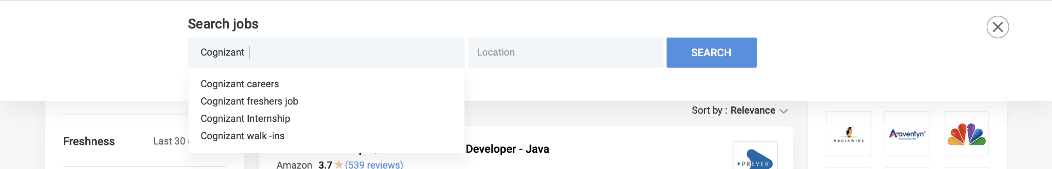
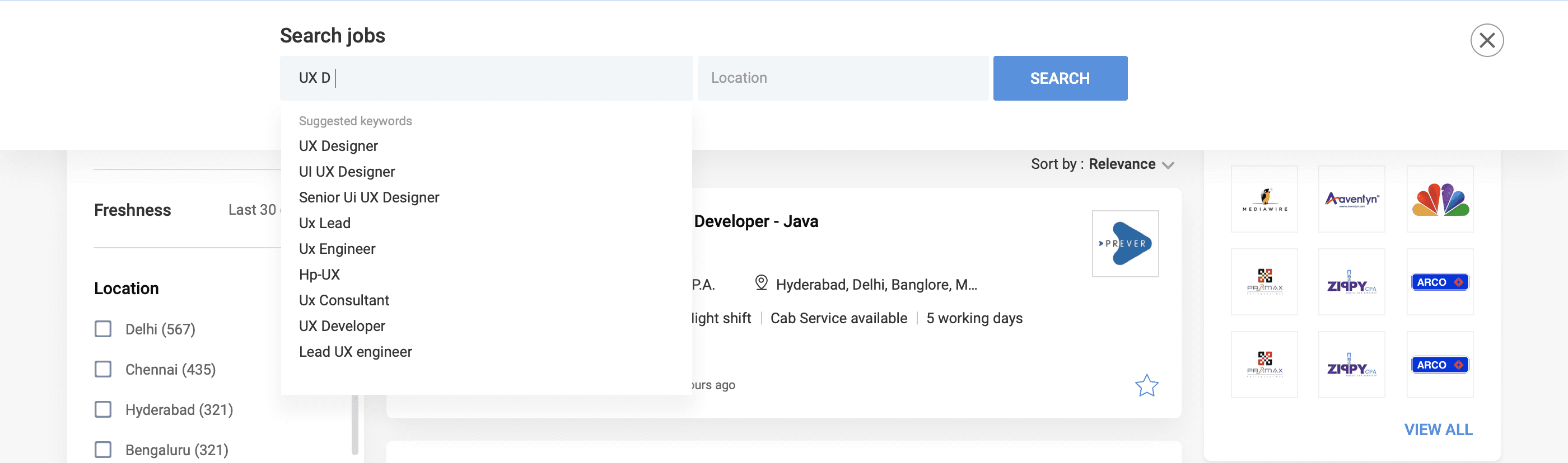
Search dropdown - suggested/related keywords
Organised user actions

Option 1
Option 2
Enhancing Company search term Interactions
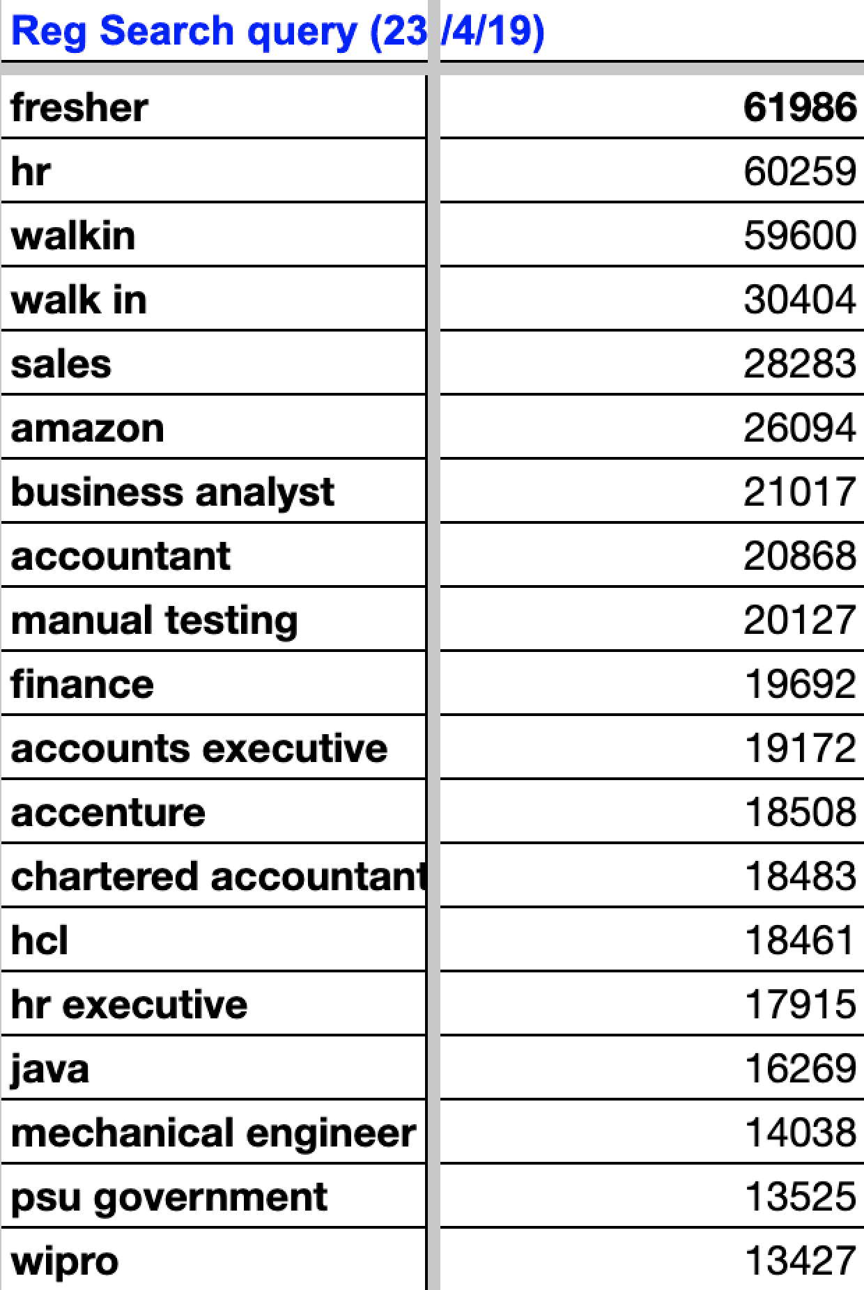
Based on GA data, users search for skill, designation, or company. How can we personalize company search results effectively?
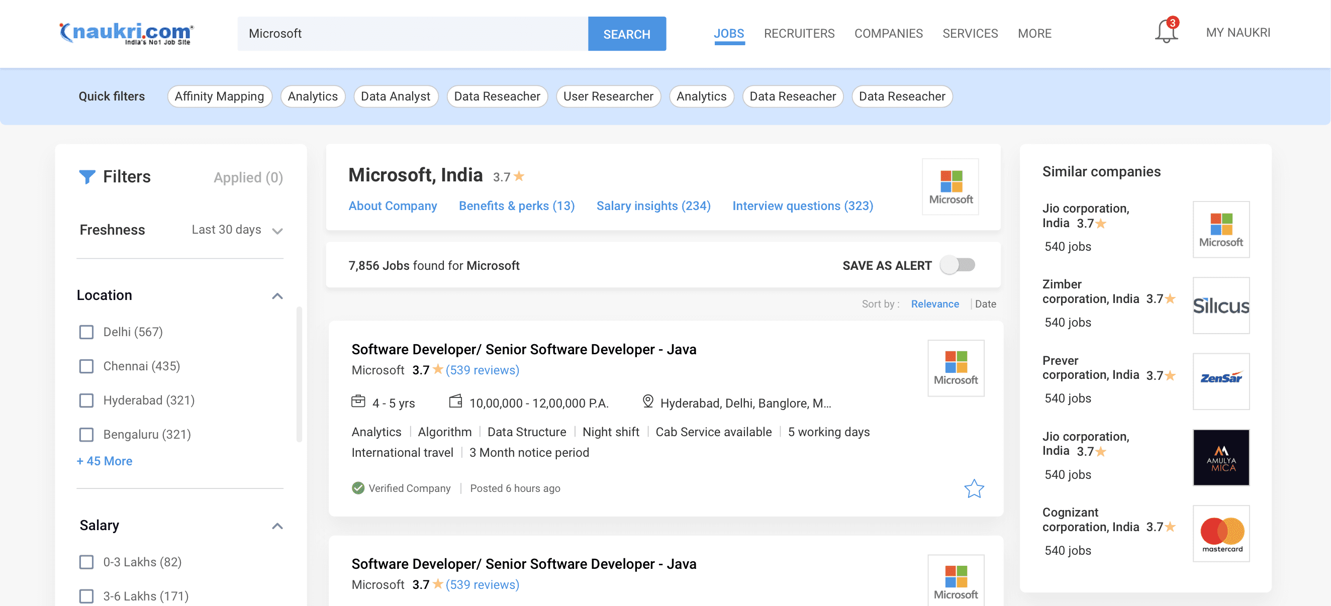
Company interactions - Eg: search term - Microsoft -> Results - Microsoft jobs, fresher job, internship etc - Microsoft insight pages.
Company widgets - provides insights on the search term, including salary, benefits, search trends, profits, acquisitions, etc.
Eg: If 26,094 daily searches for Amazon - showcase Amazon details, Perks, salaries, & jobs at multiple locations; all available backend data.
This boosts brand visibility, increases traffic, fostering collaborations with companies for information and ads, boosting platform revenue.
Experience
Industry
Company
Company
skill/designation
Translating insight to Design
Company touchpoint- About, benefits, salary, interview questions
Page redirect - Showing all about amazon company
Similar company profiles boost
Side widget: overview about company
Belly widget in between job cards - benefit, slaries, location
Company page Design & important touchpoint
Rich Company Profiles: To offer key details such as the company's mission, values, culture, and achievements.
Employee Testimonials: Testimonials or reviews to give users insights into the company's work environment and culture.
Dynamic Content Personalization: Presentation of each company's information based on the user's profile, designation and search history.
Perks and Benefits: Detail perks and benefits offered by each company, such as health programs, professional development, and unique employee benefits.
Review & interview questions Filters - filtering review, salaries, interview questions by department, designation, location and user rating
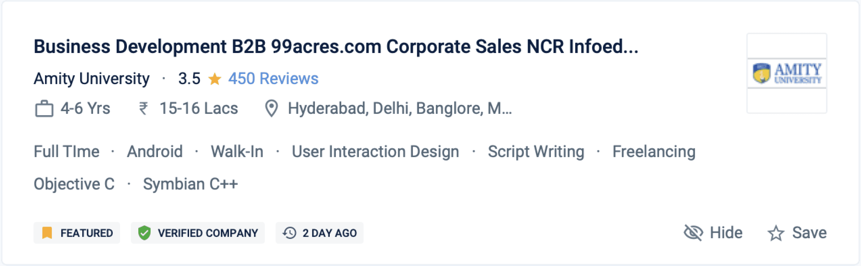
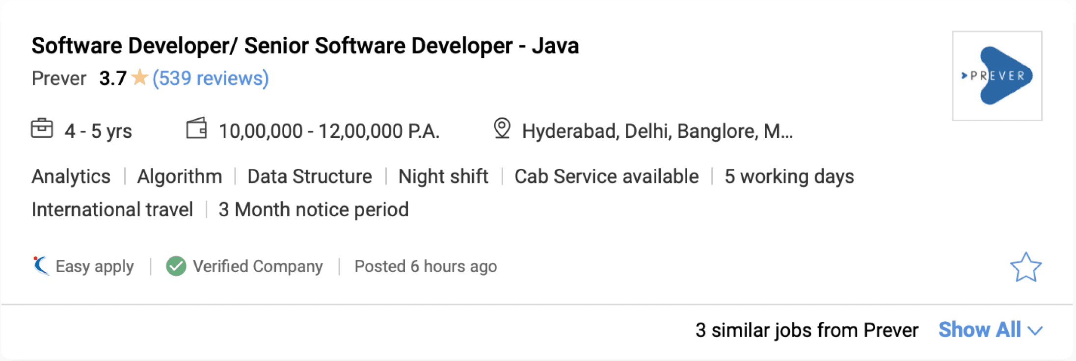
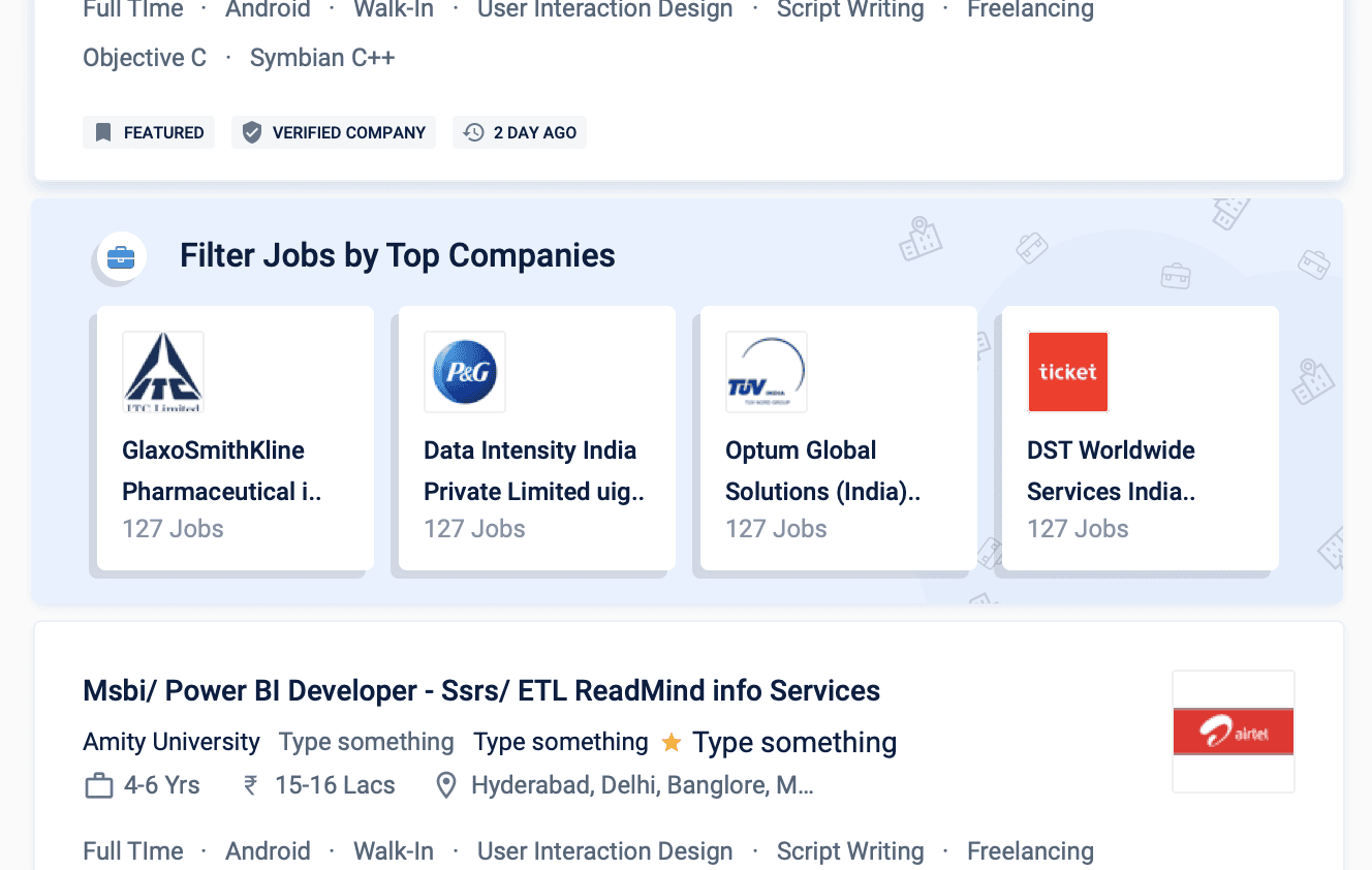
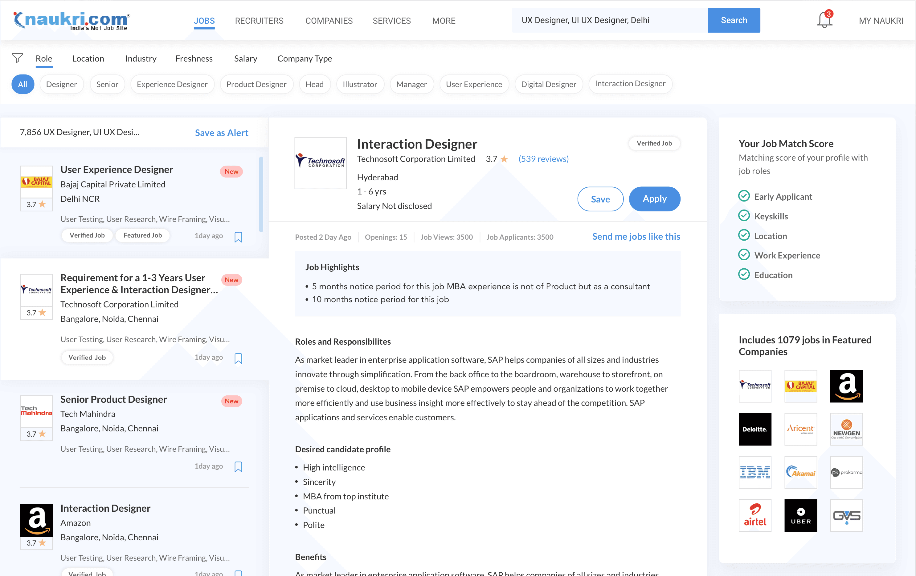
Job card enhancements
We can group related parameters
Square logos will visually seem larger and are practical.
Fetched job description lacks crucial details such as benefits, working days, and skill development.
Recruiter names didn't matter to users since there were no additional interaction touchpoints.
We needed to change the job save icon due to conflicts with the company review icon.
Identifying enhancements in previous job card
We considered displaying more job-related benefits and perks.
like Cab service, flexible hours, global travel, short notice.
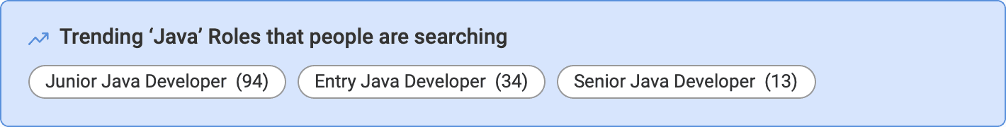
Data suggested - People search by skills, so we highlight key skills in the job card.
Grouped related parameters
Added company reviews
Implementing enhancements in New job card
Next lets look how we added key information variation in the job card
Normal job posting

Internship

Walkins

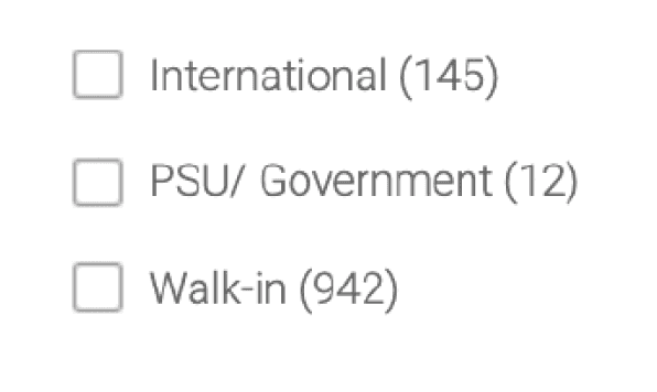
PSU / govt jobs


Introducing job tags - for quick information gauging and overview
Verified badges are given to companies with government ID and tax ID submission, addressing fake job related issues.


Due to numerous use cases, we opted for a tag approach to highlight key job features.


With 10,000+ job postings spanning diverse domains, users faced difficulty gauging the freshness of postings.


Handling Multi similar job posted by unverified companies (reducing spam)
Consultancy jobs gained a bad rep for seeking money in exchange for employment. there were No tool to verify company legitimacy.
They use job posting services, occasionally post fake jobs, pay extra to boost visibility.
After boosting, they post multiple jobs with identical descriptions to gain more views.
This dislocates genuine and verified jobs in the SRP, causing user experience issues.
so we needed to compress and stack similar consultancy jobs, having over 90% identical keywords.
Identifying similar jobs by aggregating keywords, skills, and titles from unverified consultancies."
All these spam jobs are stacked together and compressed so that legitimate jobs are shown to the user.
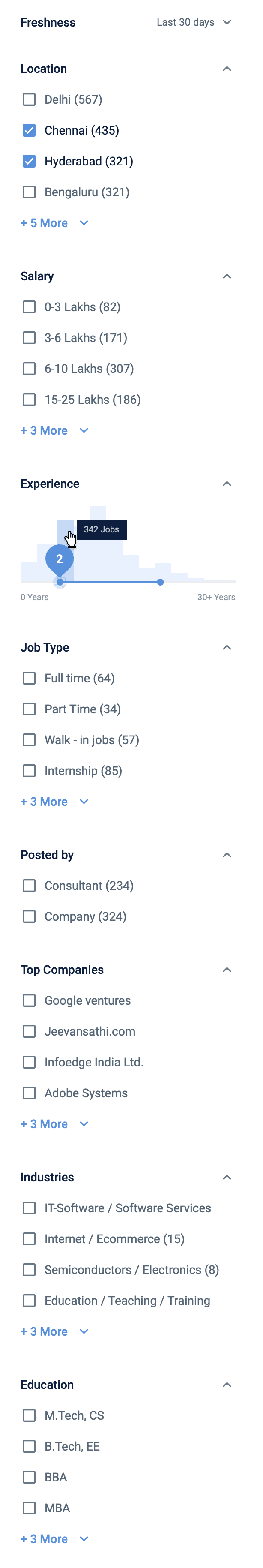
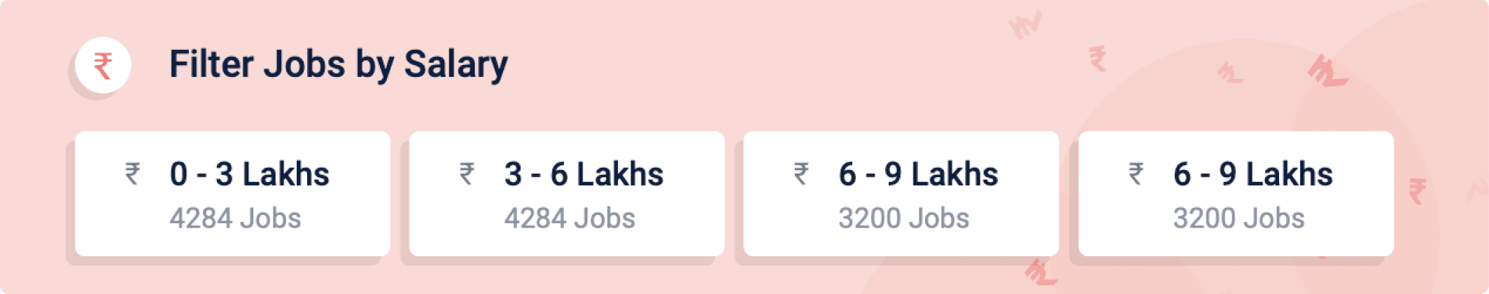
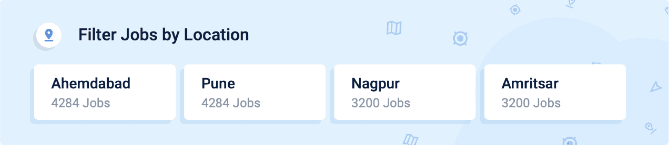
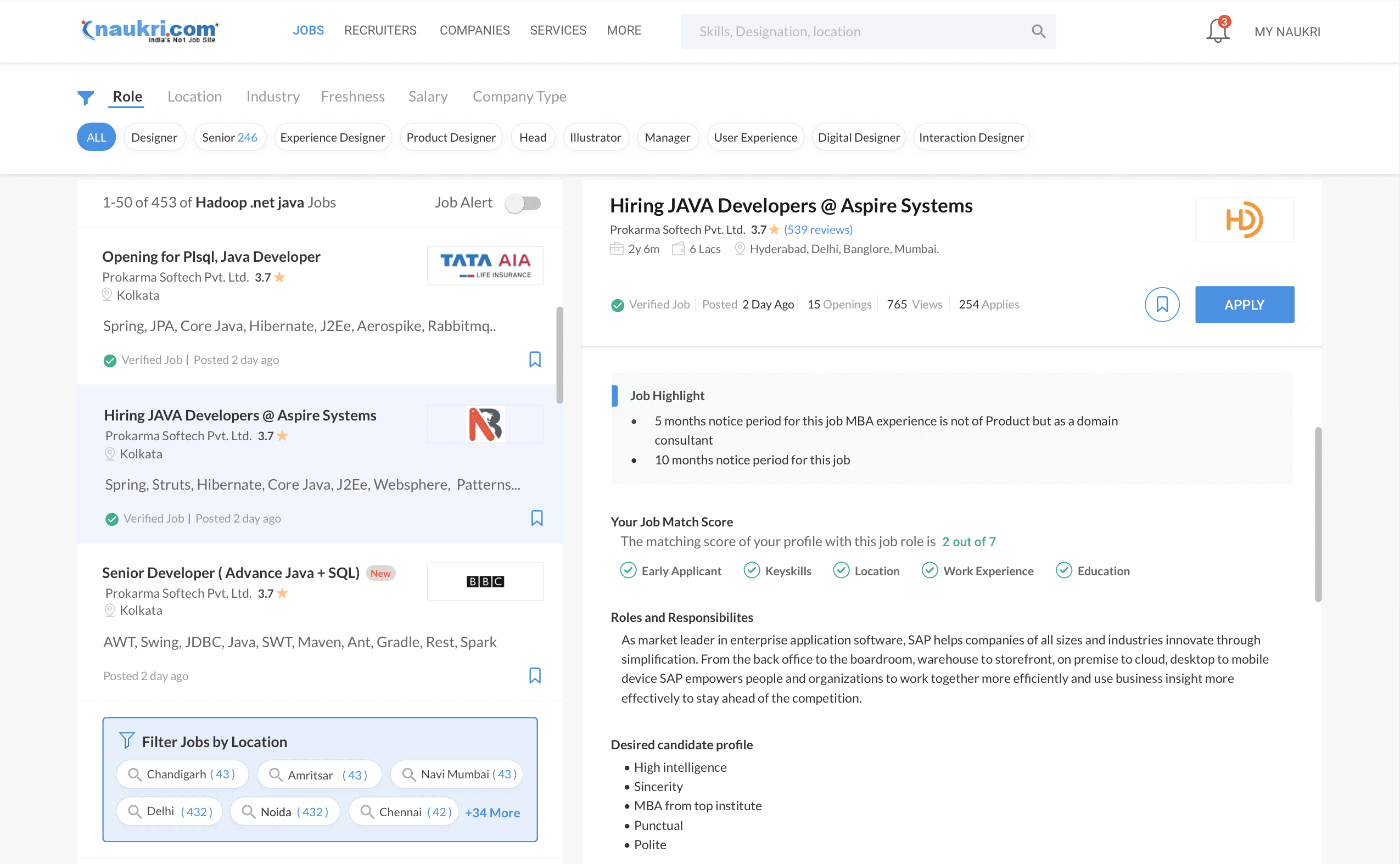
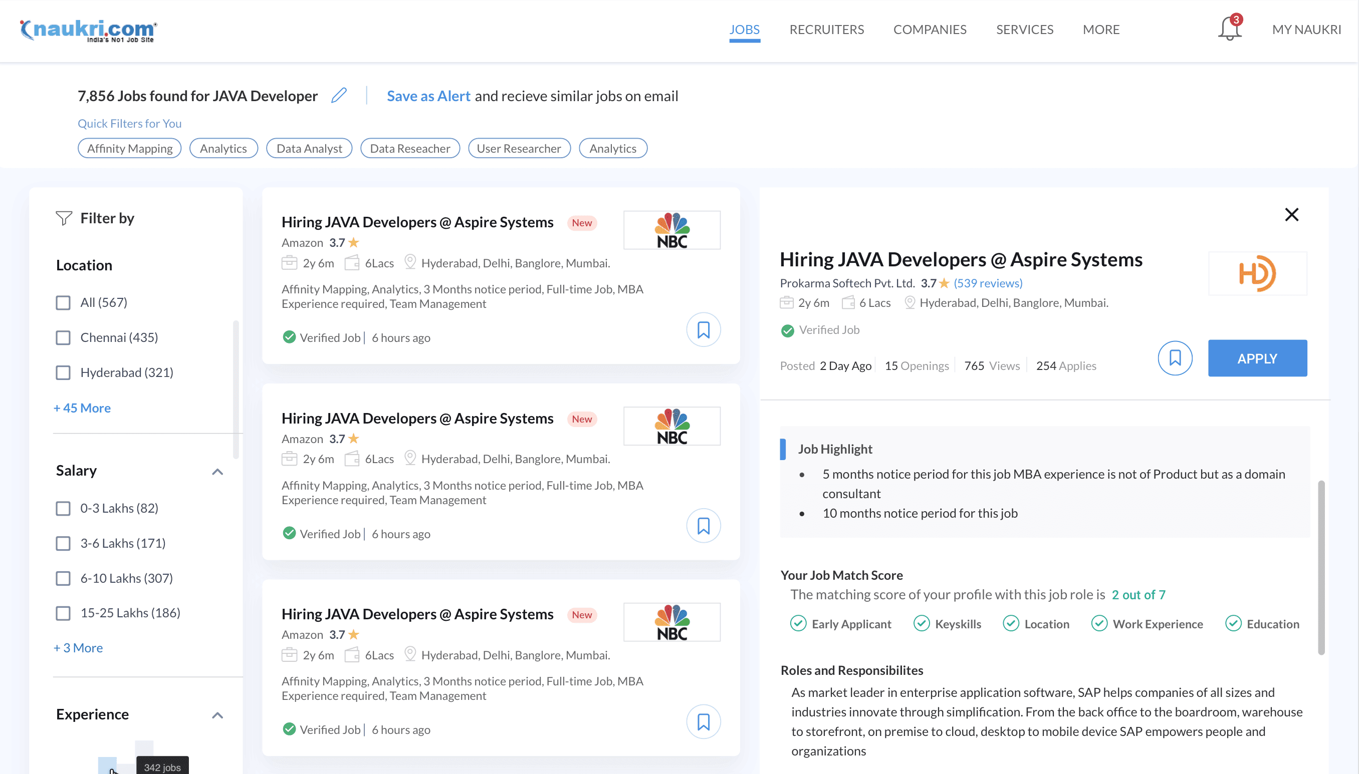
Filter re design...
Data related to filters based on what user wants to see
0
5
10
Designation
Location
Salary
Job description
Date posted
Company size
Suggestors
Education req.
Easy apply
company jobs
job alerts
Email Jobs
Previous filters were static, not adjusting based on user interaction."
Only one filter was expanded, the rest remained always collapsed.
This led to users scrolling instead of utilizing filters.
New filter categories were needed due to changing times.
We also changed the copy of the filters for better understanding
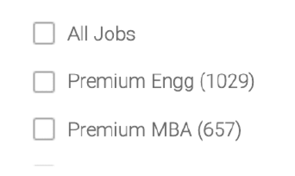
People struggled to understand 'Premium Engineering' or 'Premium MBA'.
Some filters had low usage due to legacy issues.
Issues persisted in copies due to legacy.
Issues found in Old Filters
Filter order is now based on user preferences from testing.
Users Top requirements: location, salary, experience, and job type.
Filters and subcategories are always open in preview mode for user interaction."
Filter order dynamically adjusts based on user login status.
Some “Advanced search” queries were transformed into filters and included.
Personalised filter for logged in user.
New Filters enhancements

Improving belly filters
Introducing visually enhanced belly filters to captivate users and encourage their usage.
The top categories of the belly filters were : Top Salaries, Companies, Location, and trending searches
This feature aids in transforming broad queries into filtered and streamlined results, enhancing user experience.
The applied filters here are seamlessly reflected in the left side filter, ensuring a consistent and synchronized user experience.
These filters can be effortlessly removed at a later stage, offering users flexibility and control over their search preferences.
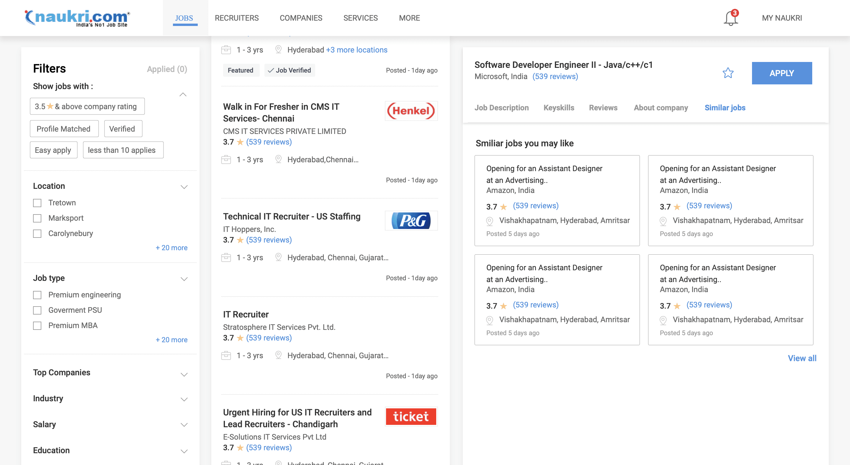
Right side widgets / inventories
The right side widgets inventories can be divided into three main parts
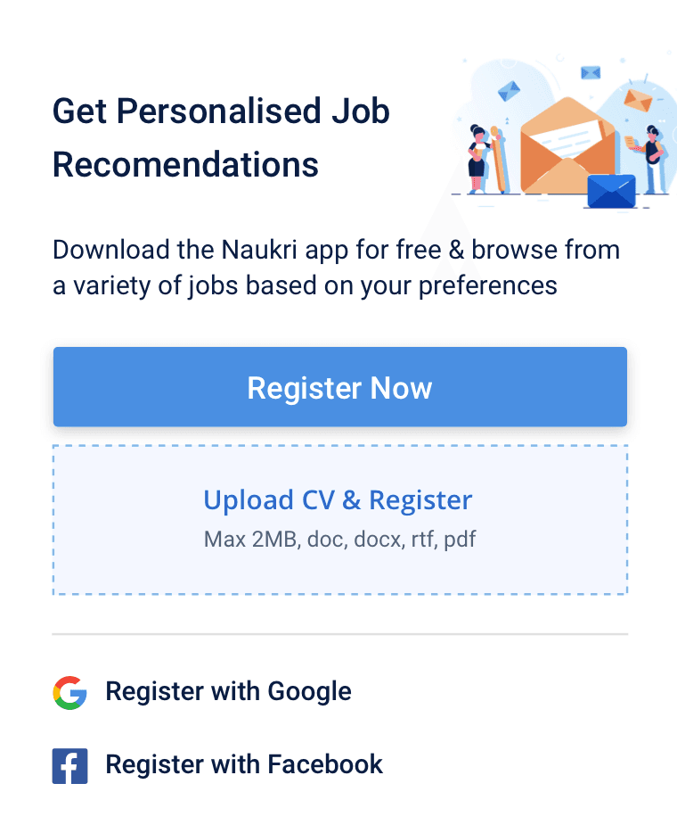
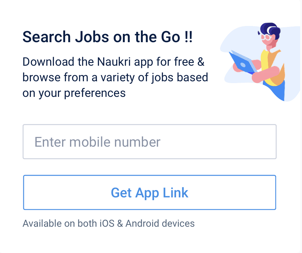
User Acquisition widgets
Registration Prompt
Registration via uploading CV details
Social media quick registration
Mobile opt in for App promotion
Job analytics insights
Company and job insights
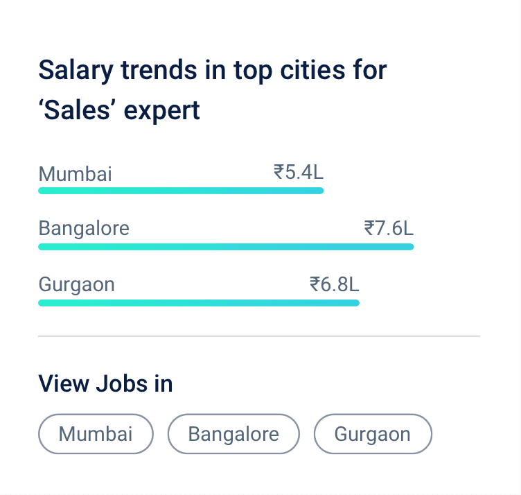
Salary trends
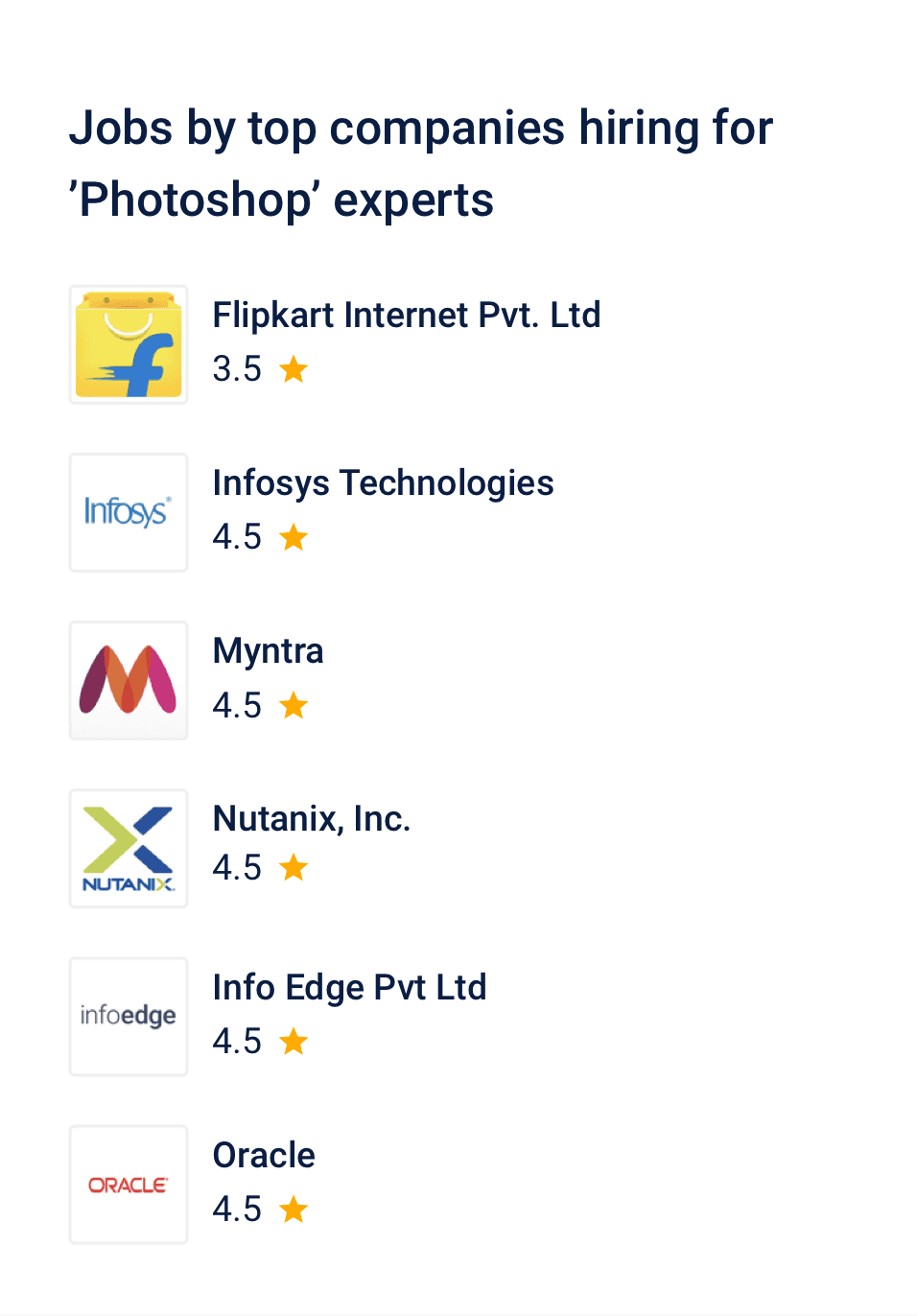
Companies hiring for the search term
Job Search term insights
skill Development
Naukri learning insights
Develop skill related to search term, course selling
Selling related to resume enhancement
Reaching to recruiter directly via priority applicant
User acquisition widgets
Attracting registered users to the system is crucial, enabling the provision of email alerts and job recommendations.
From a business perspective, this also facilitates sharing relevant job seeker information with recruiters."
Encouraging users to download and use the app is advantageous, contributing to the growth of the app user base.
Job analytics/insights
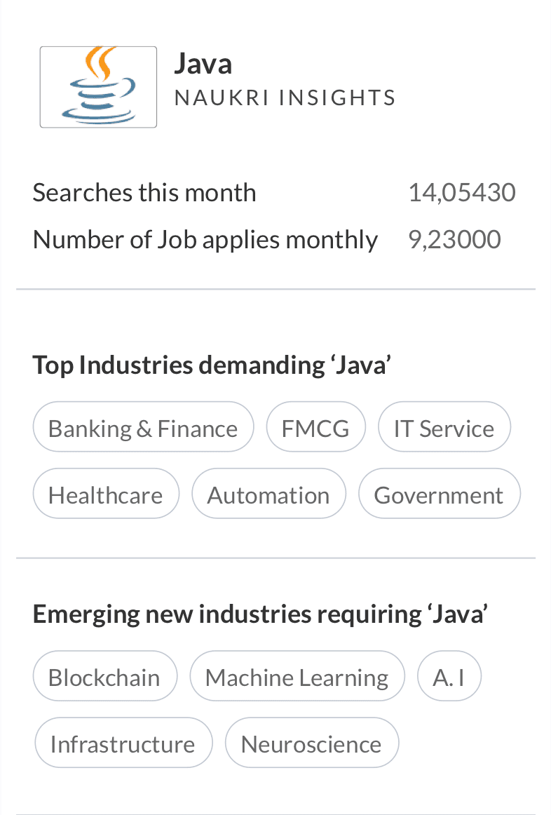
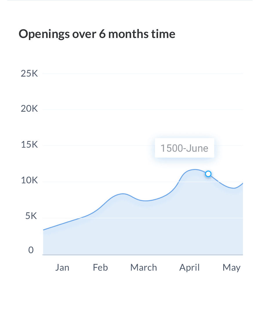
Java openings over 6 months period
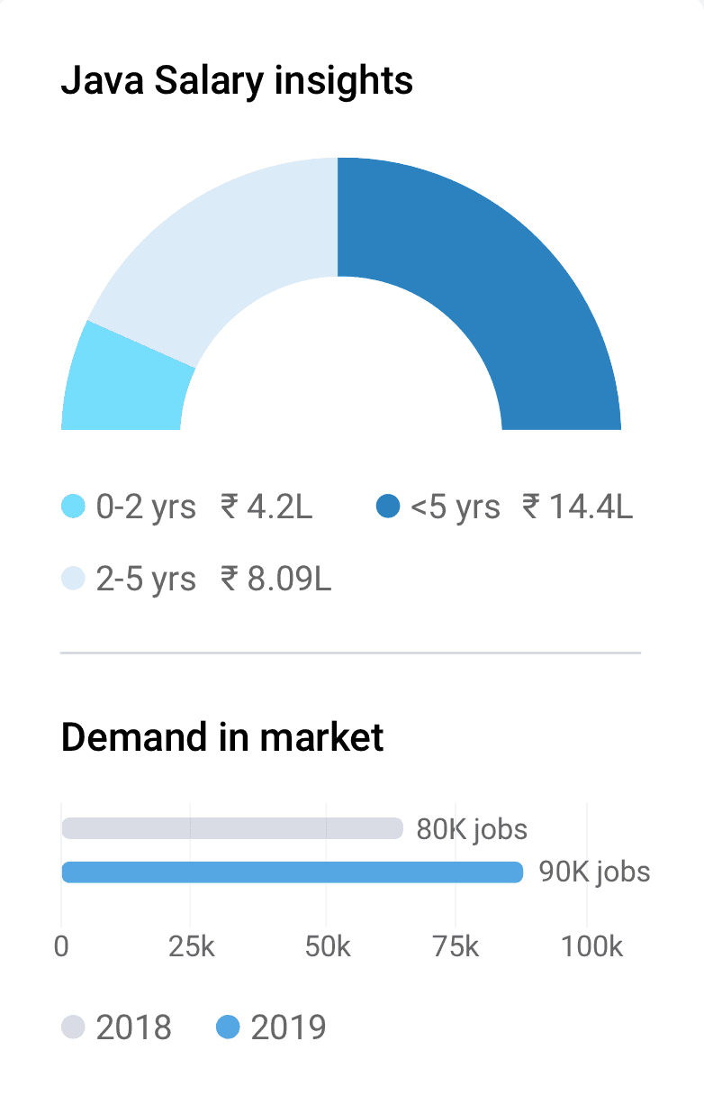
Java salary insight in interactive graph
Top companies hiring java developer
Insights about no. of searches and job applies
Industires demanding Java
Emerging industries requiring java
Java salary insights based on experience
Java Demand in market over years

When user searches -> java developer
--->
Show Java jobs + Java developer insights
Final insight cards based on user and business insights
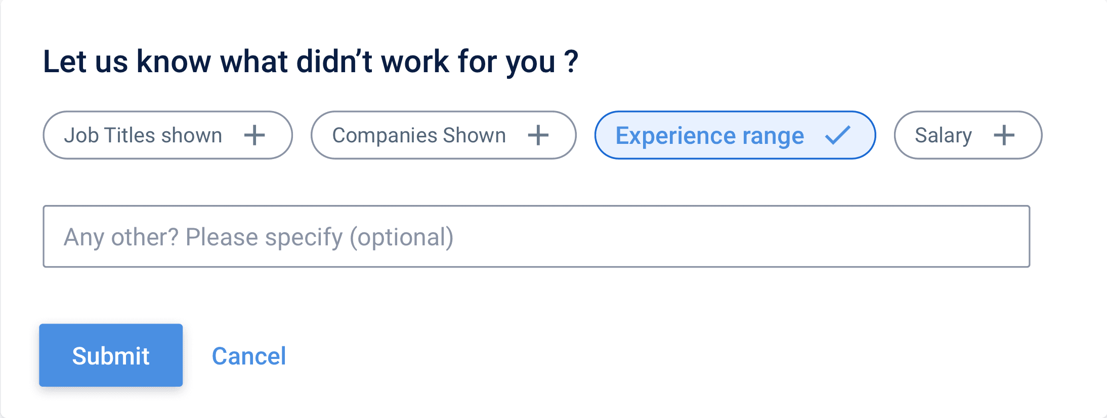
While this data may appear interesting, it might not contribute significantly to the user's job search journey.
It can discourage user if the job numbers are low, or if the demand in market is low
We will have to take services from Statistia for all the emerging industries requiring that skills which is searched or build a database
It was concluded that only showing salary insights and companies hiring for the search term query.will be relevant and can be made deployed faster.

The new design is more focused, showcasing relevant courses related to the search query for an enhanced user experience."
Enhancing the copy of the offering to broaden the user base for Naukri FastForward."
Before revamp
After revamp


Skill development widgets.
Single page view approach Vs Split view approach
We are experimenting with an approach where clicking on a job card opens the job description in the same page (split view) instead of opening in a new webpage window...The advantages being as below:
Detailed Information: Users can view job details alongside the listings, providing a more comprehensive overview of the job without the need to navigate to a separate page.
Better Decision Making: Having job details readily available allows users to make more informed decisions about whether a job is suitable for them before clicking on the listing.
Improved SEO: Showing job description and job listing in one page gives more keyword data and and more text in one page, thus improving SEO....
Single column
Two column
Three column
The two column approach explorations...
In this approach the filter goes horizontal completely
Job listing comes to left side
Job description goes to the right
Explored integrating various widget inventories using a multi-collage card approach.
User insights show that the company logo strongly influences trust.
Consequently, we prioritize displaying the logo first in our listings.
The three column approach explorations...
Horizontal contextual filters.
Maintaining the vertical filter layout for a familiar user experience.
The job card is in the middle column.
The job description is in the third column.
This approach helps user to go to specific sections in job descriptions quickly
Opted for a tag approach in a three-column view due to lengthy job description.
An essential business case involved displaying similar jobs based on the user's job description during their search.
In a split-view scenario, the placement of similar jobs comes at the end of job description and can effect business negatively.
The Figma file where all split view explorations were made.
We conducted interviews with job seekers from diverse domains and age groups to gather insights and perspectives on the new split view design."
We selected a sample group of 18 individuals ranging from ages 22 to 45 for user testing. Participants were shown both the classic single-page view and the split view to gather feedback."
User testing between classic view and split view of SRP

Below were the comments for classic view
Below were the comments for split view
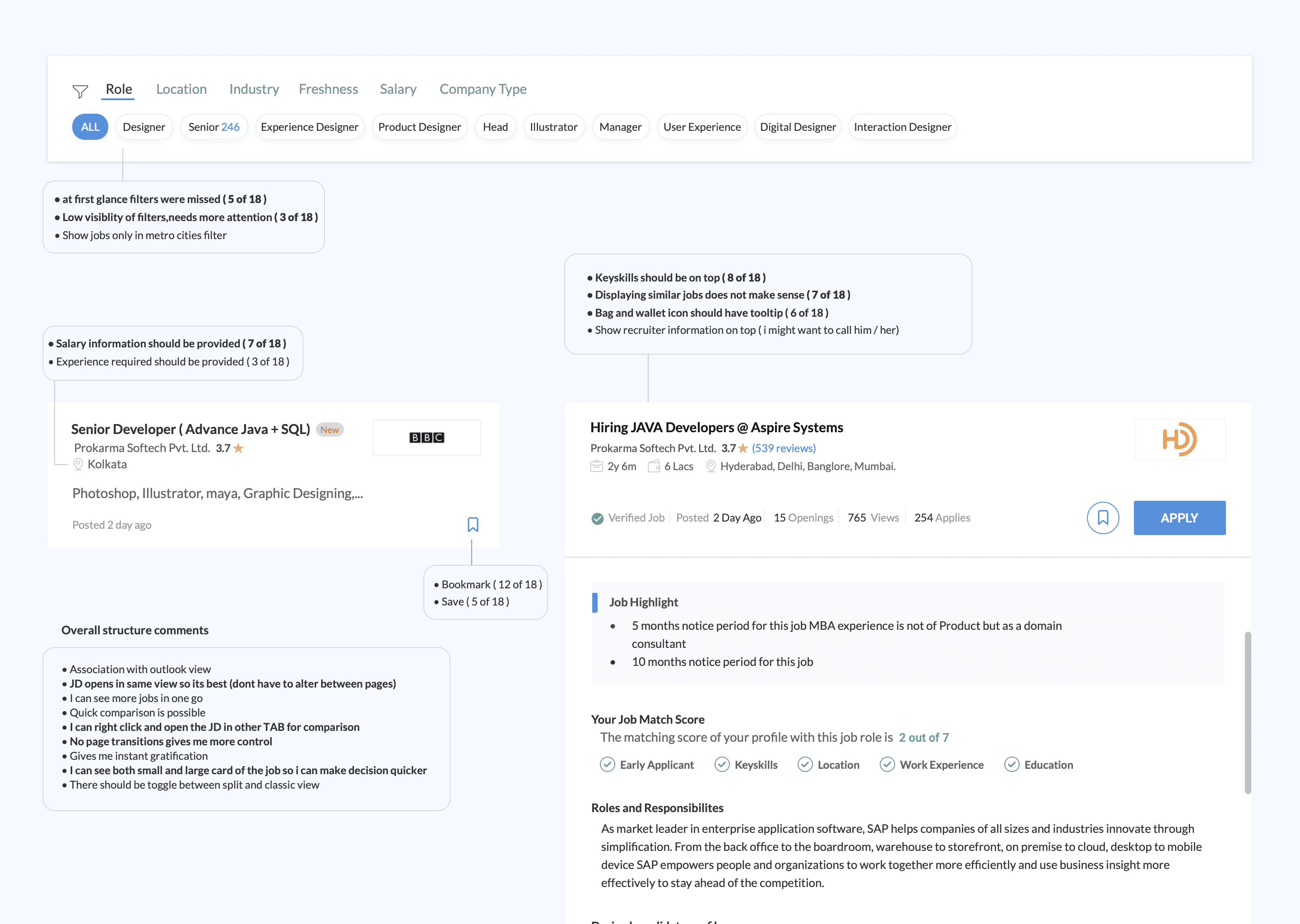
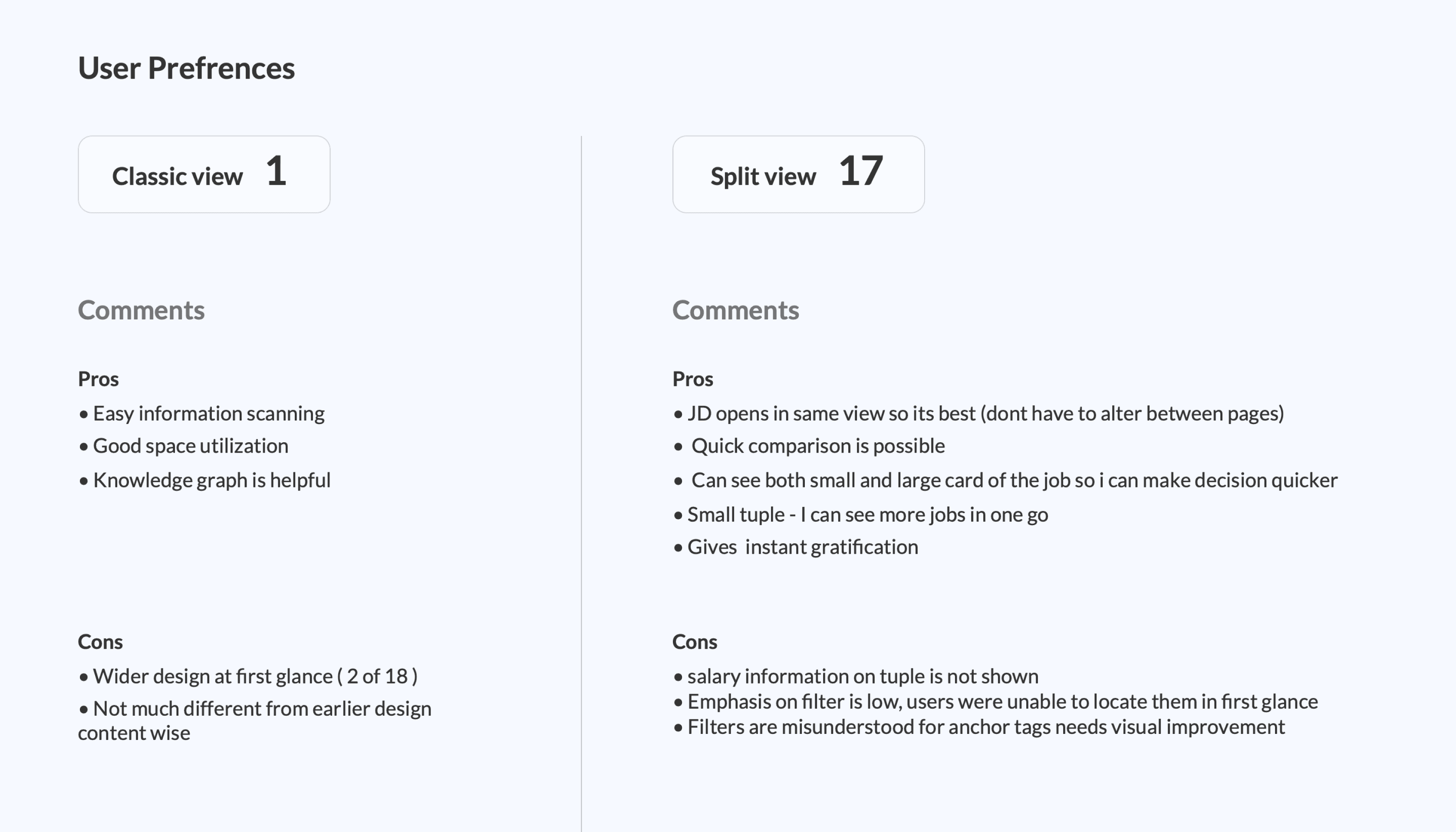
While split view was preferred, it couldn't be used due to business constraints...
For converting broad search queries into filtered results. The horizontal filter, hides filter Sub-categories, so it was not the preferred method for achieving this goal.
In comparison, the left-side vertical filter remains open to the user, eliminating the need for two clicks to operate, unlike the horizontal filter.
The current separate new window job description page, contained numerous paid inventories. This had to be compressed and placed on the second or third fold in the split-view job description page. Consequently, it had to be discarded.
Furthermore, the split-view concept posed a challenge for the footer SEO links, requiring significant effort from the SEO team to rebuild.
Final page will all elements ready to be developed.
We covered all the Interactions states of different elements as shown below...
Loading states
Empty states
Form Field error states
Form Field success states
Logged in job alert
Logged out job alert
Next page
Previous page
Breadcrumbs states
Pagination
Page shimmer states
Connection problem states
No job found - Partial query
No job found - Full query
No matching jobs found
Job Failover Scenarios
Job Expired
404 error case
Toast messages
Single/ multi Job saved successfully
Job relevancy pop up question
Job alert created successfully
Inventory monitoring
Job card states
Bottom SEO links
Search state
Side widgets
Course learning
CV upload error
Email ID already exisits
Registration flow side curtain
Create Job alert
Registration captcha
Bottom card course widget senarios
Learning course widget variations
Search result Side widgets for learning
Candidates service widgets (bottom page)
Fast forward service widgets (bottom page)
Hover
Clicked
Saved
Hide
Location links
Skill links
Course links
Designation links
Company links
Footer browse links
Modify search
Error - no keyword typed
Suggested keyword dropdown
Related keyword dropdown
Company specific search
Skill specific search
Course preview image available
Course preview image unavailable
For search result page
For Job description page
Candidate opt in thankyou message state
Captcha valid
Captcha invalid
Sort/filter states
Belly filters applied
Belly filters removed
Show more
Show less
Default relevance state
Date state
Filter by company, location,salary
Left vertical filter applied
Left vertical filter removed
Horizontal top filter applied
Horizontal top filter removed
Sort
Belly filter
vertical Filter
Horizontal top filter
The figma file showing all states and usecases.
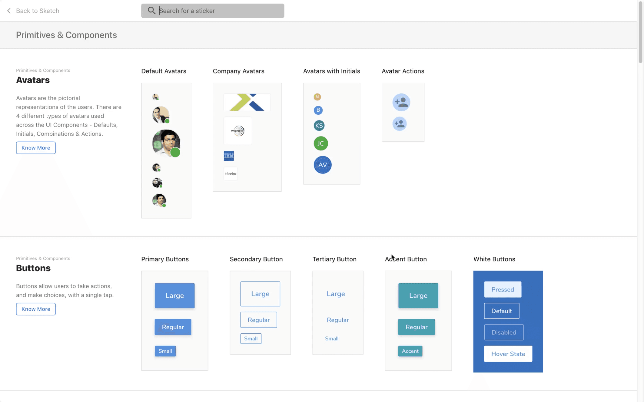
Establishing design systems for the entire Job Portal platform
The design system development began with the SRP (Search Results Page) and was later expanded to other pages in an ongoing process.
After finalizing the SRP structure and addressing all use cases, we started translating them into atoms, molecules, and components using Sketch..
First we set up the foundational structures for the color scheme, elevations, spacing, and radius, initiating the design system.
Later, we detailed elements like buttons, icons, text fields, toggles, input fields, tags, chips, tables, tooltips, notifications, alerts, list items, dropdowns, and cards in the design system.
Redesign of Search Result page (Part 2)
Naukri.com is an Indian employment website operating in India and the Middle East. In terms of user statistics, Naukri.com has a total of 21 million visits. The website ranks 2nd in the Jobs and Career and Employment category in India. i worked as UX designer in Naukri in job seekers division
Company
Studio Project
Role
UX Research
UI & UX Design
Industries
Job Portal services
Date
Jan 2022
The components of the overall structure of SRP ( long project )
Search bar (and search interactions)
Advance search
Suggested skills/ designation
Recent searches
Job alerts
Login register
Sort, filters redesign
Header footer
Naukri fast forward widgets
Footer and SEO problems
Bottom seo links
Pagination
Company links
Right side widgets
Final job card and job feedback widget
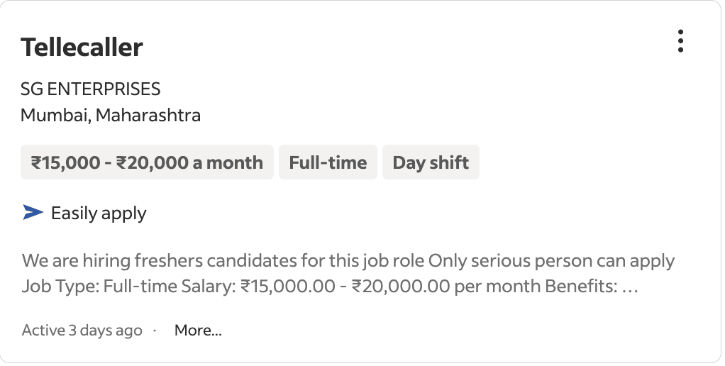
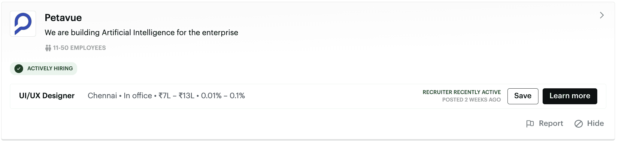
The final job card incorporates discussed variations, new features, and tags for quick information scanning.
Feedback Widget added: If users dislike search results, they can report, aiding backend efficiency improvement.