Understanding the
optimization objective...
Project objective was to increase engagement of users landing into SRP from different mediums.
Reduce the Bounce rate
Improve contextual search
Improve use of filters
Improve relevancy of job for user
Improve conversion (apply) clicks
3,569,343
Unique visitors
28,554,744
Page views / day
5,00,000
Jobs
3
countries operation


competitors
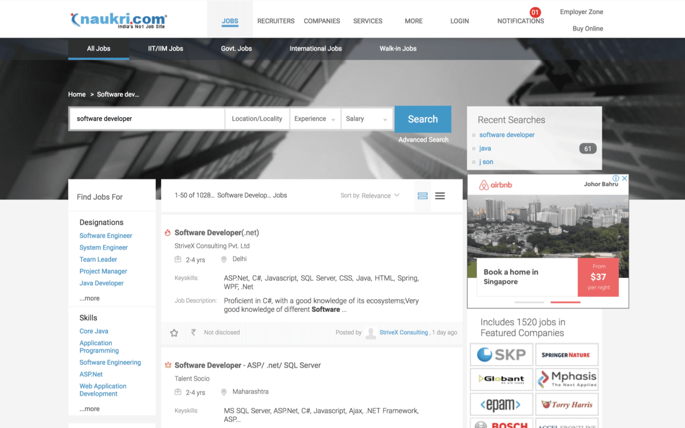
Why reducing bounce rate is so crucial?
In terms of user base Naukri.com is the biggest job portal in India followed by Linked in & Indeed
Naukri.com receives around 3,569,343 unique visitors and 28,554,744 page views per day
Naukri.com generates its revenue from pay-per-click advertising, email marketing, database sales (RESDEX), job postings etc.
Search result page therefore becomes a crucial point for job applies conversion
Also Data from Google Analytics suggested that users are bouncing off from SRP more than usual bounce off rate.
Project timeline & speed to market
The timeline was seperated into two parts of SRP redesign, first dealt with some quick wins & other part was more detailed related to slpitview.
Part one - Reduce bounce rate (short project)
Improve information on job cards
Remove legacy issues in filter
Improve filter usage
Introduce belly filters and contextual filters
Platform agnostic (Desktop and web app)
Part two - Improve the overall structure of SRP (long project)
Search bar (and search interactions)
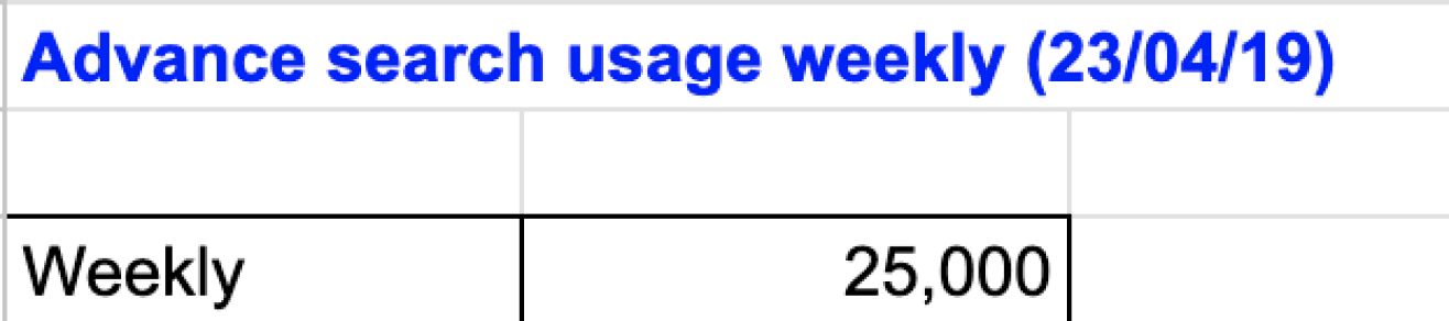
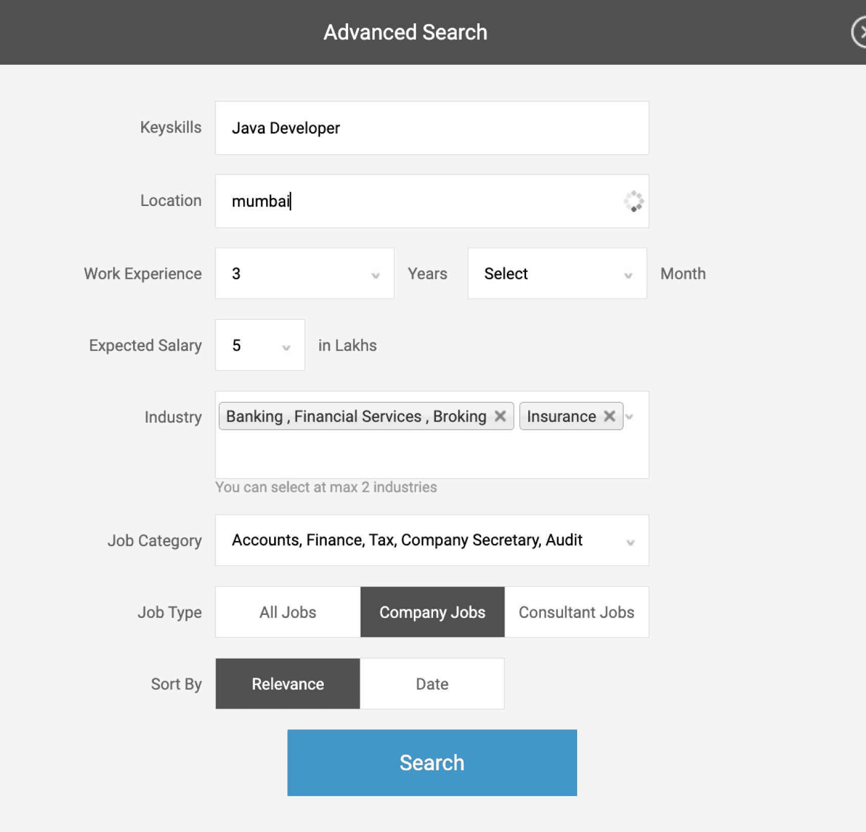
Advance search
Suggested skills/ designation
Recent searches
Job alerts
Login register
Sort, filters redesign
Header footer
Naukri fast forward widgets
Footer and SEO problems
Bottom seo links
Pagination
Company links
Right side widgets
Breaking down the Project brief

Increase user engagement
Improve Backend relevancy?
Relevancy by understanding user search patterns?
Show relevancy by gathering profile information?
Relevancy by taking progressive inputs while search?
Conversions
Application increase
Job Description page view increase
Registration increase
Increasing SRP click rates
Bounce rate
User coming and immediately bouncing
User bouncing after few scrolls
Why job relevancy is a issue?
Users
First time users / Returning users
User coming from mailers
Users coming from SEO
What are the highest profile of users
Understanding the business needs, job post procedure and job relevancy issues
PWA web session logs were used to identify bounce rate, drop offs and avg. session time spent by users during registration process.
Business POV of the SRP structure
SEO and keywords on job cards plays an important role in bringing users into Naukri.
An active database of resumes is important to Naukri.
Database ready user profiles are also necessary to sell them.
Other revenue is generated via job posting and advertisements.
Job posting procedures and job ranking
Jobs are posted by using Resdex or Job posting services
Ranking of jobs are based on DCG matrix, Paid boosting services, Naukri first listings etc.
Why job relevancy is a issue in current SRP
Naukri.com has jobs from a plethora of domains and industry.
IT & BPO jobs constitutes to a major chunk of job posting which hinders other job search terms relevancy.
Consultancy jobs put a lpt of irrelevant keywords to attract job applies.
User cant differentiate between company jobs and consultant jobs.
First like of description fetched in job card doesn't show much information.
There is less trust of a new company job post if there are not enough reviews.
Fake job and job scams from unverified job posts reduce user trust.
Sponsored and featured job are shown at the top even when relevancy is low.
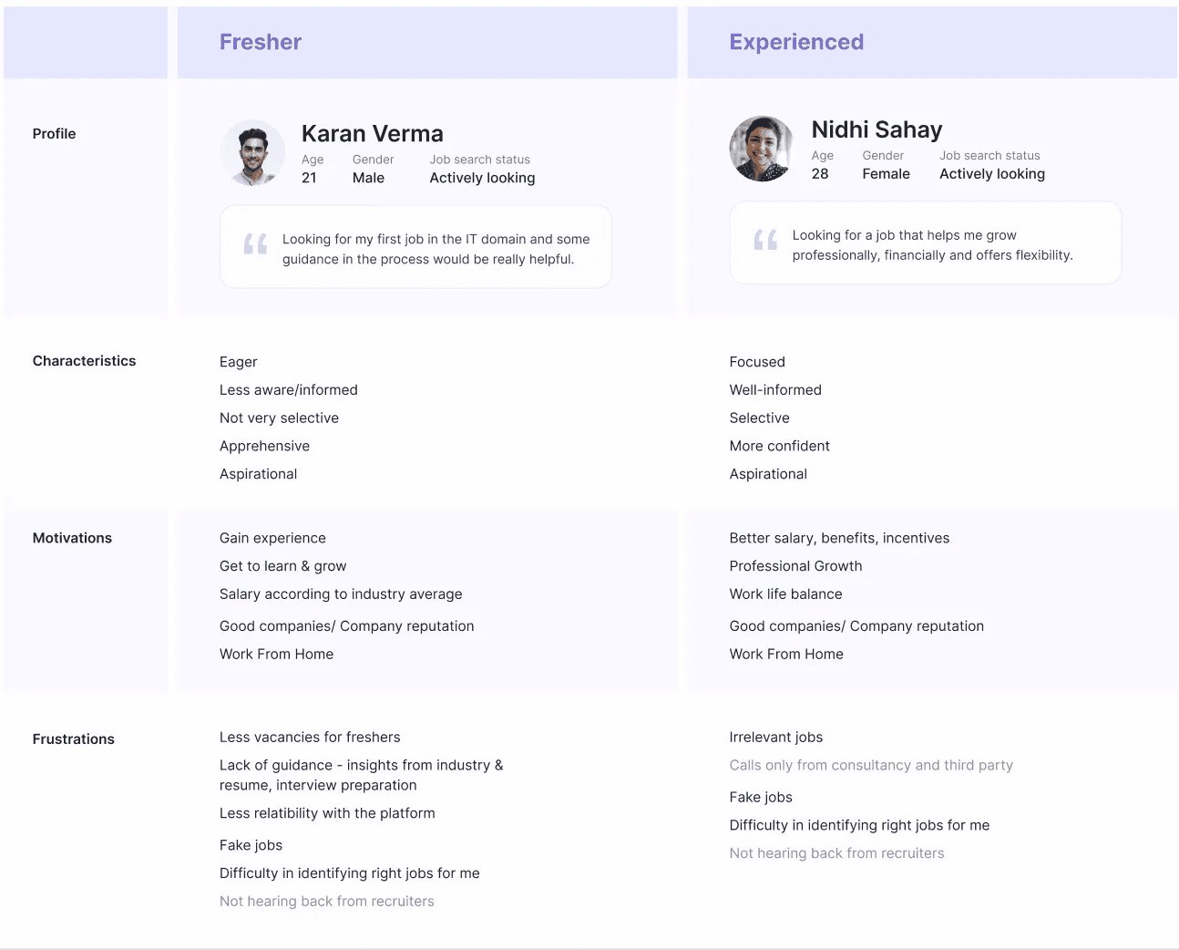
Lets look at the two main types of users of the job search platform
From the registration data we found that most majority of registration consists of Freshers (IT,BPO) & other major chunk were mid level professionals
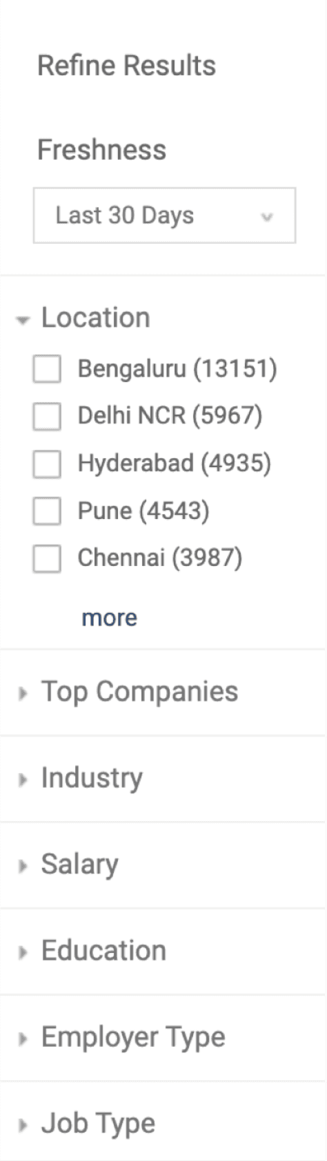
Heuristics and data extraction from the existing SRP portal
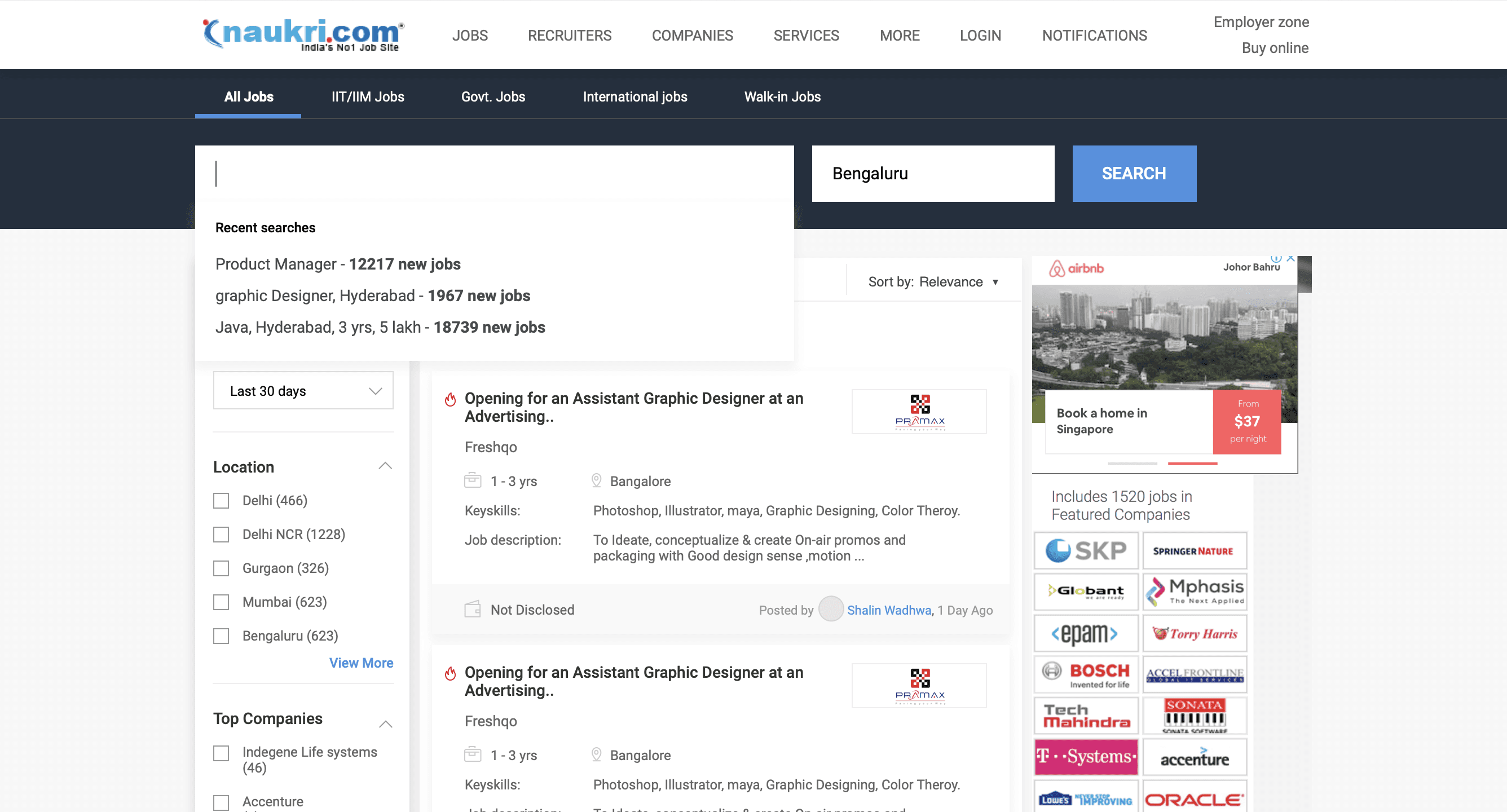
I analysed the current structure of search result page, tried to understand the functionality of each of the elements and check its heuristics.
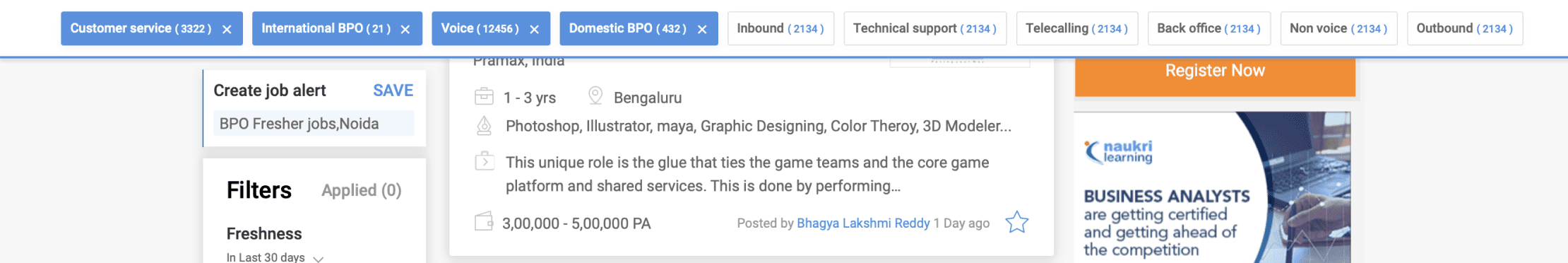
Contextual filter
Main filters
Job Icons
create job alert
Featured Job card
Normal Job card
Breadcrumbs
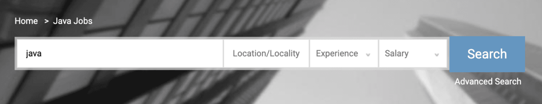
Search bar
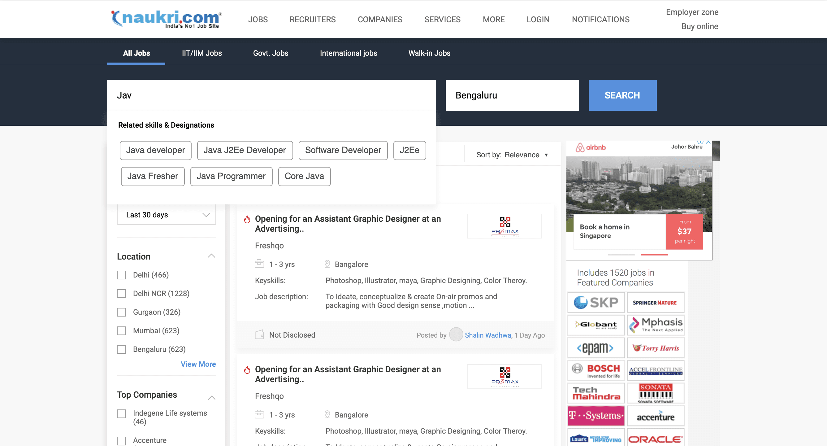
advanced search
Recent search
Sort
sticky GNB
company adverts
Featured company
SEO keywords
Career services
Register
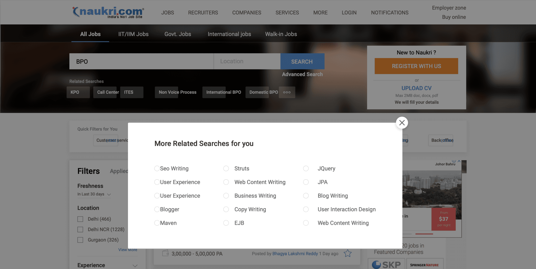
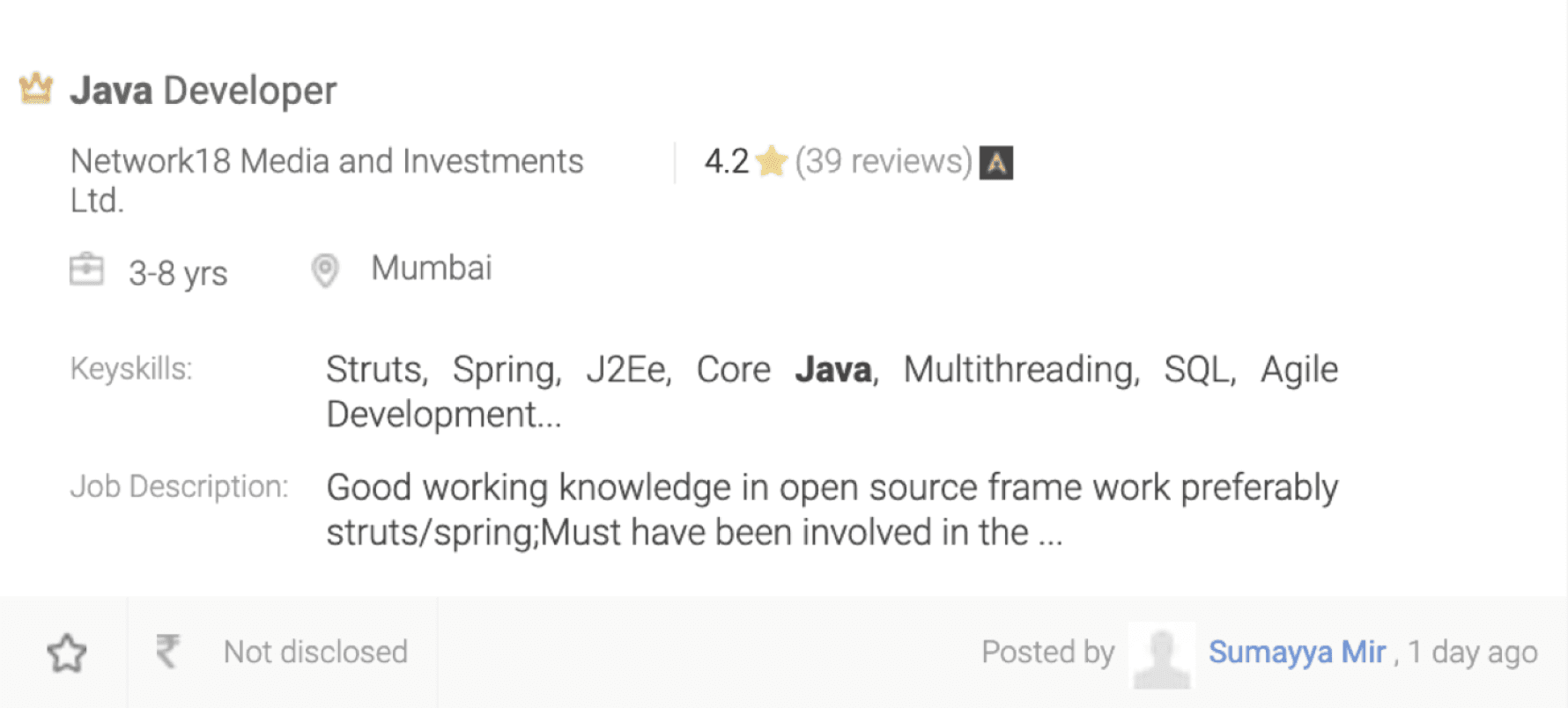
Job card icons which users had problems understanding (No tooltips) ( Raster Graphics were used instead of SVG in the webpage )

Featured job
Job description
Keyskills
Premium job
Salary
Location
Like job
Salary
Hot job
International job
Date posted
Date and time - walk in job scenario
Salary - International currency
Keyskills
Save job
Page icons (No tooltips) ( Raster Graphics were used instead of SVG in the webpage )
Job description - expand view
Job description - Collapse view
More - Report / Hide job
Filter dropdown
Pagination
Toast message success
Search bar - search Job
Checkbox - apply multiple jobs
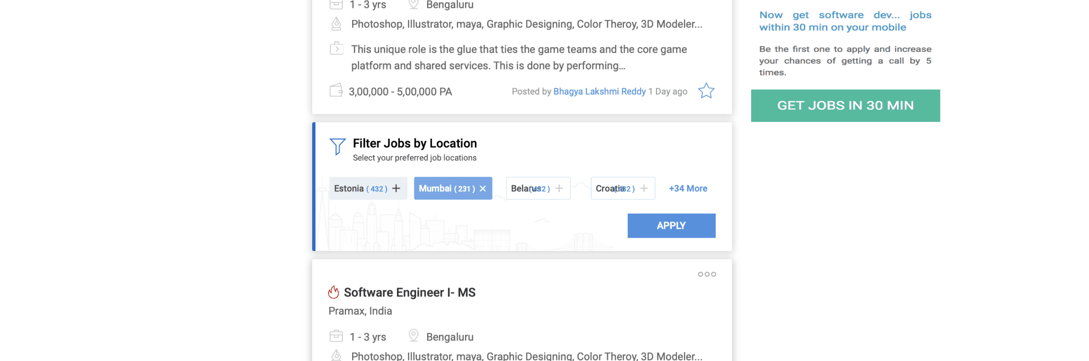
Current side Widget Interactions
Company promotions
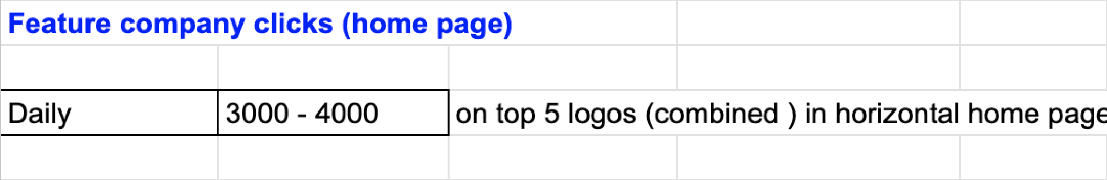
Given that almost 28,554,744 page view happens per day the company branding is also important.
Contextual companies are shown based on job search key term so that their brand get promoted.
Career boost and learning
Online learning platform by the job portal
Career oriented online course
Provides Certifications
Gives Job assistance

Registration and job alerts
Registration is also important
As per Google analytics significant amount of registration happens
Creating job alerts also leads to getting user email ID’s
Which in turn helps in profile database generation

Total data points extraction from SRP (Important parameters)
After analysing all the heuristics and data points that were represented in the SRP page, we made an excel sheet showing important parameters to keep in mind while redesign, and optimise the search result page based on time constraint
This data was later used for user research, to get insights form user about the parameters they want to see during their job search journey.
Datapoints usage summary from product managers and Google analytics
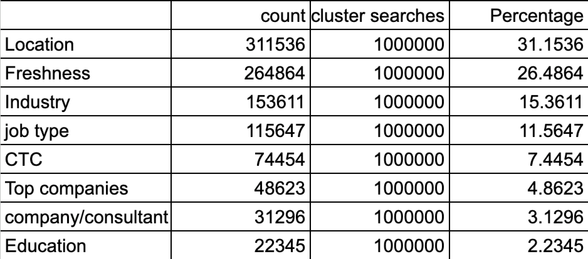
Filter and sort usage summary
Left vertical filter usage data
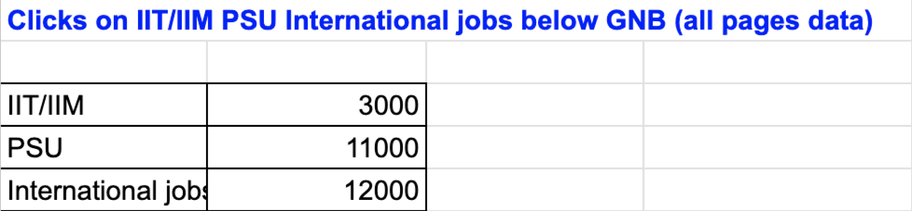
GNB second row usage data ( Government,PSU jobs)
Usage of right side widget elements (featured company logos)
Location
31.15%
Freshness
26.48%
Industry
15.36%
Job type
11.56%
CTC
7.44%
Top companies
4.86%
Company/consultant
3.12%
Education
2.23%
0
250000
500000
Count
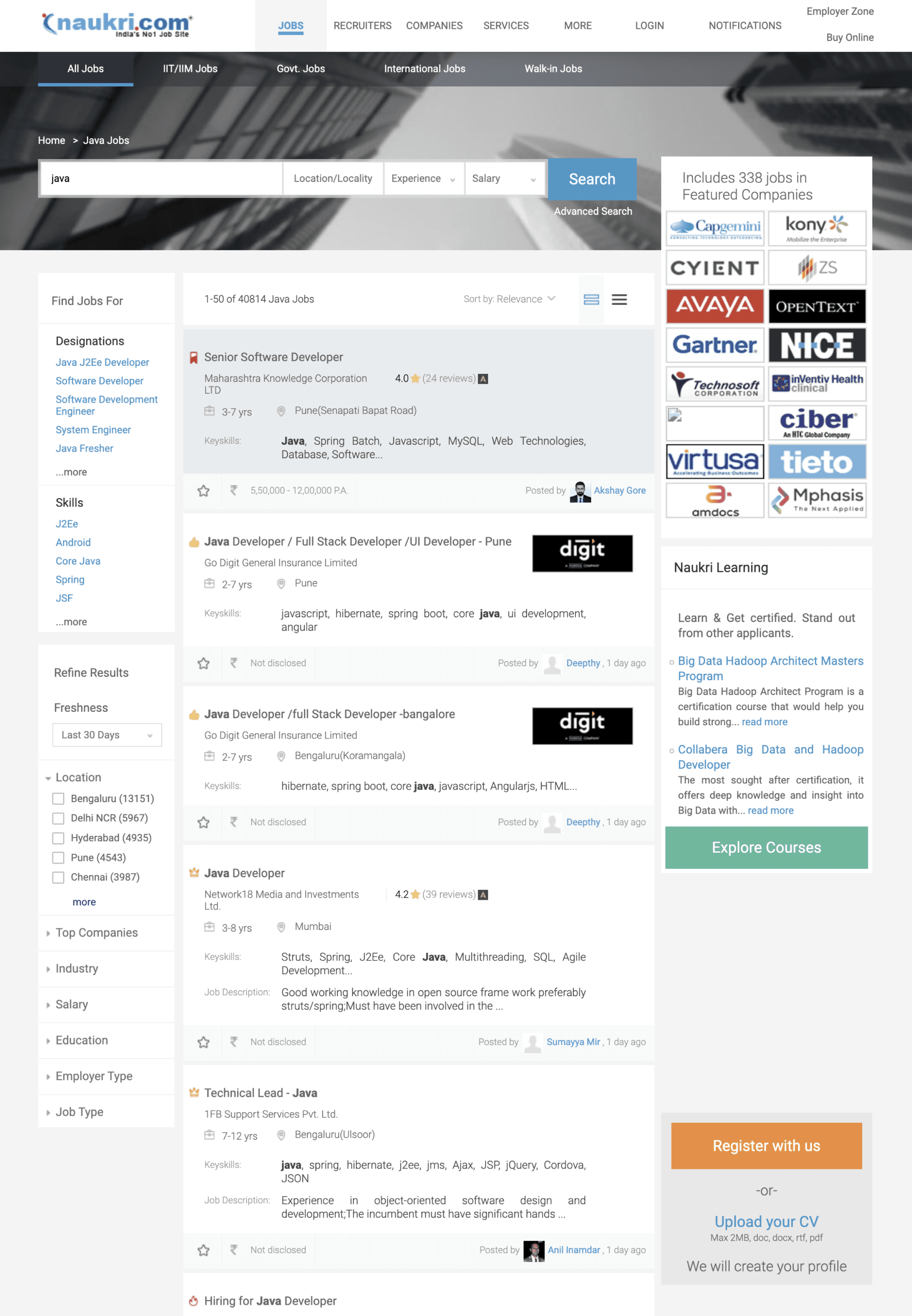
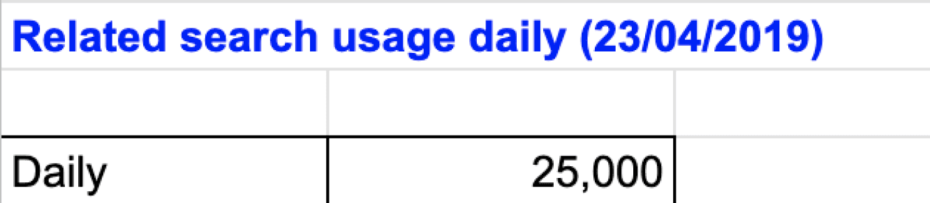
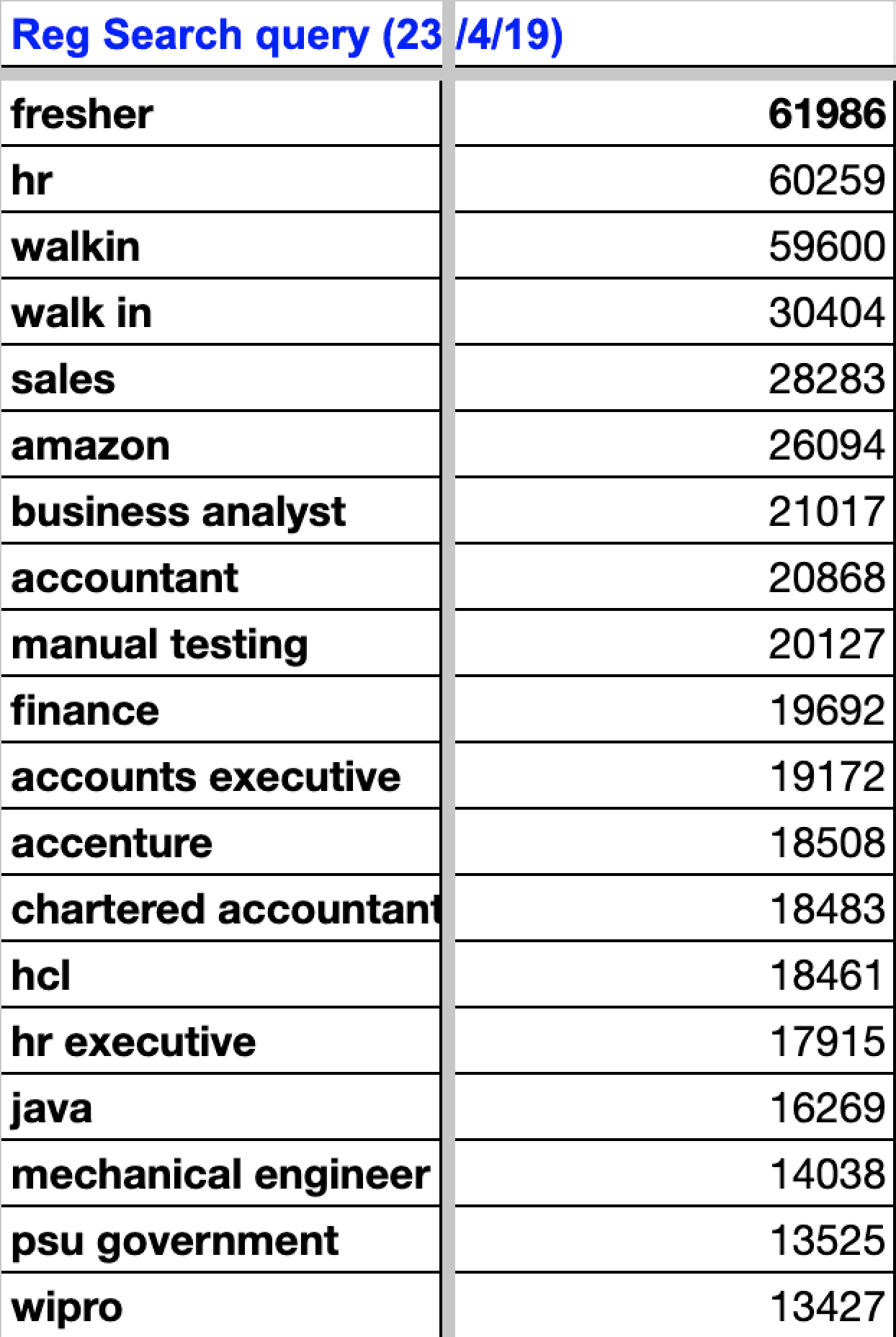
Cluster searches
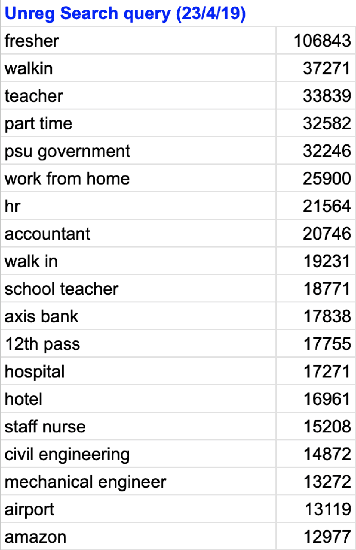
Keyword Query search data and insights
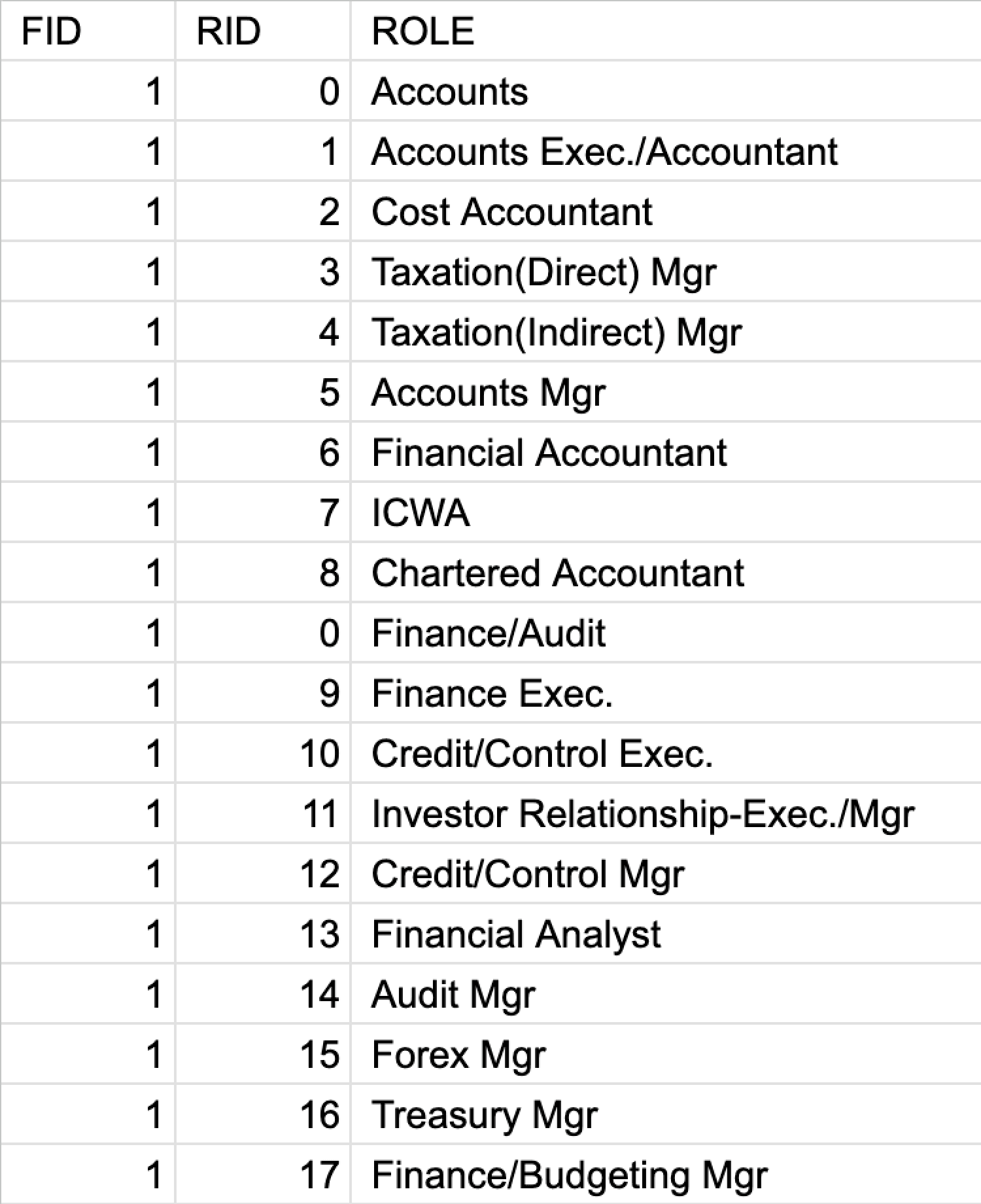
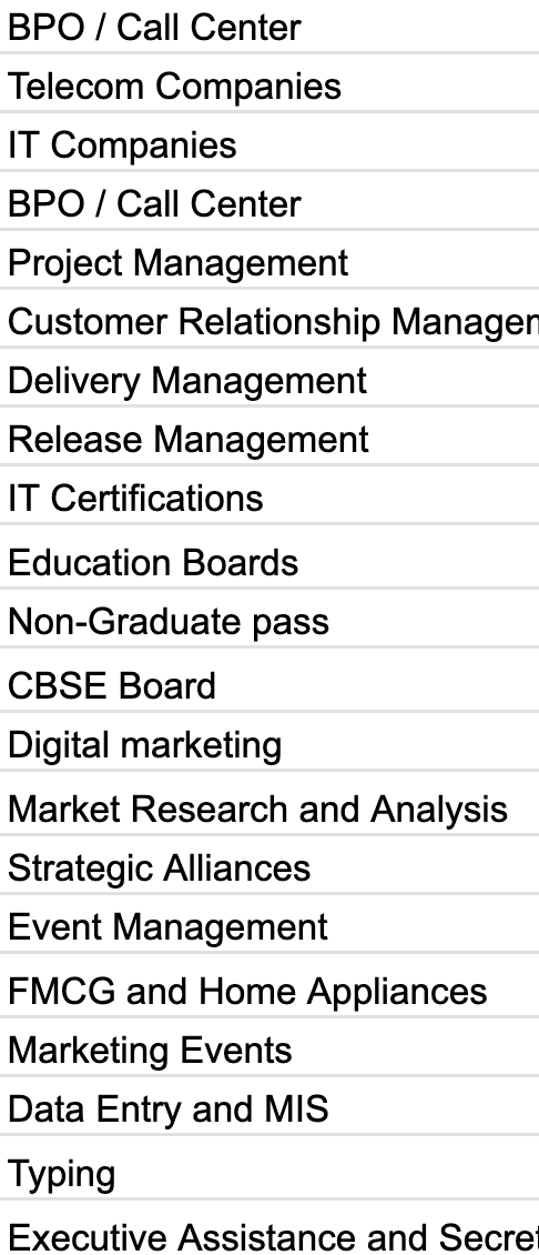
Skills search
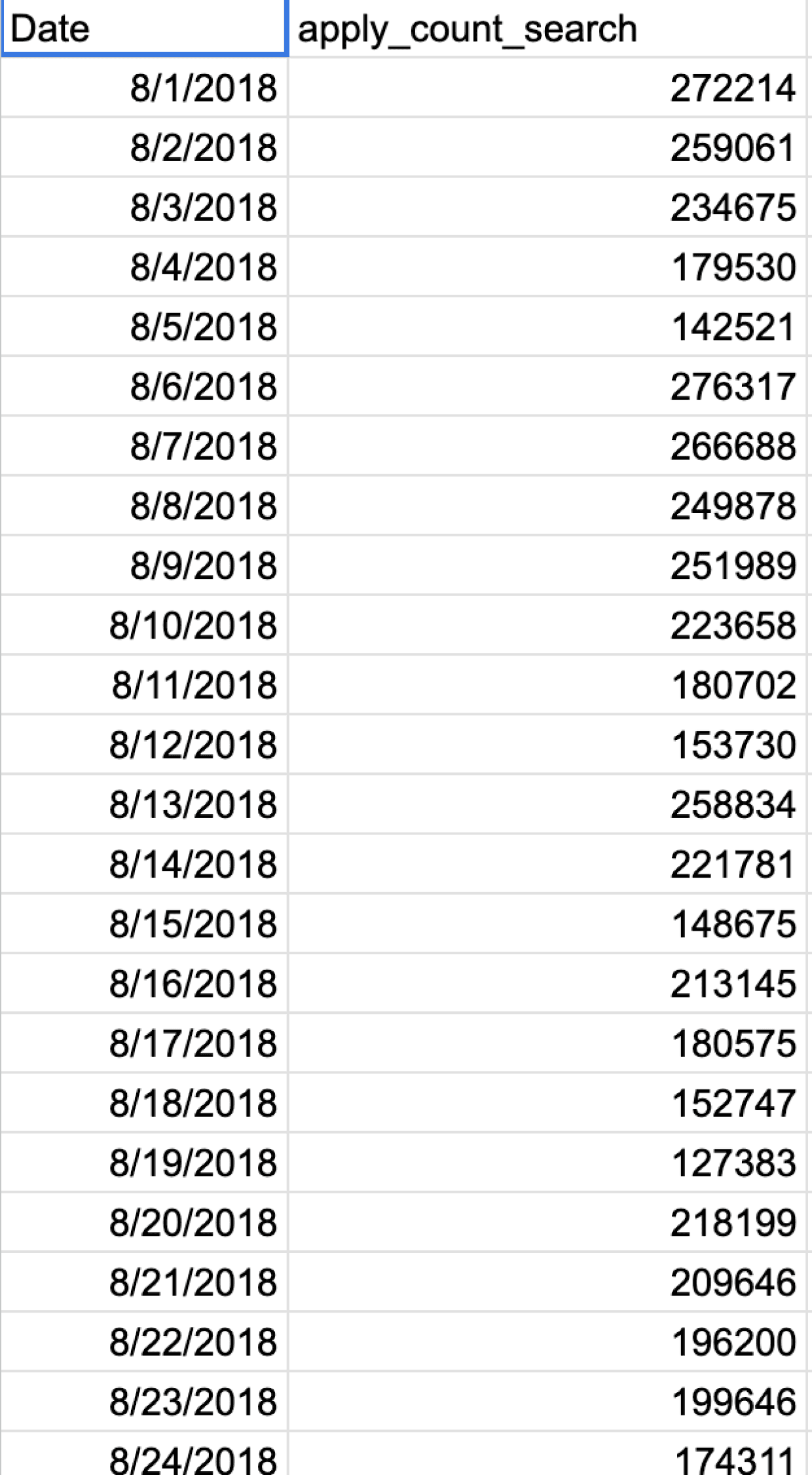
Apply count search
Freshers/Walkin are the top searched keywords for both registered and unregistered users. This data can be used to enhance their journey and experience.
In skills search, BPO/Call centre and IT & Telecom are the top searches. We can prioritize building the search results page (SRP) journey for users interested in these skills.
Given that queries are broad terms such as Freshers, BPO, and IT, it's essential to guide users in reaching the correct jobs with these broad searches.
The data also indicates that people are searching specifically for companies, presenting an opportunity to showcase insightful company data alongside job listings.
The data reveals that individuals with basic education, such as 10th and 12th, are searching for basic jobs with broad queries. Implementing progressive questions can help provide users with more refined results.
On days were apply count number is low we can improve push notifications timings for different users who have browsed certain jobs but bounced without applying and introducing more quick apply jobs on those days.
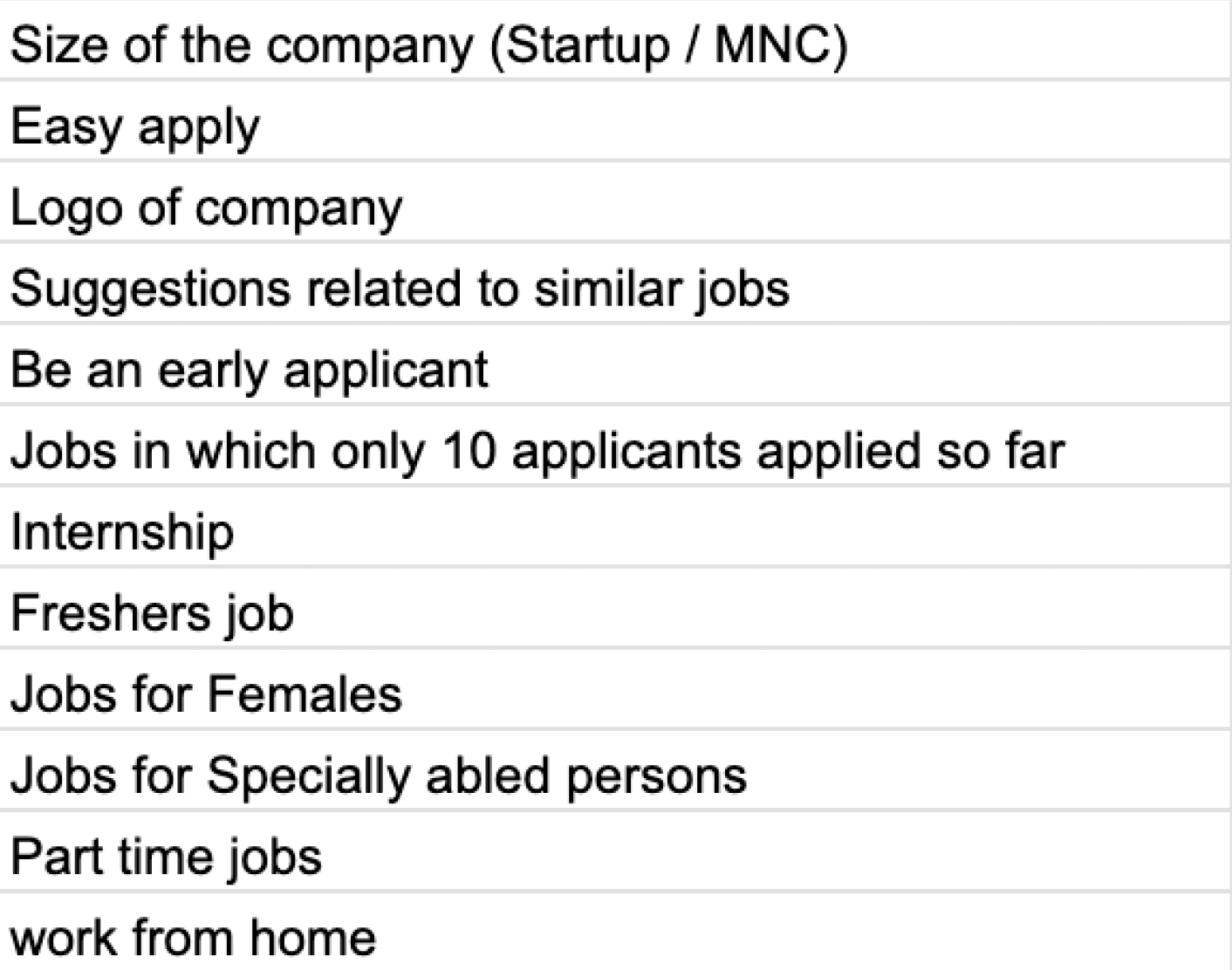
Primary research - what users want to see in the job card
Offline survey was made, we met 20 participants in real life who are using our job portal
Some of the participants were freshers, some had few years of experience and few others were senior levels.
They came from various domains like from IT, FMCG, banking etc.
We showed them the current job portal and asked them what are the parameters that are important to you while job search.
The various job search parameters requirements were marked in excel sheet, corresponding to the participants names.
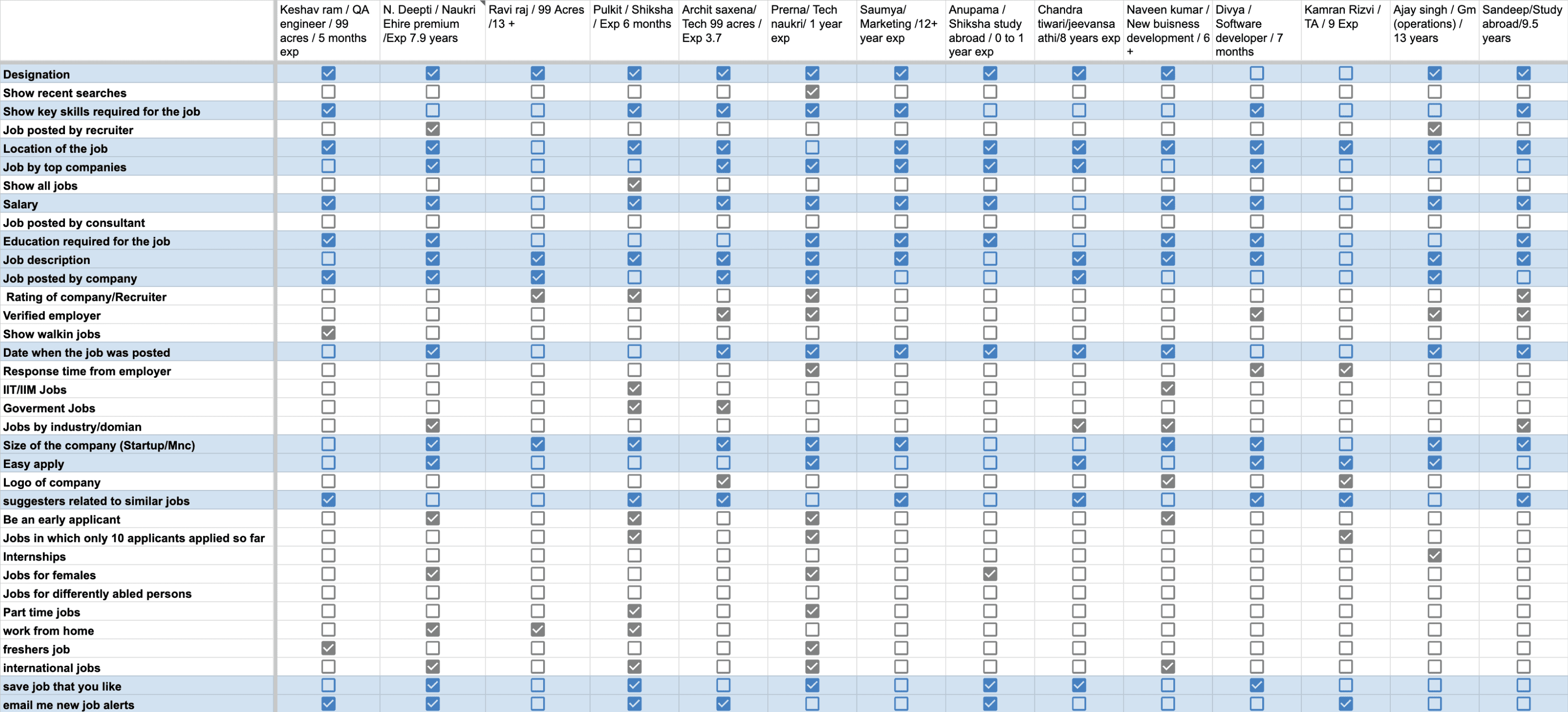
Designation
0
5
10
Location
Salary
Job description
Date posted
Company size
Suggestors
Education req.
Easy apply
company jobs
job alerts
Email Jobs
Shadowing users while using SRP and understanding problems
Whilst we approached 20 off-line participants, we also observed their interactions with SRP and the frustrations they were struggling with...
The search bar was not sticky, that means the user has to scroll all the way up to modify their search query, which in turn increases bounce off rate...
Based on observations with the users and other data, it was seen that users were satisfied with the current Job card level information.
They were scrolling for relevant jobs and looking at company logos / salary / location / key skills.
When they were not able to find jobs, they were missing out on left side filters so as to modify their query, because the filters scrolled away to the top (Filters were not sticky) and users had to scroll back to the top again manually.(There was no “go to top button”)
Some of the icons like Hot job, Premium job, International Job and walkin date icons were not understood by users.Also there was no tooltip guidance when hover over the icons.
Multiple filters were unable to apply, the filters were cancelling out each other (backend issue)
Search Query was not contained in advanced search. after the user hits search and when the results are shown the main search query gets eliminated from the search box , leading to poor user experience.
Problems in understanding icons.
Problems in understanding tool tips.
Certain filter usage was low due to legacy issues
People were not able to understand meaning of premium engg or Premium mba
There were legacy issues also because of the copy of the labels
Other points that the user said
Users said Company logos builds trust and are important
As seen here, the GNB, search bar & filters scroll away leaving user with no navigation to modify or narrow down results.
Problems with job posted by consultants & recruitment agency
We had to understand the reasons why Consultancy were having bad reputation & causing problem in search result listings.
The consultancy jobs has bad reputation for asking money in exchange of jobs, there was no tool to verify if the companies were genuine.
They take Job posting services and sometimes post fake jobs & also pay more and boost their posting to get more views.
After boosting jobs they post multiple jobs with the same description so as to get more views.
This pushes down other legitimate and verified jobs from the SRP and hence creates problems with user experience.
So there was a necessity to compress and stack similar jobs posted by consultancy, having more than 90% similar keywords ...
Also there was a necessity to have a filter which differentiate between company jobs and consultancy jobs & verified jobs badge.
Defining final needs and overall scope from all research datapoints
It was concluded that after user has given inputs, to further refine his search and showing him more relevancy, contextual filters would be helpful, also increasing the visibility of side filters will lead user to better refine his search
Providing Quick alterations of search results as and when needed by user.
Increasing relevancy by making use of filters ( Contextual and side filters )
Giving user control for applying most sought after filter easily and quickly and also making filter ( select / de select ) easily.
Converting broad searches into consolidated and confined results.
Encouraging users to take control over the results.
Overall visual improvement of filters and job Cards.
Clubbing or stacking of similar jobs posted by consultants and recruitment agency.
Providing proper tool tips wherever necessary and improving the iconography , switching to SVG icons for better visual aids.
If clicked on company logos, or if the search term is about a company then showing him all company jobs and company insights.
Filter exploration to improve filter discoverability and checking it’s feasibility
Improved text legibility by removing the background image and using the product's primary color for better content visibility.
Integrating personalized trending searches in tag format for registered users and recurring suggestions for unregistered users.
Implementing a horizontal top filter system having hierarchy based upon user research and filter usage data, to enhance user experience
Choosing a top horizontal filter gives space for job cards, providing ample space for additional content.
Dynamic filters adapt to user behaviour, prioritising the most frequently used ones for a unique and personalised experience based on each IP address.
Hover over a filter type to expand options, offering users an extended view of choices.
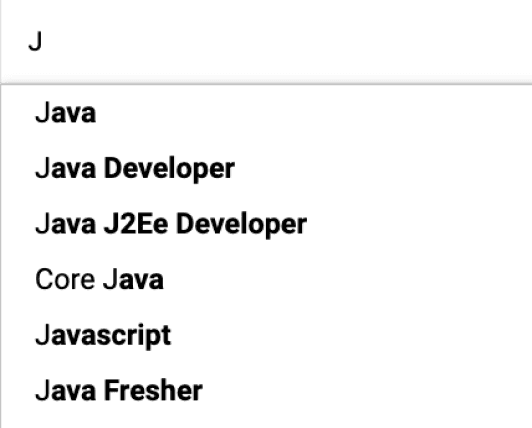
Search a keyword, and the dropdown shows related designations and skills from a comprehensive and relevant set of options.
Search query is encapsulated in the search box, and the sticky search bar ensures continuous accessibility and convenience while scrolling.
Introducing a secondary filter: click on a filter to reveal a dropdown with its contents
This approach facilitates quick and efficient scanning of filter sub-contents in a convenient list format."
Showcasing recent searches when the query is empty or being modified, offering quick access to relevant past queries.
Boosting user engagement by refining and highlighting the left vertical filter for a clean and prominent interface.
Improving filter labels and copy for broader audience comprehension.
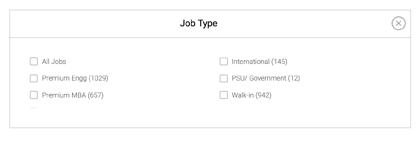
Streamlining search results by eliminating non-relevant filters like 'Premium MBA' and 'Premium Engineering.'
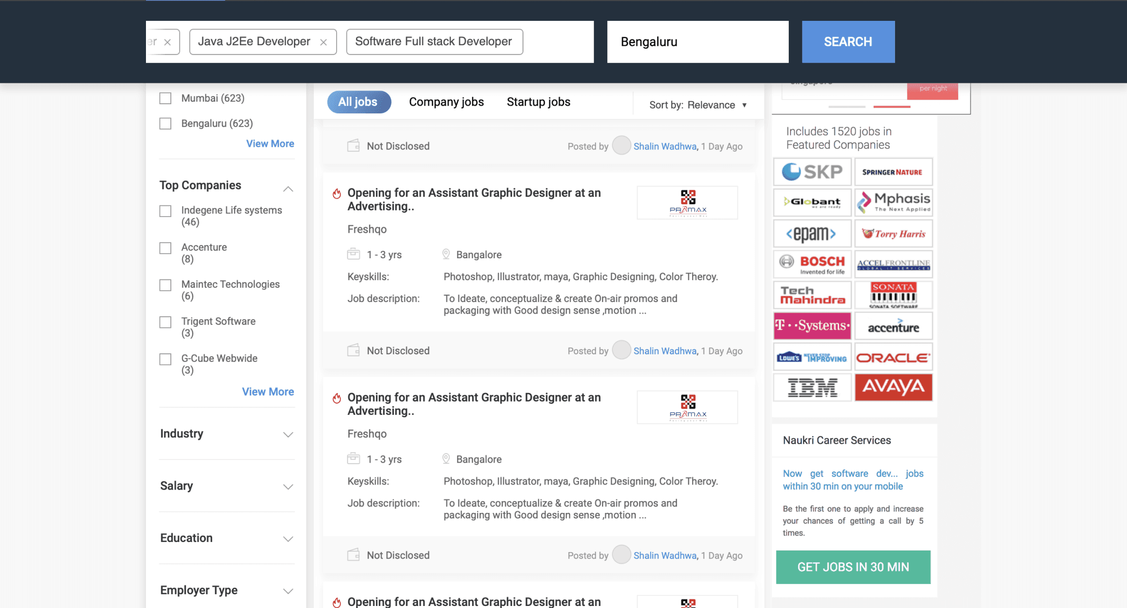
Introducing distinct horizontal filter tags - 'All Jobs,' 'Company Jobs,' and 'Startup Jobs' for quick results and to tackle fake consultancy job concerns.
Experimenting with a tags approach in the search query for improved user interaction and search precision.
Type three letters, and suggestions are displayed, automatically converted into tags for user convenience.
Tag approach enables instant removal of entire keywords for quick modification of the search query.
Transforming the search query into sticky tags for effortless modification while scrolling.
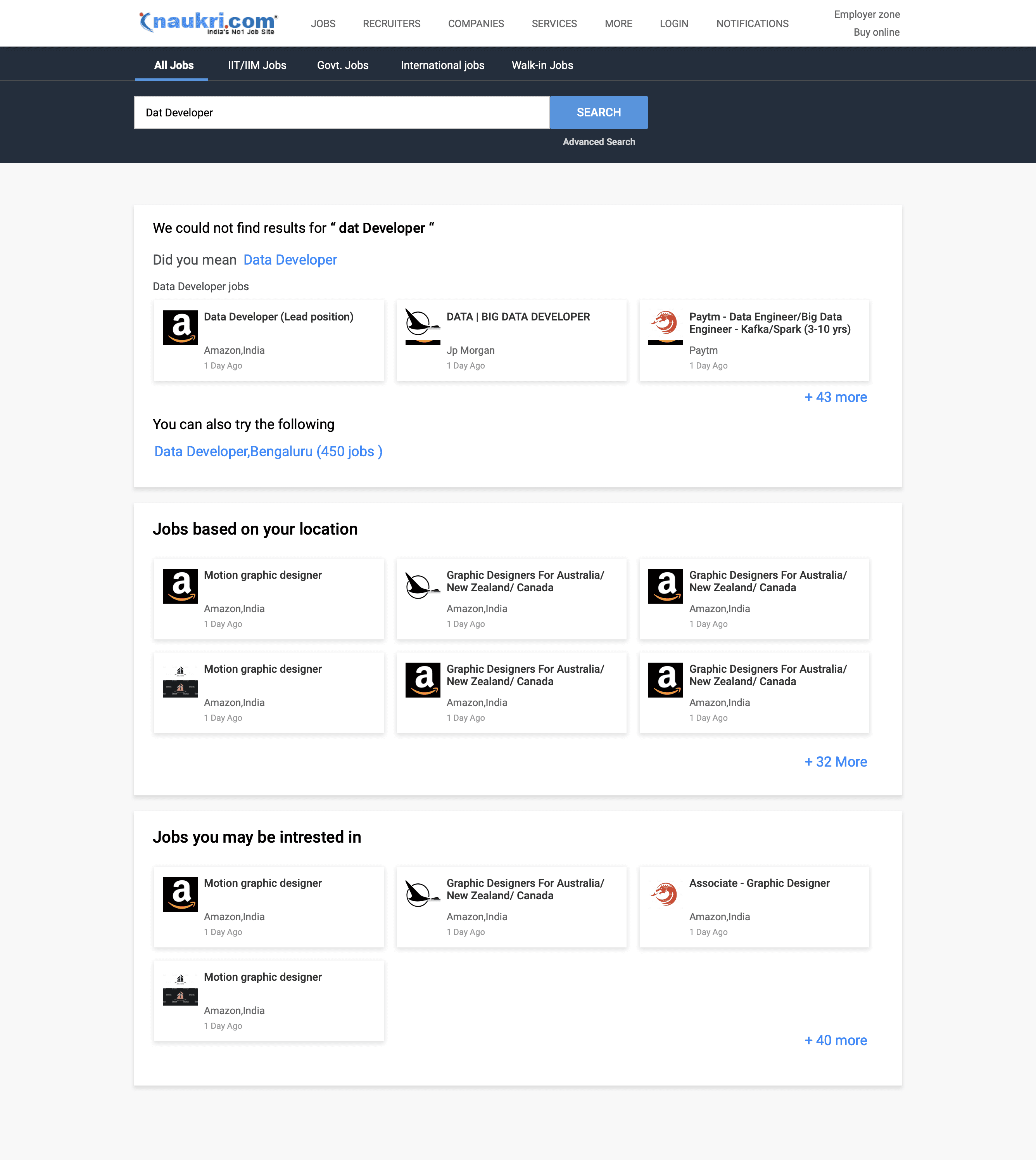
Handling zero and borderline Cases & Empty states
Handling scenarios where the search query contains errors or spelling mistakes.
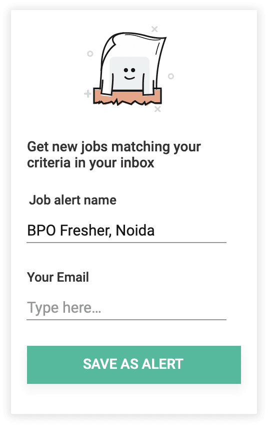
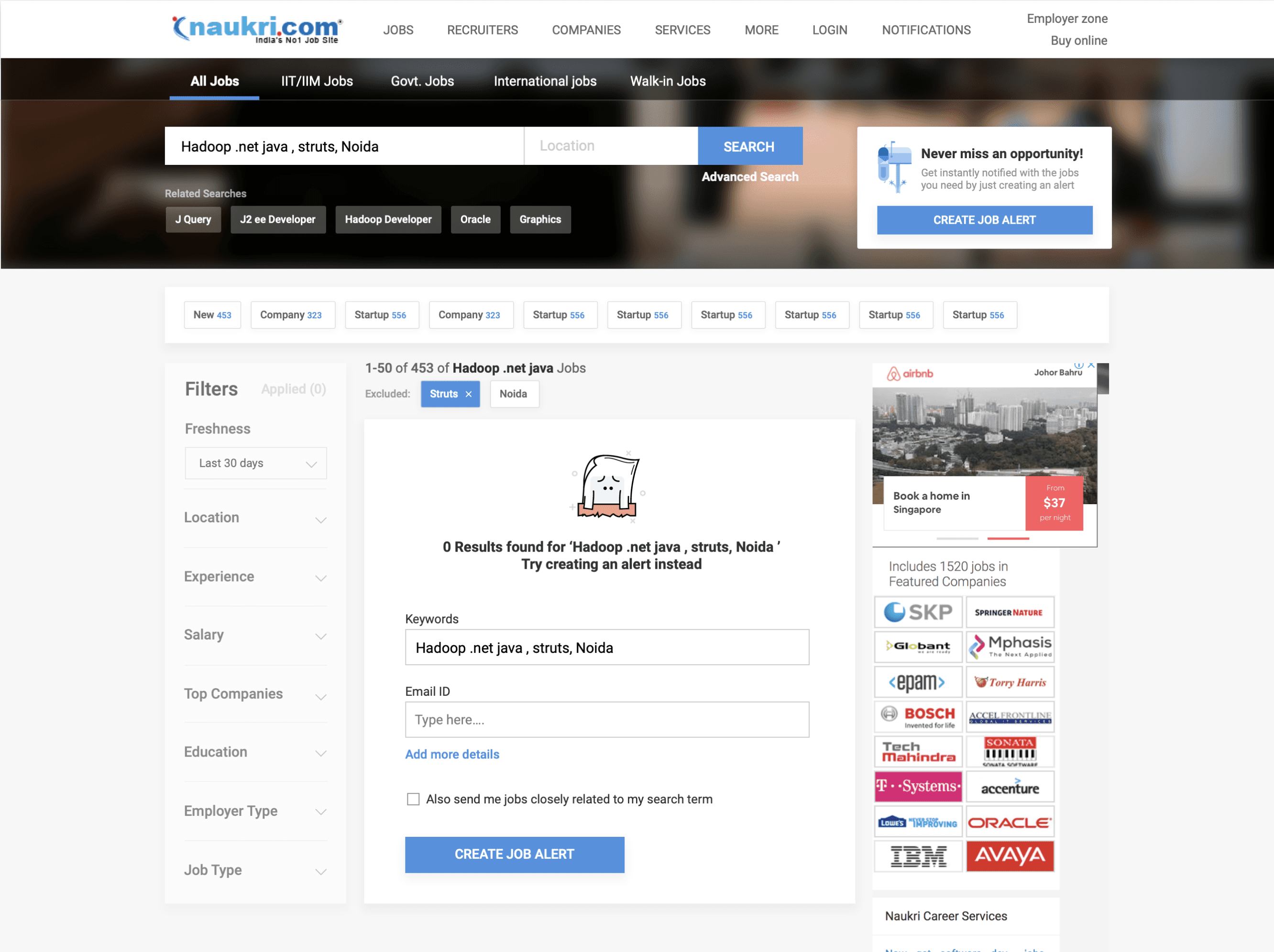
Handling scenarios where the search query is correct, but no job results are found.
In this case, prompting the user to create a job alert related to the search query.
Displaying the closest related jobs to the searched query skill or designation.
Addressing this error case by correcting and displaying the closest related job cards.
Incorporating location into the search query (with permission) to display jobs specifically in that area.
Displaying personalized job recommendations based on past queries for logged-in users and tailored suggestions for non-logged-in users.
Changes made in Job cards
The left-side job card displays the previous version.
Enhanced icons and added tooltips for easy user comprehension.
Replaced labels such as "Key Skill" and "Job Description" with icons, creating more space for additional skill types and highlighting job descriptions.
Users initially overlooked bookmarks, resulting in low usage numbers.
Moved the bookmark to the right side, aligning it with the job card hamburger menu. This menu allows users to hide or report irrelevant jobs.
Incorporated company logos into job cards based on user research, enhancing trust in job postings.
Final changes made including SEO handling
Unable to change the image background due to time constraints, requiring platform-wide redesign and affecting multiple pages.
Added tags below the search bar for relevant suggestions tied to the search query.
Managed SEO by adding extra keywords in the related search section accessible through the three dots menu.
Boosted registration visibility by promoting the top-placed widget, in response to moderate sign-ups data.
Added a horizontal filter next to the left vertical one to counteract the left-side usage bias, ensuring users notice both left and top horizontal filters.
Recognising the prevalence of search queries related to freshers and BPO call centre jobs, we now display top horizontal contextual filters specifically tailored to these queries. For instance, when a user searches for BPO, relevant filters related to BPO are prominently shown.
I.e Search query --> BPO -- Related search will be --> KPO, call Center, ITES etc -- contextual (skill/designation) filter will be --> Technical support, Inbound, voice, back office etc.
Addressed breadcrumbs and SEO to improve page ranking.
When scrolling down, horizontal contextual filters now sticky, giving users control for easy modification.
Introducing the concept of "Belly Filters" – widgets that appear between job cards while scrolling.
This concept is designed to refine broad search queries. Belly Filters prompt users to narrow down results based on location, skills, or company.
When scrolling down, the side vertical filter stays sticky, empowering users to modify search results effortlessly.
The "Create Job Alert" feature stays sticky on the left side, allowing users to save and receive job alerts with just one click.
Widgets change
We enhanced the visibility and engagement of the right-side widgets for creating job alerts or registration through visual improvements.
We developed widgets promoting app download to encourage users to conveniently search for jobs on our mobile app.


Zero cases handeling
Here are modifications we made to handle zero cases, incorporating feedback from senior designers and product managers.
The idea was to transform user queries into various keyword tags.
Even if there are no results due to multiple keywords, users can still remove one keyword tag to check for search results.
Figma link All explorations and use cases
Below you can browse all the explorations and use case tha t was done for the project.
Understanding the job seeker portal product flow
User incoming
Via organic search
Via mail campaigns
Advertisements
Web promotions
Landing on job portal
Based on logged in/out state
Lands on homepage
Lands on search result
Lands on recommended jobs
User tasks
Surf jobs
Apply filters
Sorts result
Modify search
User conversion
Job applies
Registrations
Creating job alerts
or Bounce off
Final user engagement results form this project after deployment
User engagement results after deployment
For 4000 unique searches we have around 900 searches with at least one view and for 7000 searches the number is around 1550.
So the % searches with at least one view is around 23%.
Cluster searches
0
250000
500000
750000
1000000
Overall searches
New filter usage data
Before
After
500000
0
1000000
1500000
Belly filter
Contextual filter
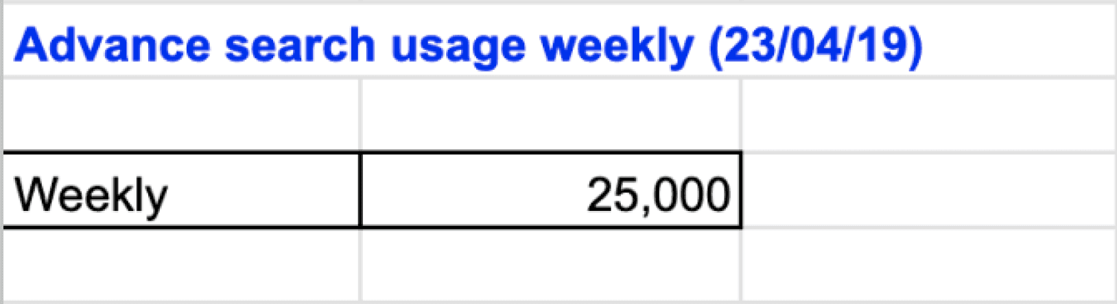
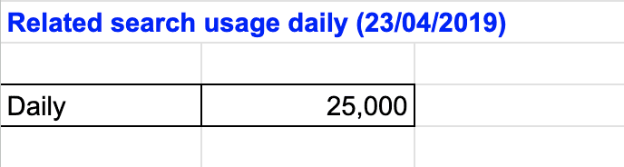
Belly filter usage (its 4% of total usage)
Total
Usage
Current search Bar Interaction
Suggested & related keyword
location
Exp. scroll & select
Salary scroll & select
Search by work ex (Years &/or Months)
Search by Industry / Domain
Search by Job category
Search by Job type (company/consultant)
Sort
Advanced search dropdown
Static Filter
Contextual Filter
Banking, Pharma etc
Company or consultant
Govt, Pvt, international
Near selected location
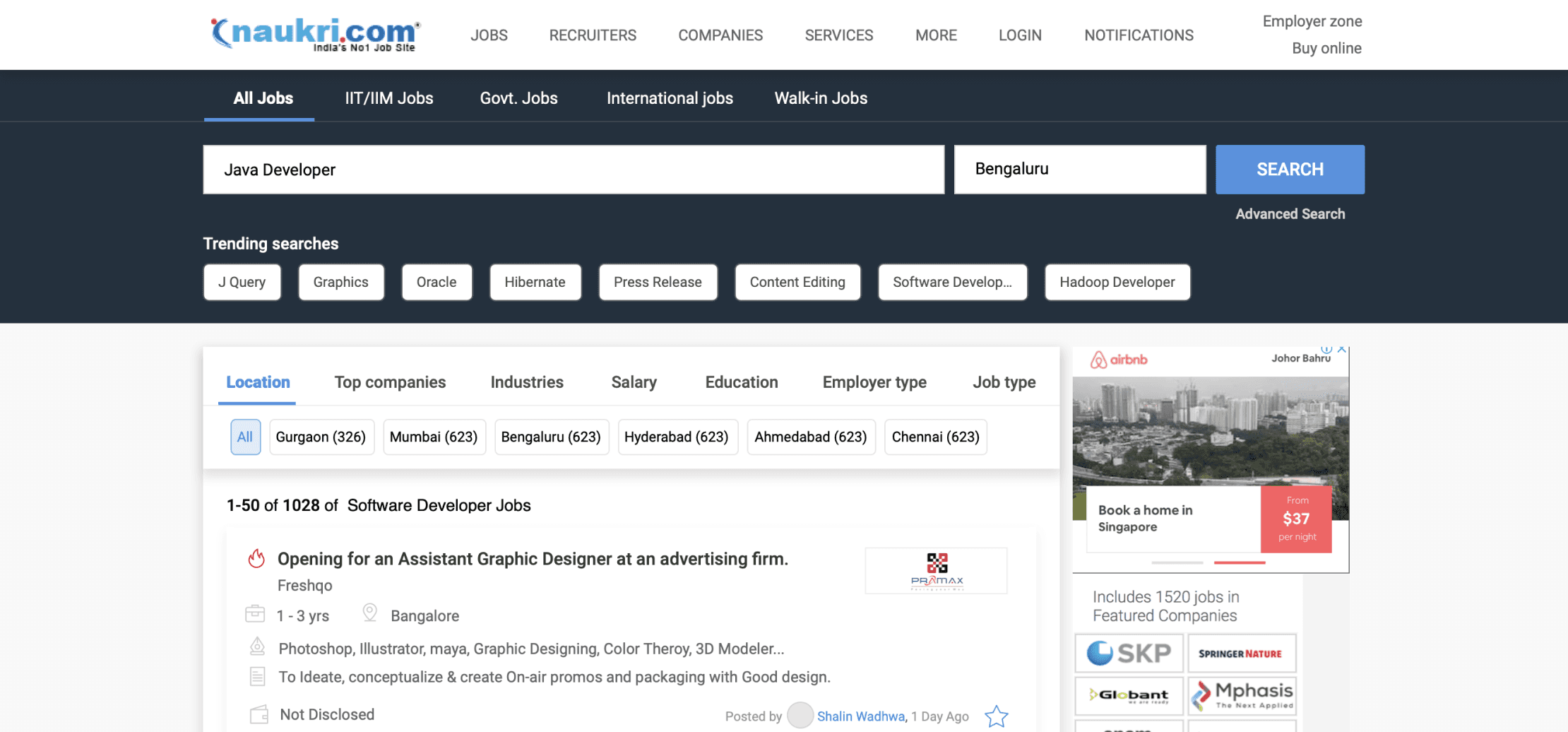
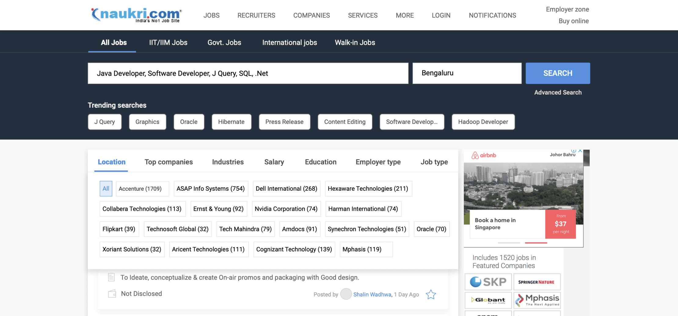
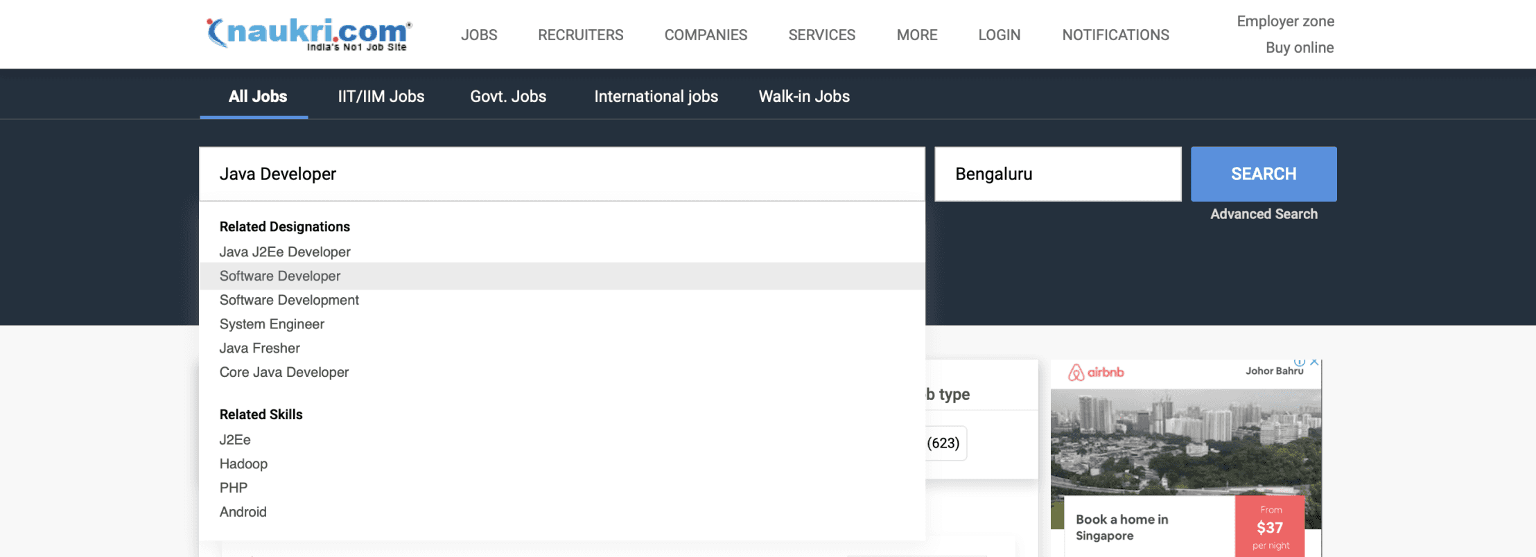
There are two types of filter in the left panel - Static filter and contextual filter
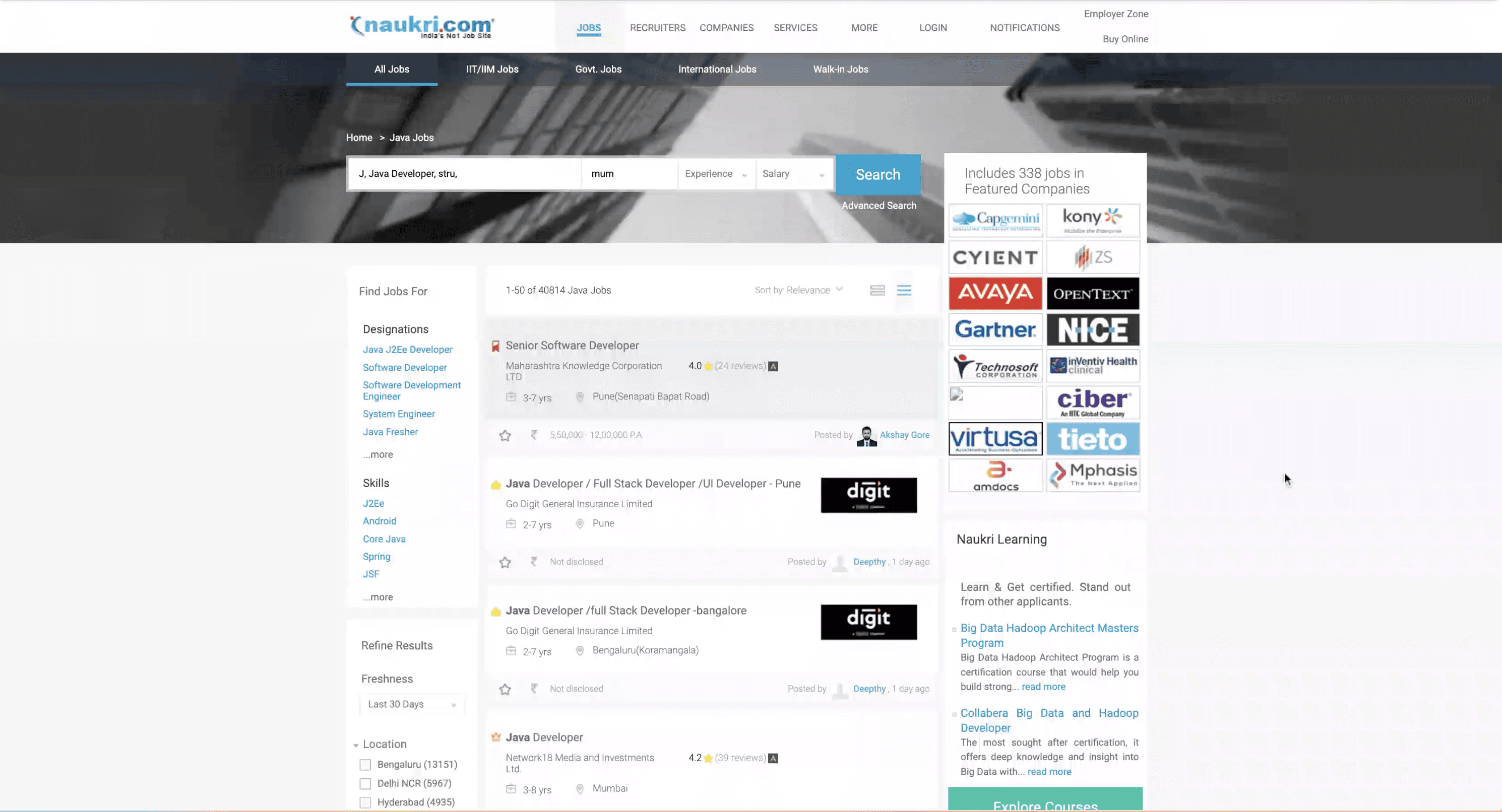
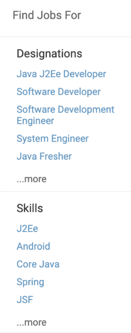
It shows related designation and skills
12 Different types of job card appears depending on the search query
Below shows the structure of the job card and elements
Shows related designation and skills based on search query
Eg:
Search query - java
Skills - java j2e dev
Designation -
System engineer
Different icons indicate type of job - featured, premium, govt etc
Keyskills - Keywords that are extracted form Job description (important form SEO P.O.V)
Bookmark the jobs
Salary provided
Recruiter info
Day posted
Job description - First few lines extracted from Job description (not very beneficial)
Job title
Company name
Job experience req
Location
company review - like salary, benefits, interview questions etc
Current Filter interaction
Current Job card interaction
Search Result page optimisation (Part 1)
Naukri.com is an Indian employment website operating in India and the Middle East. In terms of user statistics, Naukri.com has a total of 21 million visits. The website ranks 2nd in the Jobs and Career and Employment category in India. i worked as UX designer in Naukri in job seekers division
Company
Studio Project
Role
UX Research
UI & UX Design
Industries
Job Portal services
Date
Jan 2022
